“Dandelion WordPress Theme” Documentation by “Pexeto” v.3.1.8
Created: 05/11/2010
By: Pexeto
http://pexetothemes.com/
Thank you for purchasing Dandelion theme. If you have any questions that are beyond the scope of this help file, please refer to the Support section. Thanks so much!


If you like this theme, please don't forget to rate it on the ThemeForest site. Thank you!
Note: If you have any questions that are beyond the scope of this help file, please refer to the Support section.
1. Getting Started
a. If you are new to WordPress
Although building a website with WordPress is significantly much easier than coding it by yourself, if you are a beginner, even working with WordPress may look hard for you. That's why, in this section we will provide some useful links and also will explain how to get oriented in the documentation and what pattern to follow when building your website with our theme.
Working with WordPress - Useful Links- The WordPress Codex - the official WordPress manual containing lots of information and tutorials about working with WordPress.
- WP101 Basics Training - the perfect beginning spot for those just getting started with WordPress. The video tutorials provided are very helpful to easily understand how WordPress works.
b. Working with the theme
Once you have some basic WordPress knowledge, you are ready to go with setting the theme. Here are some example steps about how you can do this:
- Install and activate the theme - read about how to do this in the Installing and activating the theme section.
Having problems with installing the theme?
» Refer to the "Fail to install the theme" subsection of the Troubleshooting section. - Change your logo - learn how to do this in the Changing the logo section
- Create your basic menu - during the process of setting your theme, you will be changing your menu links all the time. However, it is good to start with having the main menu set. Learn how to set your menu in the The menu section.
- Start with creating your content
You can create all the content by creating your pages one by one. Here are some examples of what steps to follow when creating different pages:
You need a Home page template with services boxes:
- Go to Template pages » Home page section - in this section you can read about how to create such a page and all the settings you can do about this page template. You can read about how to set your services boxes content, insert an intro text, select a slider, etc.
- You need to set a slider for the page? » Go to the The sliders section to read how to create a slider. After you have your slider created and populated with images, go back to your page in edit mode and select the slider you have created (how to set the slider for the page is explained the Home page section.)
- After you set your page, go to the Menus section and add it to your menu so it can be easily accessible.
You need a Blog page:- Go to Template pages » Index/Blog page section to learn how to create a blog page, how to create posts to it and all the settings you can do for this page
- You need to set a slider for the blog? » Go to the The sliders section to read how to create a slider. After you have your slider created and populated with images, you have to select the slider you have created (how to set the slider is explained in both The sliders and the Home page sections)
- You need a separate blog sidebar? » Go to the The sidebars section to learn how to create additional sidebars and how to add widgets to them. After you have created your sidebar, go back to the Index/Blog page section to learn how to set the sidebar you have created to your blog page.
Basically, these are the steps you need to follow - when you need to create a page, just go to its relevant subsection of the Template pages section and read about how to create it and what settings you can do for the page. The main key about understanding how the theme works is to read the documentation we have provided carefully, as we have explained everything you need to know about the theme in here.
- Set your footer content - learn how to do this in the The footer section
- Once you follow all these steps and have the basic theme setup, you can also check the rest of the sections of this documentation to read what other features our theme provides.
We hope you will enjoy working with the theme!
Useful instructions back to top
Activating the theme
There are 2 main ways to upload the theme:
- Via the built in WordPress theme uploader (recommended)
Below you can read the instructions about installing a theme via the WordPress uploader, but you can also watch the "Installing a Pexeto Theme via WordPress Uploader" video here
First you need to unzip the download file and find the zip file called "Dandelion_vxx" (xx-the version of the theme- 22 means version 2.2). After this you have to go in the admin panel » Appearance » Themes, click on the Install Themes tab and in this section in the top there is a link "Upload". After you click the "Upload" link, a new page will be opened where you will be asked to find the Dandelion.zip file on your local file system.
Note: Some servers sometimes can't handle a whole theme upload and in such cases you have to upload the theme via FTP. - Via FTP client
Below you can read the instructions about installing a theme via FTP, but you can also watch the "Installing a Pexeto Theme via FTP" video here
If you know the FTP login details of the server where your site is hosted and you have a FTP client installed, you might consider using this way of uploading your theme. First you have to unzip the download file, find the zip file called "Dandelion", unzip it and upload the folder to the main WordPress installation folder » wp-content » themes. Please note that if you prefer this way of installation, you have to make sure that the main files of the theme are contained just within one folder of the themes folder. The right way to locate your root theme files is for example themes/Dandelion but not themes/Dandelion/Dandelion.
After you have uploaded the theme to the server you will need to activate it. In order to activate this theme you have to go to the admin panel » Appearance » Themes. In this section you should see the theme with a title Dandelion by Pexeto. Just click on Activate button and your theme should get activated.
Importing the demo content
If you would like to import the demo content and start editing the theme from the created content rather
than from scratch, you need to import the demo_exported.xml file that is included with the download
folder. You can do this by going to the WordPress admin panel -> Tools -> Import -> Select WordPress,
find the demo_exported.xml file from your local file system and upload it.Please note that not all the settings are saved with the demo exported data- settings such as custom menus, slider images and
sidebar widgets don't get saved so it is always recommended to set your theme from scratch rather than installing the demo
content and editing it.
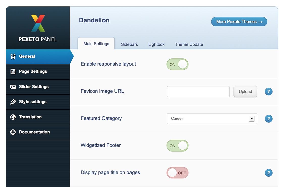
Options page
When you activate this theme, an options page is created in order to help you make the theme settings much easier. This page is located in the admin panel » Appearance » Dandelion Options.
Setting a custom field
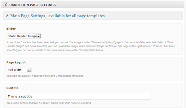
Many times in this documentation you will be told that you need to set a custom field for a page or post. There are some custom field that have been created for this theme. Those custom fields are located just below the main content area of the page/post when opened in "edit" mode. For the portfolio items the section is called "Dandelion PORTFOLIO ITEM SETTINGS" and for the pages the section is called "Dandelion PAGE SETTINGS".
c. Setting a featured image to a post/page
In order to set a thumbnail (featured image) to a post/page, when creating/editing your post/page in the bottom of the right sidebar
you will see a link "Set a Featured Image":
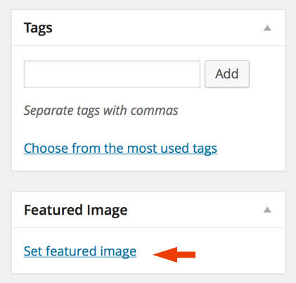
If you click on this link, a window will be opened where
you can choose the image. When you select the desired image, you have to click on the "Set featured image"
link.
The header back to top
Changing the logo
You can either use your own existing logo image or edit the included logo PSD file. If you choose the second option then the file you need to edit is called logo.psd - it is located in the photoshop_files folder of the main download package.
In order to change the logo, go to the options setting page » Styles » Logo and upload (or insert the image URL) in the Logo Image section.
If you would like to have
a sharp logo image on retina displays, the image uploaded should be twice bigger than its
display size - for example if the standard logo image size is 30x70 pixels, the image size of the
uploaded image should be 60x140 pixels.
The default logo image width is 160 pixels and the height depends on the
original image ratio. If you would like to apply custom width or height to the
logo image, you can do this in the "Logo image width" and "Logo image height" fields.
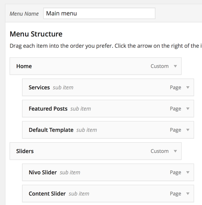
The menu
Here are the steps you have to follow in order to set the menu:
- Go to Appearance » Menus. To create the menu click on the
"Create a new menu" link.

- After you create the menu, you can
add Page, Category and custom links from the left sidebar.
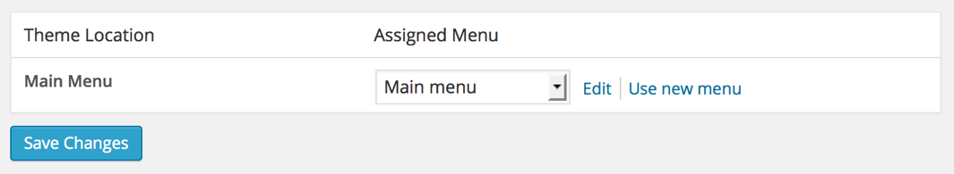
- Then click on the "Manage Locations" tab section and select the menu that you have created
in the "Main Menu" field.
The footer back to top
This theme supports a widgetized footer and you can insert whatever widgets you like in there. There are 4 different columns in the footer and each of them supports multiple widgets.
You just have to go to Appearance » Widgets and and drag and drop the desired widgets into the sections "Footer First Column", "Footer Second Column", "Footer Third Column" and "Footer Fourth Column".Disabling the widgetized footer
If you would like to disable the widgetized footer, you can do this in the options setting page » General » Main Settings »
Widgetized Footer field.
Changing the copyright text
You can change the default Copyright text (located below the widgetized
footer) in the Translation » Other section of the options setting
page.
The sidebars back to top
This theme supports multiple sidebars and they are all dynamic. This means that you can put whatever you want on them.
There is one default sidebar that goes to each of the pages. If you would like to have more sidebars than the default one, then you can create your new sidebars in options setting page » General » Sidebars section:
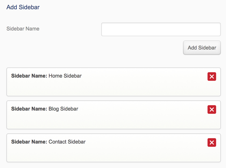
To customize your sidebars you have to go in the admin panel » Appearance » Widgets. There you should see your sidebars on the right part of the page. Now you can drag and drop widgets from the left into your sidebars and that's it!
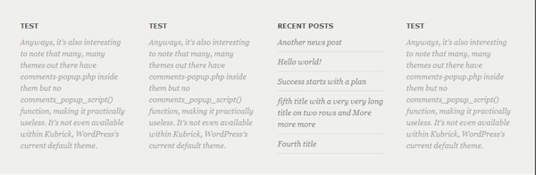
Here is an example of a sidebar:
The sliders back to top
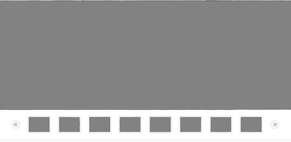
Thumbnail Slider
The thumbnail slider looks like this:
In order to add images to this slider you have to go to the options setting page » Sliders » Thumbnail Slider section. All you have to do is to upload the selected image (or add its URL), link of the image (links can be set to the images, so that when the user clicks on the image to be redirected- this feature is optional) and description (also optional) and press the "Add Image" button. After you add the images, you can sort them by dragging and dropping the image box to the desired position.
Optimal image size: 980px × 370px
Creating additional Thumbnail SlidersIf you would like to add a new slider, you have to go to the bottom of the Thumbnail Slider section, in the subsection "Add new Thumbnail slider". In this field you can add a new slider, you just have to make sure that if you have multiple sliders, they will have unique names. After you add the names of the new sliders, you have to press the "Save Changes" button and after that you will see new sections for adding images created for the new sliders.
In the bottom of this section there is a Slider Settings subsection where you can do the main settings for this slider.
Nivo Slider/Fader
The Nivo Slider looks like this:
In order to add images to this slider you have to go to the options setting page » Sliders » Nivo Slider section. All you have to do is to upload the selected image (or add its URL), link of the image (links can be set to the images, so that when the user clicks on the image to be redirected- this feature is optional) and description (also optional) and press the "Add Image" button. After you add the images, you can sort them by dragging and dropping the image box to the desired position.
Optimal image size: 980px × 370px
Creating additional Nivo SlidersIf you would like to add a new slider, you have to go to the bottom of the Nivo Slider section, in the subsection "Add new Nivo slider". In this field you can add a new slider, you just have to make sure that if you have multiple sliders, they will have unique names. After you add the names of the new sliders, you have to press the "Save Changes" button and after that you will see new sections for adding images created for the new sliders.
Also, in this section there is a Slider Settings subsection where you can do the main settings for this slider.
Accordion Slider
The Accordion slider looks like this:
In order to add images to this slider you have to go to the options setting page » Sliders » Accordion Slider section. All you have to do is to upload the selected image (or add its URL) and optionally you can set a title, description and a link (that will be displayed with the "Learn More" text). After everything is set for the image you have to press the "Add Image" button. After you add the images, you can sort them by dragging and dropping the image box to the desired position.
Optimal image size: 700px × 370px
Creating additional Accordion SlidersIf you would like to add a new slider, you have to go to the bottom of the Accordion Slider section, in the subsection "Add new Accordion slider". In this field you can add a new slider, you just have to make sure that if you have multiple sliders, they will have unique names. After you add the names of the new sliders, you have to press the "Save Changes" button and after that you will see new sections for adding images created for the new sliders.
Content Slider
The Content Slider looks like this:
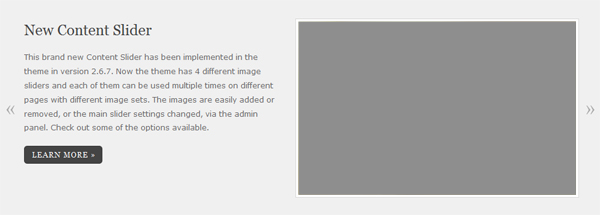
In order to add images to this slider you have to go to the options setting page » Sliders » Content Slider section. All you have to do is to upload the selected image (or add its URL), link of the image (links can be set to the images, so that when the user clicks on the "Learn more" button to be redirected- this feature is optional), title and description (also optional) and press the "Add Image" button. After you add the images, you can sort them by dragging and dropping the image box to the desired position.
Optimal image size: 450px × 280px
Creating additional Content SlidersIf you would like to add a new slider, you have to go to the bottom of the Content Slider section, in the subsection "Add new Content slider". In this field you can add a new slider, you just have to make sure that if you have multiple sliders, they will have unique names. After you add the names of the new sliders, you have to press the "Save Changes" button and after that you will see new sections for adding images created for the new sliders.
The "Learn More" button text can be changed in the "Translation" section of the options panel
Also, in this section there is a Slider Settings subsection where you can do the main settings for this slider.
Template Pages back to top
Index/Blog page
Index page is the default front page on WordPress - this page actually is a blog page.
There are 2 different ways of using this template:
- As a front page - it will be opened by default on your site. To set the blog page as a front page go to Settings -> Reading and select the "Your latest posts" option in the "Front page displays" field.
- As an inner, non-home page. In order to do this you have to first create a new page. After this you have to go in the Admin Panel » Settings » Reading and you have to select the "A static page" option in the "Front page displays" field. Below this field you have to select the page which will be your home page in the "Front page" field and you have to select the name of the page that you have just created in the "Posts page" field. Now your Blog page will contain the latest posts.
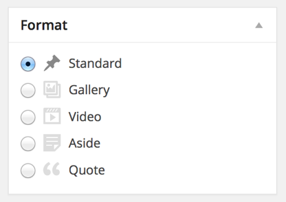
The theme supports custom post formats since version 2.9.0. The supported formats are Standard, Gallery, Video, Aside and Quote. The format can be selected in the "Format" section of the create/edit post screen:
Here is an explanation about each of the supported formats:
- Standard post format - includes a featured image in the beginning of the post. It looks like this:
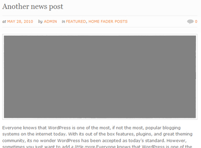
You can read here about how to set a featured image to the post.
- Gallery post format - displays the first WordPress gallery inserted into a post
as a fading slider in the beginning of the post.
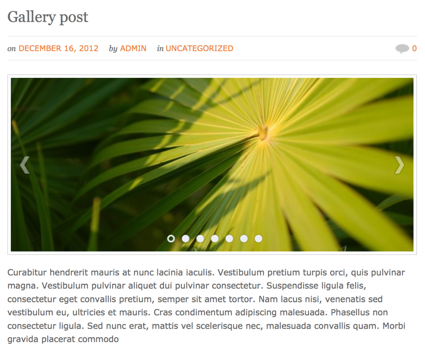
Adding images In order to add images as attachments to the post you just have to insert a WordPress gallery into the content of the post. If you have multiple galleries in the same post, the images from the first gallery will be used in the sldier.
In order to add a gallery you have to:
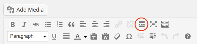
- Click on the "Add Media" button above the main content area:
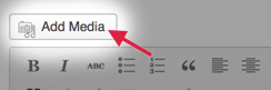
- Open the "Create Gallery" section. If you would like to upload new images click on the
"Upload Files" tab and upload the images. If you would like to add existing Media Library
images, click on the "Media Library" tab and select the images you like. After you select
the images, click on the "Create a new gallery" button.
- Click on the "Insert Gallery" button.
There is also a slider autoplay option included - you can enable it in the Dandelion Options » Page Settings » Blog » "Gallery post type slider autoplay" field.
- Click on the "Add Media" button above the main content area:
- Video post format - will display a video as header of the post. It looks like this:
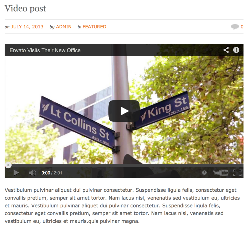
You can set the video URL in the "Video URL" custom field of the post. The theme uses the WordPress [embed] shortcode to insert the video, you can see the supported formats on the WordPress Embeds page. We have also included support for Flash videos (with .swf extension). - Aside post format - displays a box with text only (the content of the post). It
doesn't include any post information, such as titles, images, etc. It looks like this:
- Quote post format - displays the post content in a quote style. It looks like this:
Just before the text that you want to be hidden you have to click on the "Insert more tag" button (Alt+Shift+T):
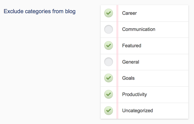
Blog page settings Excluding categories from the blog:
In order to exclude categories from the blog you have to go to the options setting page in the section Pages » Blog » Exclude categories from blog. In this section you have to check the names of the categories that you want to be excluded.
Defining the number of posts on the blog:
In order to define the number of posts per page that will be shown on the blog you have to go to the options setting page in the section Pages » Blog » Number of posts per page and you have to edit the value of this field. Default is set to 5.
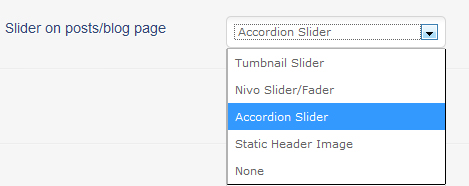
Selecting a slider for the page:In order to select a slider you have to go in the options setting page in the section
Pages » Blog » Slider on posts/blog page. In this field you can select between Thumbnail Slider, Accordion Slider, Nivo Slider/Fader, Content Slider, Static Header Image and None.
-If one of the sliders selected, to the blog page will be automatically assigned the default slider of the selected slider type. If you have created
an additional slider and you would like this slider to be displayed, you can select it in the "Slider Name" field below.
-If None selected, then you can insert a title in the Page Title field below.
-If Static Header Image selected, you have to insert its URL
into the the Static Image URL field below.
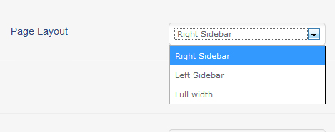
Selecting a layout for the page
For the blog page you can select the layout to be Right Sidebar, Left Sidebar or Full Width. You can do this in the Page Layout section. This setting will affect also the blog post, archive and search layouts.
The blog sidebar:
By default this page template uses the Default Sidebar. If you would like to use another sidebar, you can create one in the options setting page » General » Sidebars and after that you can select the created sidebar in the field Sidebar in the options setting page » Pages » Blog » section. To customize it you have to go to the Appearance » Widgets and find the selected sidebar. You can drag and drop widgets from the left into it.
Setting advanced blog pagination
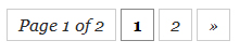
In order to have advanced pagination enabled on your blog page (as on the screenshot above) you need to install the WP-Pagenavi plugin. You can read more about how to do it the section Widgets Included.
Enabling threaded comments (with reply functionality):
In order to enable threaded comments, you have to go to Settings » Discussion and check the field "Enable threaded (nested) comments x levels deep"
Home page
In order to make one page a home page you have to select the Template for this page to be Home page. If you want to set this page to be opened by default when a visitor first opens the site you have to go in the admin panel in Settings » Reading » Front page displays » Select a static page and select the page that you have just created in the Front Page list.
Setting the content of the home page
The content layout of the home page looks like this:
Basically, the structure of the Home page template consists of 2 parts- the main content and the services boxes. The main content you can insert in the main content area of the page. If you would like to have the same intro as the one on the demo (and the screenshot above), you have to use the intro shortcode:
[intro]Intro content goes here[/intro]
After that comes the services boxes section. In order to set the content and links to them you have to go to the options setting page » Pages » Home and there for each of the 3 boxes you can set the content, icon and button settings.
Selecting a slider for the page
In order to select a slider for the page, you have to set the custom field Slider in the page.
-If one of the sliders selected, to the page will be automatically assigned the default slider of the selected slider type. If you have created
an additional slider and you would like this slider to be displayed, you can select it in the "Slider Name" field below.
into the the Static Image URL field below.
-If "None" selected there, you can set the custom field Subtitle below.
-If Static Header Image
has been selected, you can set the static image by setting the image as a Featured one. Here is explained how to do this.
If you would like to insert additional services boxes, you can do this by using the services boxes shortcode. You can read about how to use the shortcode in the Shortcodes section.
Featured page
The main purpose of the Featured page template is to show some featured blog posts. In order to make one page a featured posts page you have to select the Template for this page to be Featured page
Above the Featured Posts section you can insert some intro content by inserting it in the main content area of the post.
Selecting the Featured category:All the posts that that are shown below the main page content are posts from one category.
So the posts that you need to be shown in this page should be set to belong to one "featured" category. To set the category whose posts will be
shown you have to go to the options setting page » General » Main Settings and set the Featured Category field.
Setting a thumbnail/image to the featured posts:
You can read here how to set thumbnails to your featured posts.
Selecting a slider for the pageIn order to select a slider for the page, you have to set the custom field Slider in the page.
-If one of the sliders selected, to the page will be automatically assigned the default slider of the selected slider type. If you have created
an additional slider and you would like this slider to be displayed, you can select it in the "Slider Name" field below.
into the the Static Image URL field below.
-If "None" selected there, you can set the custom field Subtitle below.
-If Static Header Image
has been selected, you can set the static image by setting the image as a Featured one. Here is explained how to do this.
Setting the page layout
For this page you can select the layout to be Right Sidebar, Left Sidebar or Full Width. You can do this by setting the custom field Page Layout.
The sidebar
By default this page template uses the Default Sidebar. If you would like to use another sidebar, you can create one in the options setting page » General » Sidebars and after that you can set the custom field Sidebar and select the sidebar that you have just created. To customize it you have to go to the Appearance » Widgets and find the selected sidebar. You can drag and drop widgets from the left into it.
Hiding part of the content of the post with the "Read More" link:
Just before the text that you want to be hidden you have to click on the "Insert more tag" button (Alt+Shift+T):
Portfolio page
The main structure of the portfolio page looks like this:
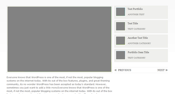
To make one page a portfolio page you have to select the Template for this page to be Portfolio.
- You can select a portfolio category whose items to be displayed there by setting the custom field Display items from categories in the page. If "All Categories" has been selected, all the portfolio items that you have created will be displayed there. You can read about creating porfolio items in the next section below.
- You can select whether the items to be ordered by the date they have been created or by custom order by setting the custom field Portfolio item order in the page.
- You can set the number of thumbnails per page displayed on the right by setting the custom field Number of posts per page in the page.
- You can disable the automatic thumbnail generation by setting the custom field Turn on/off automatic thumbnail generation in the page.
- You can select a slider/fader on the portfolio page by setting the custom field Slider.
- If no slider is selected, you can add a subtitle to your portfolio page by setting the custom field Subtitle.
- You can change the words "More Projects", "Prev" and "Next" in the options setting page » Translation » Portfolio.
Creating portfolio items:
Creating Portfolio items can be accomplished in the Portfolio section » Add New.
Here are the settings that you can do to each of the portfolio items:
- Set the images » Each portfolio item contains 2 images- a small thumbnail and a bigger preview image which is shown when clicking
on the small image above the main content area.
2.1. To set the bigger (preview) image or video you have to set the custom field in your post called Preview Image URL to contain the full path of the image. For example http://domain.com/img1_preview.jpg
2.2. By default the theme will create the small thumbnail by using the bigger (preview) image. However if you prefer to use your own thumbnail images you have to set the custom field Turn on/off automatic thumbnail generation in your portfolio page to off. After that in your portfolio post you have to set the custom field called Thumbnail URL and set its value to be the full path of the image. For example http://domain.com/img1.jpg. The optimal size of the images is 110px x 100px. - You can set the content of the portfolio item in the main content area.
Portfolio Gallery page
In the video are shown the main steps you need to accomplish in order to set a portfolio gallery, however for full reference please read the instructions below.
The main structure of the portfolio gallery template looks like this:
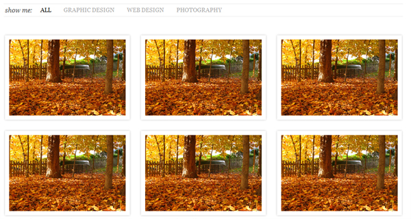
To make one page a portfolio page you have to select the Template for this page to be Portfolio Gallery.
- You can select a portfolio category whose items to be displayed there by setting the custom field Display items from categories in the page. If "All Categories" has been selected, all the portfolio items that you have created will be displayed there. You can read about creating porfolio items in the next section below.
- You can select how many columns (items per row) to be displayed by setting the custom field Number of columns in the page. You can select between 2,3 and 4 columns.
- You can select whether the items to be ordered by the date they have been created or by custom order by setting the custom field Portfolio item order in the page.
- You can show/hide the portfolio item category filter by setting the custom field
Show Portfolio Categories in the page.

The purpose of this filter is to display the portfolio categories and filter the items by the category that is set to them. If in the field Display items from categories above "All Categories" is selected, then all the portfolio categories will be displayed. If a category is selected there, only this category and its subcategories will be displayed in this filter.
- You can show/hide the portfolio item descriptions by setting the custom field Show Item Descriptions in the page. If it is set to "Show" the item descriptions will be displayed below the item thumbnail. If set to "Hide" and the the item has a description set to it, then the description is displayed in the lightbox.
- You can set the number of items displayed per page setting the custom field Number of posts per page in the page.
- You can disable the automatic thumbnail generation by setting the custom field Turn on/off automatic thumbnail generation in the page.
- You can select a slider/fader on the portfolio page by setting the custom field Slider.
- If no slider is selected, you can add a subtitle to your portfolio page by setting the custom field Subtitle.
- You can turn on/off the link of the title by setting the custom field Turn on/off title link in the page. When descriptions are displayed and this field is set to ON, then after clicking on the title the user will be redirected to the post content area.
Creating portfolio items:
Creating Portfolio items can be accomplished in the Portfolio section » Add New.
Here are the settings that you can do to each of the portfolio items:
- Select what action to be taken after clicking on the item thumbnail by setting the custom field
When clicked on the image open:. You have the following possibilities:
- Preview Image in lightbox- when clicked on the thumbnail the image that is set in the Preview Image URL custom field of the item will be displayed. By default the theme will create the small thumbnail by using the bigger (preview) image. However if you prefer to use your own thumbnail images you have to set the custom field Turn on/off automatic thumbnail generation in your portfolio page to off. After that in your portfolio post you have to set the custom field called Thumbnail URL and set its value to be the full path of the image. For example http://domain.com/img1.jpg.
- The content of the item- when clicked on the thumbnail a page that contains the main content of the item (inserted in the main content area) will be displayed. You can still use the automatic thumbnail generation functionality and generate the smaller thumbnail by inserting the image URL in the Preview Image URL field.
- Play Video- when clicked on the thumbnail a video will be played. For the video link you have to set the custom field
Custom Link/Video URL by inserting the link in there. You can still use the automatic thumbnail generation functionality and generate
the smaller thumbnail by inserting the image URL in the Preview Image URL field.
Here are some examples of inserting videos:
- YouTube video:
http://www.youtube.com/watch?v=geplBr2fcZc - Vimeo:
http://vimeo.com/11326568Please note that a vime link containing www is not valid (such as http://www.vimeo.com/11326568)
- Flash Alone:

Please note that you need to insert width and height of the video
- YouTube video:
- Custom Link- when clicked on the thumbnail the user will be redirected to a custom link that you have set in the custom field Custom Link/Video URL of the item. You can still use the automatic thumbnail generation functionality and generate the smaller thumbnail by inserting the image URL in the Preview Image URL field.
- Do Nothting - nothing happens when clicked on the thumbnail image. You can still use the automatic thumbnail generation functionality and generate the smaller thumbnail by inserting the image URL in the Preview Image URL field.
- You can set the content of the portfolio item in the main content area. This content will be displayed after clicking on the title of the item (when descriptions are enabled and title links are set to ON on the portfolio page) or after clicking on the item (if "The content of the item" has been selected as an action above).
- You can set a description to the item by setting the custom field Description.If in the portfolio page the Show Item Descriptions is set to "Show" the item descriptions will be displayed below the item thumbnail. If set to "Hide" and the the item has a description set to it, then the description is displayed in the lightbox.
- You can set the item a category so that it will be filtered by this category in the category filter above
the items (if enabled) in the right sidebar of the portfolio item page:
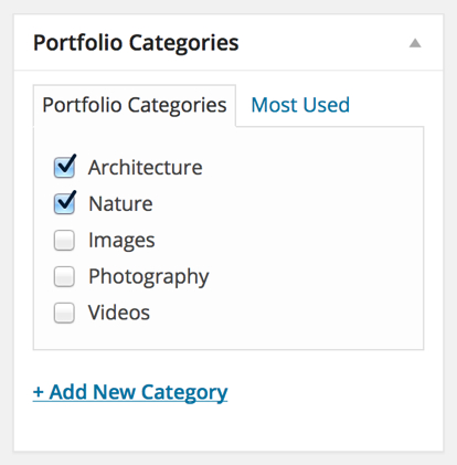
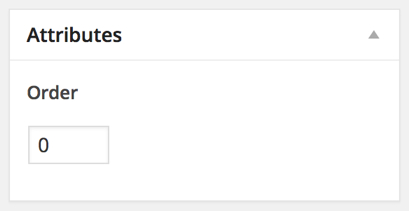
You can read more about the category filter in the section above (where the Portfolio page settings are described). - You can set an order number to your item if in the portfolio page the Portfolio item order field is
set to "Custom Order". You can set the order number in the Attributes section of the right sidebar:
Quick/Easy Gallery page
This is the default WordPress image gallery - the purpose of this gallery is to insert multiple images at once - you can very quickly create multiple galleries just for several minutes.
In order to create a quick gallery you have to:
- Create a new page (you don't have to set a page template to it)
- Click on the "Add Media" button above the main content area:
- Open the "Create Gallery" section. If you would like to upload new images click on the
"Upload Files" tab and upload the images. If you would like to add existing Media Library
images, click on the "Media Library" tab and select the images you like. After you select
the images, click on the "Create a new gallery" button.
- After this when you click on each image in the gallery, you can set a title and description to it.
- If you would like to edit an image, click on it. The text that you enter in the Caption section will be displayed as a caption below the image. The value of the Alternate Text field will be displayed in the lightbox as a title and the value of the Title field will be displayed in the lightbox below the image.
- Use the "Gallery Settings" section to change the gallery settings:
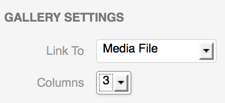
In the "Link to" select "Media File" and in the "Gallery Columns" field select 5 if the page is full width or 3 if the page contains a sidebar.
Click on the "Insert Gallery" button. - If you would like to change the default image size, you can do it in Settings » Media » Thumbnail Size field. Please note that if you change the default size, you would have to reupload the images again, as WordPress automatically crops the images during image upload only.
Contact Form page
The contact form page looks like this:
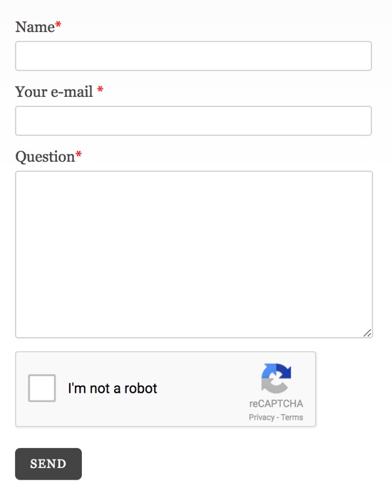
This page contains an AJAX contact form and a separate contact sidebar.
To make one page contain a contact form you have to do some settings. When you create (or edit) your page, you should find the field Template and in it to choose the Contact form page option. After that immediately your page will contain a contact form.
To set a text in the contact page, just insert it as a content of the page.
Setting the email address to which to send the emailTo set the email address, you have to go to the options setting page and in the section Pages » Contact find the field Email to which to send contact form message in. In this field you have to insert your email address.
As you can see in this section there are some other fields that you can edit. I have provided this feature in case that you need to translate your site or just don't like the text that is output.
Setting a sender e-mail address
You can set the e-mail address to which to send the messages in the Dandelion Options » Page Settings » Contact » Email sender field.
Yahoo has recently published a DMARC policy of reject, meaning that all the emails that are sent from Yahoo emails, but not from the Yahoo servers, should be rejected by the email providers. This means that if your site visitor sets a Yahoo email and this email is set as a sender, you may not be able to receive the email (depending on the email provider that you use to receive the messages). Therefore, please make sure to set your custom email address in this field (such as [email protected], non-Yahoo address), so that you can make sure that you will receive all the emails from Yahoo users.
Setting CAPTCHA
Having CAPTCHA enabled for your form will prevent sending spam emails by robots, just by asking the users to click on the checkbox.
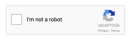
The theme uses the Google reCAPTCHA service for the captcha feature. In order to enable reCAPTCHA for the theme, apply the following settings in the Dandelion Options » Page Settings » Contact section:
- Select "ON" in the "Enable CAPTCHA" field.
- Register API keys and set your generated site and secret keys in the "reCAPTCHA Site Key" and "reCAPTCHA Secret Key" fields.
You can very easily generate these keys here. You would need to login with a Google account - if you don't have one, you can easily create one. After you log in, you will be able to generate the API keys for your site. - (Optional) You can change the reCaptcha widget theme in the "reCAPTCHA Widget Theme" option
- (Optional) Changing the language: The reCaptcha widget will automatically detect the user's language. If you prefer to explicitly set a language to be loaded, you can enter the corresponding language code in the "reCAPTCHA Language Code" field - you can find the full codes reference here.
Setting the sidebar
By default this page template uses the Default Sidebar. If you would like to use another sidebar, you can create one in the options setting page » General » Sidebars and after that you can set the custom field Sidebar and select the sidebar that you have just created. To customize it you have to go to the Appearance » Widgets and find the selected sidebar. You can drag and drop widgets from the left into it.
Selecting a slider for the page
In order to select a slider for the page, you have to set the custom field Slider in the page.
-If one of the sliders selected, to the page will be automatically assigned the default slider of the selected slider type. If you have created
an additional slider and you would like this slider to be displayed, you can select it in the "Slider Name" field below.
into the the Static Image URL field below.
-If "None" selected there, you can set the custom field Subtitle below.
-If Static Header Image
has been selected, you can set the static image by setting the image as a Featured one. Here is explained how to do this.
Setting the page layout
For this page you can select the layout to be Right Sidebar, Left Sidebar or Full Width. You can do this by setting the custom field Page Layout.
The Default page
The default page contains a separate sidebar on the right.By default this page template uses the Default Sidebar. If you would like to use another sidebar, you can create one in the options setting page » General » Sidebars and after that you can set the custom field Sidebar and select the sidebar that you have just created. To customize it you have to go to the Appearance » Widgets and find the selected sidebar. You can drag and drop widgets from the left into it.
Selecting a slider for the pageIn order to select a slider for the page, you have to set the custom field Slider in the page.
-If one of the sliders selected, to the page will be automatically assigned the default slider of the selected slider type. If you have created
an additional slider and you would like this slider to be displayed, you can select it in the "Slider Name" field below.
into the the Static Image URL field below.
-If "None" selected there, you can set the custom field Subtitle below.
-If Static Header Image
has been selected, you can set the static image by setting the image as a Featured one. Here is explained how to do this.
Setting the page layout
For this page you can select the layout to be Right Sidebar, Left Sidebar or Full Width. You can do this by setting the custom field Page Layout.
Changing the theme style
All the style settings can be done in the options setting page » Styles
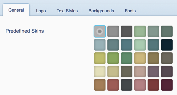
The theme goes with several predefined skins. You can change between those skins in the Predefined Skins section:
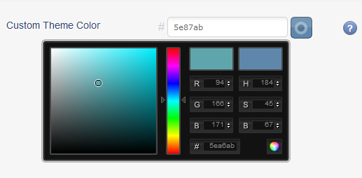
If you would like to use another custom color, rather than one of the predefined colors, you can select your color in the Custom Theme Color field:
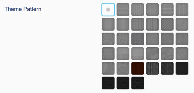
If you would like to select a pattern for the theme, you can do it in the Theme Pattern section.
These are the main style settings that you can do on the theme. In this section (Styles section) there are many other custom settings that you might need to change such as text sizes, text colors, background colors, etc.
Shortcodes back to top
This theme goes with 28 shortcodes. For a full reference of their usage and examples you can refer to the Features section of the demo.
Using shortcodes is really easy- you just have to insert the shortcode in the main content area of the post/page. For example, if you would like to insert a button, you have to insert a content like this one:
[button href="http://site.com"]Button text[/button]
Formatting buttons available from version 2.3
In version 2.3 of the theme, some formatting buttons have been included:

There are buttons for almost all of the styled elements that the theme provides. These buttons allow you to more easily insert styled elements and also you are able to see how they will look from the editor. However, if you feel more comfortable with using raw shortcodes, you can do it - they are still available for you.
Inserting Lighbox image
There are different ways to insert a lightbox image (via the formatting buttons and the shortcodes), but the easiest way to set an image lightbox is to insert the image into the post (via the "Add an Image" button), after that click on the image -> an Edit Image button will be displayed. You have to click on this button, and in the window that is opened you have to click on the "Advanced Settings" section. In this section, in the field "Link rel" you have to insert the word lightbox. This automatically will set the lightbox functionality to the image.
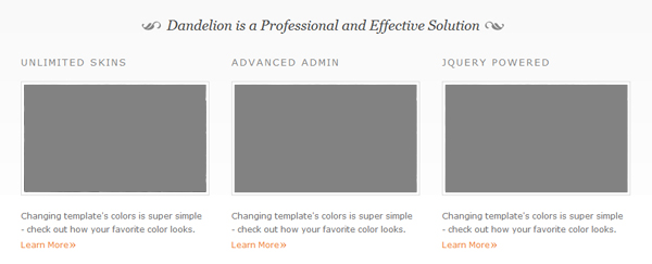
Additional Services Boxes
The services boxes look this:
Apart that you can use the services boxes when setting the "Home page" template to a page, you can also add additional services boxes wherever you like by using a shortcode:
[servicesboxes] [servicesbox title="Title one" link="http://site.com" linktext="Learn More" image="IMAGE URL"]First box text [/servicesbox] [servicesbox title="Title two" link="http://site.com" linktext="Learn More" image="IMAGE URL"]Second box text [/servicesbox] [servicesbox title="Title three" link="http://site.com" linktext="Learn More" image="IMAGE URL" last="true"]Third box text [/servicesbox] [/servicesboxes]Note:Please make sure that all the shortcode tags are on the same line, but separated with at least a space (on the example above the shortcodes are set on different lines to improve readability), for example:
... [/servicesbox] [servicesbox] ...
Social Sharing back to top
The theme includes sharing buttons for the main social network sites: Facebook, Twitter, Google+, Pinterest and LinkedIn . These buttons can be enabled on posts, pages and portfolio posts single pages.

You can configure the how and where the buttons will be displayed in the Dandelion Options » General » Social Sharing section.
Fonts back to top
All the fonts settings can be done in the options setting » Style settings » Fonts section. By default the theme uses web safe fonts: "Georgia" for the titles and "Verdana" for the main body text.
Using Cufon font replacementYou can enable Cufon font replacement by setting "ON" in the "Enable Cufon for headings" field. When Cufon is enabled the selected font will be set for all the main headings, and for the headings this font will be used with higher priority than any font settings set in the below section or within the style.css file. With Cufon enabled, you can still use Google or standard fonts for the rest of the sections.
If Cufon enabled, you can select either one of the fonts that the theme goes with (in the "Heading Cufon Font" field) or upload your own font within the "Custom Heading Font" field. The font to upload should be in JavaScript format and you can generate this JavaScript file on the following page: http://cufon.shoqolate.com/generate/
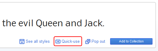
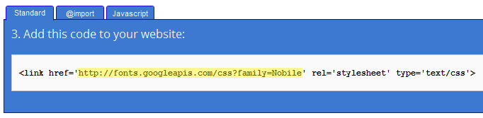
Using Google fontsIn order to use Google Fonts, the field "Enable Google Fonts" should be set to "ON". After that, you can add the new fonts in the text area provided within the "Add Google Font". When adding the new font, please make sure that you insert the URL of the font only, not the whole embed link. For example, if you would like to insert the Nobile font, you have to click on the "Quick Use" button:
In the new window that will be opened, select the settings according your needs and from the embed section you have to copy only the value that is contained within the href property:
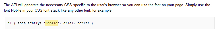
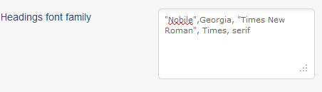
After you add the font URL in the "Add Google Font" field, you have to set the theme use this font. You can do this, by setting its font name in the "Headings font family" or "Body text font family" field, depending where you would like to use this font. For example, if you would like to add the font for the headings, you first have to get its font name from the Google page:
 and insert its name within the "Headings font family" section:
The other fonts, that go after this font name are the fonts that will be used, in case there is some problem with loading the font from Google.
Translation back to top
For this theme we have provided the possibility to easily translate/change the built-in words from the admin panel, without having to edit the PHP files. You can do this in the Appearance -> Dandelion Options ->Translation section. For the contact form you have to edit the fields in the Pages » Contact section.
Setting a multi-language installation
If your WordPress installation supports more than one language, you can set the theme built in words change depending on the selected language. In order to do this you have to follow the following steps:
- In Dandelion Options » Translation » Settings select "ON" for the "Enable Multilingual Translation" field.
- In the same section select the locale for the default language. If your default langauge is English, you don't have to change this field. If, for example, you would like to change the default language to German, in this field you have to insert de_DE. Here you can see some examples of locales. For the default installation language, the theme will use the words that are set in the Dandelion Options » Translation section.
- Create .mo files for the additional languages
In the lang folder within the main theme folder you will find a file called default.po. You have to open this file with a program that can generate .mo files, such as PoEdit. Once you open it, you can insert the words in the additional language. Here is an example, with the file opened with PoEdit and the meanings of the words inserted into English:
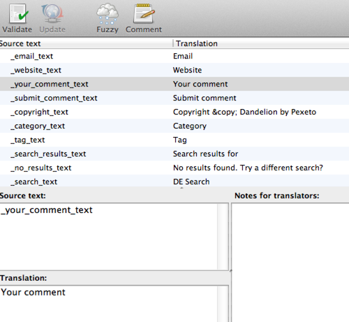
In the same way you can insert the translations in the additional language. Once you save the document, a .mo file will be generated in the directory you specify. You have to rename this .mo file to the locale of the language used. For example, if this language is French, the name of the file should be fr_FR.mo. After that, you have to insert this .mo file in the lang directory of the theme. If you are using a child theme, create a folder called lang and insert the .mo file in there.
Note: If you would like to translate the services boxes on the home page, you can use the services boxes shortcode to add the boxes in a Default page template, instead of using the Home page template. You can read about using the services boxes shortcode in the Shortcodes section.
Widgets included back to top
The theme goes with several additional widgets included:
- Pexeto's portfolio posts loader - its purpose is to display the latest portfolio thumbnails in the sidebar
- WP PageNavi - displays an advanced blog pagination - downloaded from http://wordpress.org/extend/plugins/wp-pagenavi/
- Simple Google Map - displays a Google Map in the sidebar - downloaded from http://wordpress.org/extend/plugins/simple-google-map/
- Twitter Widget Pro - displays the latest Tweets - downloaded from http://wordpress.org/extend/plugins/twitter-widget-pro/
- Pexeto's posts loader - its purpose is to display the latest blog posts with thumbnails within the sidebar (NEW - added in version 2.6.2)
All the widgets are located within the plugins directory of the download folder. In order to activate them, you need to go to the WordPress admin panel -> Plugins -> Add New -> click on the Upload link and find the desired plugin file on your local file system. After the plugin has been uploaded successfully you need to click on the Activate link. For the WP PageNavi plugin only activation is needed. For the other two you need to go to the Widgets section and drag and drop them to the desired sidebar.
CSS Files back to top
The theme contains the following CSS files:
- style.css - the main CSS file
- style_ie6.css - only for Internet Explorer 6
- style_ie7.css - only for Internet Explorer 7
- prettyPhoto.css - style for the PrettyPhoto plugin
- nivo-slider.css- style for the Nivo slider
- superfish.css- style for drop-down menu -- downloaded from http://users.tpg.com.au/j_birch/plugins/superfish/#download
The first file (style.css) contains all of the specific stylings for pages. The file is separated into sections:
- Text styles (containing styles for the text)
- Logo(containing styles for the logo)
- Menu (containing the styles for the main navigation menu)
- Header (containing the styles for the header)
- Slider (containing the styles for the 3 sliders)
- Content (containing styles for the main site content)
- Sidebar Menu (containing styles for the sidebar)
- Footer (containing styles about copyrights text)
- Contact page (containing styles about contact page and the email form)
- portfolio page (containing the styles for the portfolio page)
For each of the main parts of the website there are comments. For example, for the menu the comments look like this:
/*-------------------- MENU --------------------*/
--menu styles here--
Javascript files back to top
The theme contains the following JavaScript files:
- slider.js- this is the thumbnail image slider. See here how to work with the slider.
- content-slider.js- this is the content image slider. See here how to work with the content slider.
- accordion-slider.js- this is the accordion image slider. See here how to work with the slider.
- script.js- this is the main script for the page. It uses some simple functions used in the website like validation and making AJAX request for sending email.
- supersleight.js- this is a script that makes transperant .png images to look transperant in Internet Explorer 6 - downloaded from http://24ways.org/2007/supersleight-transparent-png-in-ie6/
- jquery.prettyPhoto.js- this ithe jQuery plugin for lightbox effect for the images on the portfolio page- downloaded from http://www.no-margin-for-errors.com/projects/prettyPhoto-jquery-lightbox-clone/#download
- portfolio-setter.js- this is the script that contains the main gallery and gallery with descriptions functionality
- portfolio-previewer.js- this is the script that contains the portfolio showcase functionality
- jquery-easing.js- for the animation transitions- downloaded from http://gsgd.co.uk/sandbox/jquery/easing/
- jquery.nivo.slider.pack.js- the Nivo slider- downloaded from http://nivo.dev7studios.com
- jquery.tools.min.js- jQuery Tools library- downloaded from http://flowplayer.org/tools/download/index.html
- colorpicker.js - script for the color picker- downloaded from http://eyecon.ro/colorpicker/#download
- jquery-ui.js- jQuery UI - downloaded from http://jqueryui.com/
- jquery.cookie.js - jQuery Cookie - downloaded from http://plugins.jquery.com/project/Cookie
- jQuery Touchwipe - downloaded from http://www.netcu.de/jquery-touchwipe-iphone-ipad-library
- jQuery ScrollTo - downloaded from http://flesler.blogspot.com.au/2007/10/jqueryscrollto.html
- Sharrre - downloaded from http://sharrre.com/
Font files - all fonts have been downloaded from http://www.fontsquirrel.com/ and have been generated from http://cufon.shoqolate.com/generate/
- andika.js
- caviar_dreams.js
- charis_sil.js
- chunk_five.js
- comfortaa.js
- droid_serif.js
- kingthings_exeter.js
- luxy_sans.js
- sling.js
- vegur.js
PhotoShop files back to top
There are 4 PSD file included in this theme. Every PSD file has a clear structure and is organised in groups with well named layers.
Special thanks to all the great graphic resorces to:
- Images used on the demo: http://www.flickr.com/photos/dexxus
- Images used on the demo: http://www.photos8.com/
- Pixel patterns http://naomiatkinsonproducts.com/
- Tango icons: http://tango.freedesktop.org/Tango_Desktop_Project
- Vector Patterns http://speckyboy.com/2010/04/08/6-free-vector-seamless-backgrounds-source-files/
- Grunge Brushes http://wefunction.com/2010/04/42-more-subtle-grunge-brushes/
- Social Media Icons http://www.komodomedia.com/blog/2009/06/social-network-icon-pack/
- Seamless Patterns http://www.premiumpixels.com/20-seamless-photoshop-grid-patterns/
- Woo Function Icons http://www.woothemes.com/2009/09/woofunction-178-amazing-web-design-icons/
PHP files back to top
Except the main files needed for this theme to run, here are the other external PHP files used:
- aq_resizer.php- the purpose of this script is to resize/crop images to smaller sizes. The file is downloaded from: https://github.com/sy4mil/Aqua-Resizer/
- update-notifier.php - this is the file that contains the functionality for the update notifications when a new update of the theme is available - downloaded from https://github.com/unisphere/unisphere_notifier
- recaptchalib.php - the reCAPTCHA PHP library - downloaded from http://code.google.com/p/recaptcha/downloads/list?q=label:phplib-Latest
- Envato WordPress Toolkit Library - downloaded from https://github.com/envato/envato-wordpress-toolkit-library
Updates back to top
a. Installing an update
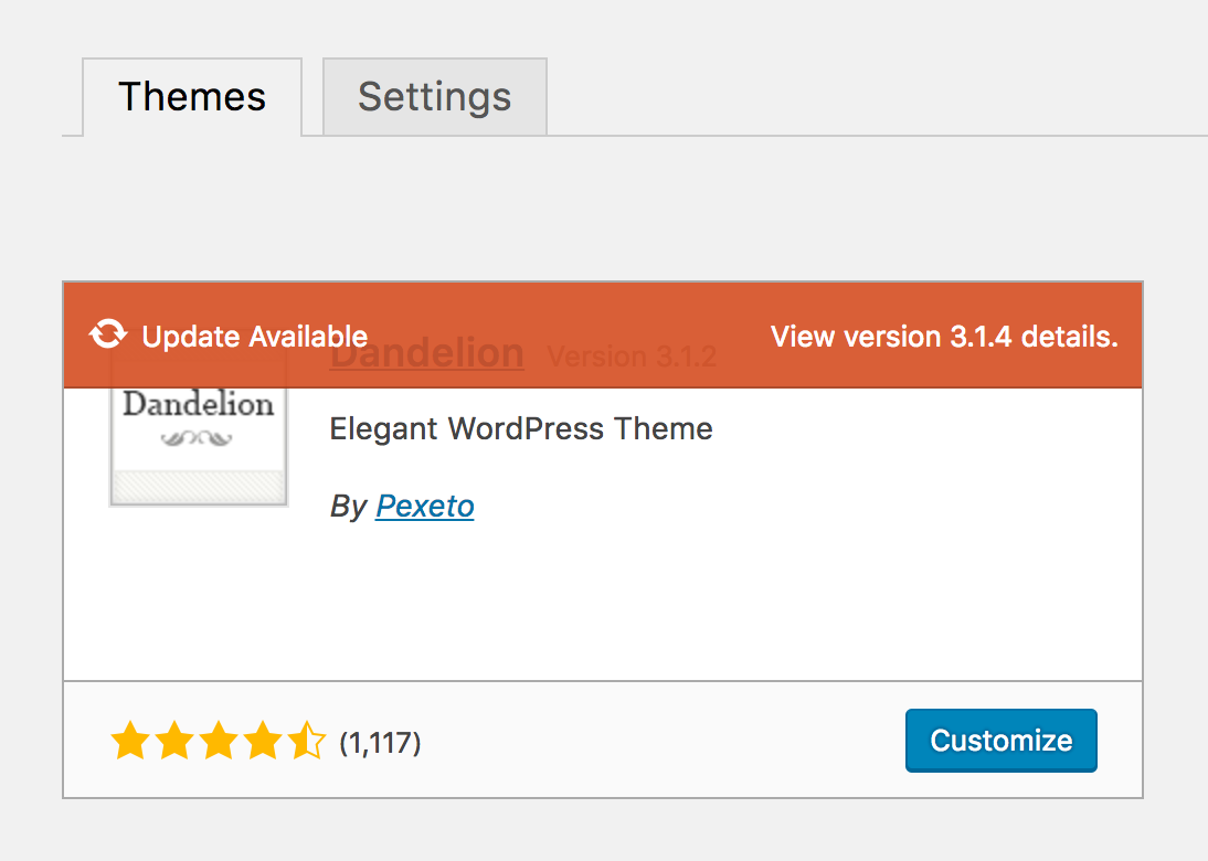
You can install an update of the theme either automatically by using the Envato Market Plugin or manually.
If you have modified the theme's code: your modifications will be lost when you install the update. Please create a backup of your code modifications and consider using a child theme instead of modifying the theme's code. More info here.
Due to the retirement of the old Envato API, since version 3.1.4 of the theme we have changed the way automatic updates are installed from the Dashboard. We had to remove the Envato Toolkit Library from the theme and recommend installing the Envato Market Plugin that can replace it.
In order to install updates automatically from the dashboard, you first need to install the Envato Market Plugin. The Envato Market Plugin, created by the Envato team, can be used to install updates of all of your ThemeForest and CodeCanyon items.
Installing the Envato Market Plugin
- Download the plugin
- If you are running version 3.1.4 or later, you should see a notification in your Dashboard to automatically install the plugin
- If you are using an older version or you don't see the dashboard notification:
- Download the plugin from here or
- Go to the Envato Market Github page, scroll down to the "Installation" section of the plugin description and click on the "download" link. Do not use the "Download ZIP" link of the repository!
- Install the plugin. After you have downloaded the plugin, you can install it from the Plugins » Add new » Upload Plugin section and select the downloaded plugin zip file.
Configuring the Envato Market Plugin
Once you have the Envato Market Plugin installed and activated, you will need to setup your API token in order to be able to use it. To setup your token, visit the "Envato Market" page of your dashboard and follow the instructions on the page. This page includes a link to the Envato Market site where you can easily generate your token.
Once you setup your token, you should see a "Themes" tab on the page where you can install updates of all your ThemeForest themes. Clicking on the "Update Available" button will start installing the update.
If you experience issues with using the Envato Market Plugin
- Check the Envato Market Plugin Issues Page to see if this is a known issue
- Consider reporting the issue on the Envato Market Issues Section
- Although the Envato Market plugin is not built by us, feel free to open a ticket/bug report on our Support Site so we can see if there is anything that we can do to help
- You can alternatively just install the update manually, as explained in the next section.
Installing an update manually
There are two main ways of installing an update manually:
- By uploading the theme as a new theme (recommended)- this is an easier way to accomplish this.
First you have to either delete your current theme or rename its folder on the server. To rename the theme, log in via FTP to the server, navigate to the WordPress installation folder » wp-content » themes folder where you will find the theme folder that you can rename. After this, just upload the updated theme zip file via the built in WordPress theme uploader as a new theme as explained here and activate the theme.Note: Please note that with the activating of the new theme it is possible your menu setting not to be saved for the new theme. If so, you just have to go to Appearance » Menus » Theme Locations, select the menu (it will be still there) and press the "Save" button.Once you install the updated theme and make sure that everything is working normally, you can go back to the Themes section and delete the older version of the theme.
- Via FTP - you can use an FTP client (such as FileZilla) and replace all the theme files with the updated ones. The theme folder is located in the WordPress installation folder » wp-content » themes folder of the server.
Version 1.1
This version includes:
- Added an option for automatic image resizing to all the sliders- for each slider this option can be enabled in the Settings section of the slider.
- Code improvements
Version 2.0
This version includes:
- The new Pexeto panel has been added
- Code improvements
Version 2.1
This version includes:
- WordPress Quick gallery support - you can read about setting it here
- Made Pexeto Panel PHP 4.x version compatible
Version 2.2
This version includes:
- Fixed an issue related with the descriptions on the sliders
Version 2.3
This version includes:
- Included Formatting Buttons for most of the styled elements - you can learn more here
- Added Upload functionality next to the image URL fields in the portfolio item pages
- Fixed some small styling issues
Version 2.4
This version includes:
- Unlimited sliders functionality added - you can read about how to create addional sliders in the relevant slider section of the Sliders section. You can read about how to assign the additional slider to a page in the relevant section of the Template Pages section.
- Edit slider items functionality added
- Save last edited section in Pexeto Panel functionality added
- Fixed some lightbox plugin issues
- Unlimited testimonials and accordion content sliders per page functionality added
- Poprtfolio Posts Loader plugin improvements added - now the click action is determined by the action saved for the portfolio item
- Added some SEO improvements
- Fixed some other small issues
Version 2.5
This version includes:
- Fixes some incompatibilities with WordPress version 3.1. for the portfolio items
- Updated the following external tools to the latest versions:
-jQuery
-timthumb
-PrettyPhoto
Version 2.6
This version includes:
- Updated the Cufon script to the latest version - the previous version isn't supported by the newly released Inetrnet Explorer 9
- Fixed an issue with sorting the slider items in the Options Panel for Internet Explorer 9
- Fixed some issues related with image upload and timthumb (resizing script) for WordPress Network (multisite) installations
- Added support for quick gallery in Portfolio Showcase gallery - now you can add additional quick galleries to your portfolio preview items
- Code improvements
Version 2.6.1
This version includes:
- Fixed a small issue related with the portfolio
Version 2.6.2
This version includes:
- Added custom pattern field with upload functionality
- Added a new sidebar widget - Pexeto's posts loader (displays the latest blog posts within the sidebar with small thumnails)
- Improved the Thumbnail slider initial loading
- Improved the contact form code
- Improved the Showcase functionality - now JavaScript plugins can be used within it
- Fixed two small issues related with the gallery:
- when hovering the images and titles, some numbers were displayed
- an issue related with the lightbox when filtering by category instead of the title of the item a - Some other small issues fixed
- Code improvements
Version 2.6.3
This version mainly includes incompatibility fixes regarding the upcoming WordPress 3.2. WordPress 3.2. would include jQuery 1.6 which implemented some structural changes and lead to some incompatibilties. The theme update changes:
- Updated the Nivo slider to the latest version 2.5.2 - this version was released in order to fix some jQuery 1.6 incompatibilities. Also some additional animations have been included to the slider
- Fixed a jQuery 1.6 incompatibility for the Showcase template
- Fixed some other small issues
Version 2.6.5
In this version we have updated Tithumb (the image resizing script) to the latest version (1.34) - a security vulnerability was found regarding this script and version 1.34 fixes this vulnerability.
Version 2.6.6
This version includes:
- Updated Timthumb to the latest version available (2.8)
- Implemented an update notification functionality - from now on, when new updates are available of the theme, a notification will be displayed under the "Dashboard" menu.
- Implemented more security to the upload image functionality
Version 2.6.7
This version includes:
- Added a new image slider - Content Slider
- Updated Timthumb to the latest version available (2.8.2)
- Fixed a small issue with the Portfolio Posts Loader - displaying "undefined" text below the image
- Changed the zip structure of the theme and plugins included to be compatible with the upcoming WordPress 3.3
- Added a beginners section in the documentation
- Made some other small improvements
Version 2.6.8
This version includes:
- Embedded a CAPTCHA functionality (reCAPTCHA) for the contact form page - for more information you can refer to the "Contact Form Page" section above
- Added a Lightbox Options section in the Options panel. The section is located in Dandelion Options -> General -> Lightbox
- Included an upload favicon option in Dandelion Options -> General -> Main Settings
- Updated Timthumb to the latest version available: 2.8.10
- Updated the PrettyPhoto Lightbox plugin to the latest version available: 3.1.4
Version 2.7.0
This version includes:
- Implemented Google Fonts options - for more information please refer to the Fonts section
- Implemented an Automatic Theme Update functionality by using the Envato WordPress Toolkit Library. Now you can update your theme just by pressing one button. For more information you can refer to the Updates section
- Fixed a blog pagination issue, that was raised in the new WordPress 3.4 - when the number of blog posts to show per page in the theme's options and the one set in the WordPress general reading settings were different, a 404 page was opened when trying to access some of the blog pages.
Version 2.8.0
This version includes:
- Improvements for child theme support - the previous releases of the theme included child theme support for all the main styles and all the page templates. In this update we have also included child theme support for all the functions used in the theme
- Translation : apart of the default Translation section that can be used for translating the built into the theme words, we have also included a .po file for those words that can be used for additional languages.
- Added a services boxes shortcode for inserting more services boxes in different pages
- Added support for HTML tags in the sliders descriptions
- Added an option to select the way the thumbnails will be cropped (top, bottom, left, right, center) in the Portfolio Gallery and Portfolio Showcase page (when automatic image resizing is enabled in the page)
- Added an option to change the default footer copyright text (in Dandelion Options->Translation)
- Improved the way the scripts and styles are enqueued in the theme
- Updated Timthumb to the latest version
- Updated the instructions in the documentation regarding the latest WordPress 3.5 changes
- Included updated versions of the Twitter Widget Pro and WP-PageNavi plugins
- Code improvements and some small issue fixes
Version 2.8.1
This version includes:
- WordPress 3.6 compatibility modifications: fixed an issue with the dialogs in the admin panel - on WordPress 3.6 the dialogs sometimes appear behind some of the elements
- Other minor code modifications and improvements
Version 2.8.2
This version includes:
- WordPress 3.7 Update: in this update WordPress removed the titles added to the WordPress Gallery (or as we call it Quick Gallery) items and therefore the titles are not displayed in the lightbox preview. We have applied some filters to the generated markup so that the titles are displayed in the lightbox.
- Fixed an issue with the update notification functionality not adding a notification in the admin bar when a minor update is available (it used to add it to the Dashboard menu only)
- Other minor bug fixes and code improvements
Version 2.9.0
This version includes:
- WordPress Post Format support - added support for Gallery, Video, Aside and Quote post formats. You can read more about the formats supported and how to setup the posts in the Blog/Index page section
- Updated the Nivo slider to the latest version
- WooCommerce improvements - added a custom woocommerce template for some layout and style improvements
- Code improvements and minor bug fixes
Version 2.9.1
This version includes:
- Fixed an issue with the Gallery post format - the content after the "More" separator was displayed on the blog page
Version 3.0.0
This version includes:
- Dandelion is now responsive - the responsive layout will set a fluid size to the main content elements, so they are resized proportionally according to the window size. This layout mainly improves the experience on mobile devices with smaller screens, as the elements are resized to fit the screen. The responsive layout is enabled by default in version 3.0.0, you can disable it in the Appearance -> Dandelion Options -> General -> Main Settings -> Enable Responsive Layout field.
- Pexeto Panel redesigned: Pexeto Panel now comes with a fresh new design
- Replaced most of the image resizing functionality of Timthumb with the BFI Thumb script. As BFI Thumb doesn't support an option to select a crop position (e.g. top, bottom, etc.), Timthumb will still be used in the portfolio sections when you select a different than "center" option in the "Crop thumbnail image from" field of the portfolio item. All the other sections will use BFI Thumb resizing.
- Logo image: the logo image is now added as an HTML <img/> tag instead of background image, this gives us more control over the size of the logo on smaller screens and additionally allows you to upload a x2 image, so it looks sharper on retina displays. After updating the theme you might have to re-adjust the default sizes in the Dandelion Options -> Style Settings -> Logo section if you have set a different size than your default image size.
- IE7 support: although the theme looks and works well on IE7 and includes various code improvements for IE7, version 3.0.0 of the theme doesn't officially support IE7.
- Various code changes and improvements, such as:
- Improved the gallery pagination animation: after changing the page, it scrolls automatically to the top of the page
- Content slider: the slider height changes automatically depending on the current slide content height
- Main navigation menu: when there are multiple levels of drop-down menus and there isn't enough space to fit them on the right of the page, it moves the drop-down menu to left side of its parent menu
- Enabled touch swipe events in some areas (e.g. sliders, showcase pagination)
- Improved the PrettyPhoto functionality on smaller screens
- The additional styles are now printed into the head of the document, instead of loading them as a separate file - this will improve the performance of the page load
- Many other minor code changes and small bug fixes
Version 3.0.1
This version includes:
- Fixed: contact form sometimes not working when CAPTCHA is enabled
- Fixed: Dandelion options page not displayed when theme editing is disabled
- Fixed: Simple Google Map widget navigation buttons not displayed correctly
- Improved: Back-end admin style improvements
Version 3.1.0
This version includes:
- Added: Sharing buttons for the posts, pages and portfolio posts. For more information please refer to the Social Sharing section.
- Added: New lightbox theme - "Pexeto Theme". It can be selected in the Dandelion Options » General » Lightbox » "Lightbox Theme" field.
- Added: Option to change the default thumbnail height in the Portfolio Gallery page. This option can be set in the "Custom thumbnail height" field of the page settings section of the gallery page edit screen.
- Improved: Replaced Timthumb and BFI Thumb image resizing scripts with the Aqua Resizer script
- Improved: Replaced the image upload functionality (in the Dandelion Options page and portfolio item settings section) with a Media Library image select
- Improved: Updated the Envato WordPress Toolkit library to the latest version
- Improved: Design of the page/post settings section in the admin panel
- Improved: Contact form - added a sender email option to avoid messages failing to be sent due to the Yahoo DMARC reject policy. For more information, please refer to the Contact Form Page section.
- Improved: make the theme's custom editor buttons always visible regardless of whether the toolbar button is enabled or not
Version 3.1.1
This version includes:
- Updated the PrettyPhoto lightbox plugin to version 3.1.6 to fix the recently found XSS vulnerability
Version 3.1.2
This version includes:
- Fixed: third level drop-down menus not working on the latest version of Chrome (version 45, macs only)
Version 3.1.3
This version includes:
- Fixed: Tabs and Accordion elements not working properly with WordPress 4.5
- Code improvements
Version 3.1.4
This version includes:
- Major change affecting the automatic updates from the dashboard: removed the Envato Toolkit Library that handles automatic updates due to the retirement of the old Envato API (that Envato Toolkit uses). Implemented a script to install the Envato Market Plugin, which is the new tool to install automatic updates from the dashboard. For more information please refer to the Updates section.
- Fixed: Use https in the recaptcha challenge URL when SSL is enabled
- Fixed: Responsive layout issue on the blog page when using the full-width layout
Version 3.1.5
This version includes:
- Updated the contact form reCAPTCHA widget to version 2, since version 1 of the reCAPTCHA API is now deprecated and will be shut down in March 2018. This requires generating new API keys. Please refer to the Contact Form Page section for more details.
- Introduced support for the upcoming WordPress 4.9 Gallery Widget
- General code improvements and minor bug fixes
Version 3.1.6
This version includes:
- Add support for the WordPress 4.9.6 comment form cookie checkbox. The commenter cookie is used to pre-fill the name,
email and URL fields of the comment form when the commenter intends to post another comment. It also allows the commenter to preview
and delete any comments awaiting moderation.
WordPress 4.9.6 automatically includes the cookie checkbox in the comments form, however you need to update the theme to version 3.1.6 in order for the checkbox to be displayed.
Version 3.1.7
This version includes:
- Preparation for WordPress 5.0: Make the classic editor to be enabled by default, once WordPress 5.0 is released. Dandelion supports the classic editor only and a major part of its elements rely on the classic editor. If you wish to use Gutenberg, you can select the "Default for WordPress" option in Dandelion Options -> General -> Content Editor, however please keep in mind that some of the theme elements might not function properly, as they were designed to be added via the Classic Editor. You can learn more in this article.
- Load the Vimeo and YouTube video players in lightbox via https.
Version 3.1.8
This version includes:
- Introduced compatibility with the upcoming WordPress 5.5, including:
- Fixed: Thumbnail slider not working
- Added a section under Dandelion Options -> Page Settings -> Portfolio -> WordPress 5.5+ sitemaps allowing you to customize the portfolio items added to the WordPress 5.5 sitemaps. In this section you can exclude items from sitemaps based on their type and also disable the portfilio category taxonomy sitemap.
- General code improvements and minor bug fixes
Troubleshooting back to top
In this section you can check the most common issues and the solutions for them
- Fail to install the theme
If you experience any problems with installing the theme, please check the following:
- Please make sure you have installed the theme as described in the Activating the theme section
- If you have used the WordPress uploader and can't upload the theme: as the theme is versatile and provides lots of options, its zip file is bigger than standard themes and some servers can't handle an upload with that file size. In this case you have to use an FTP client to upload the theme.
- If you have used an FTP client to upload the theme:
* make sure the theme main files (such as style.css and index.php) file are located just within one directory apart the wp-themes directory. The right way to locate your root theme files is for example themes/the_cotton but not themes/the_cotton/the_cotton
* the problem you are experiencing may be related with the FTP client used - in this case you can try with another one- we recommend FileZilla FTP client. - Make sure you have WordPress 3.0 or higher installed
- Portfolio thumbnail/Slider image not generated
Sometimes the image resizing script doesn't generate the image due to the following reasons:
*functions/cache directory is not editable (777)
*original image size is too big (more than 2000 pixels)
*original image is not located within the WordPress installation directory
*your site is hosted on a HostGator server - HostGator have some known incompatibilities regarding timthumb and in this case you have to contact the support and ask them to make your server settings compatible for timthumb. On the this page you can find an article with an email template that you can use to send them the query. - Portfolio section does not exist in the main menu
This theme is available for WordPress version 3.0 or higher, so please make sure you have the latest version installed.
- Appearance » Menus section does not exist
This theme is available for WordPress version 3.0 or higher, so please make sure you have the latest version installed.
- Portfolio items not loading
This issue is mostly likely to happen if you have uploaded the theme via an FTP client. If so, you need to make sure that the main theme files are contained within just one directory of the wp-themes directory, not more. For example for the style.css file it is correctly to be located within http://site.com/wp-content/themes/Dandelion/css/fonts.css but not http://site.com/wp-content/themes/Dandelion/Dandelion/css/fonts.css
Another possible reason for this is that you haven't inserted some of the image/video URLs correctly. So for images, please make sure you have set the image URLs and for videos please make sure you have inserted correctly the video URLs. There are some examples of correct video URLs in the Portfolio Gallery section above.
- Contact form not sending emails
- A "406 Not Acceptable" error occurs when saving the option in the TheCotton Options page
This error may occur on some servers, because of some security settings and it is related with the jquery.cookie.js script which is used for saving the last edited tab within the options page. In this case, apart of changing the server settings, the easiest way to fix this would be to disable this functionality. You can do this by opening the functions.php file and change line 106:
pexetoOptions.init({cookie:true});to be like this:pexetoOptions.init({cookie:false}); - Portfolio items not loading on Internet Explorer
This issue is most likely to happen if you have a broken image URL has been inserted. In this case, please make sure that all the image URLs that you have inserted are URLs of existing images.
- In the Dandelion Options Upload Button/Color Picker/Add Slider Image Functionality is not working
This is most likely to be caused by a plugin you have installed. You can try to deactivate all the plugins you have installed and check if it will work. If it turns out that a plugin is causing this, you can deactivate the plugin until you set the theme and activate it back once you are done.
This issue is mostly likely to happen if you have uploaded the theme via an FTP client. If so, you need to make sure that the main theme files are contained within just one directory of the wp-themes directory, not more. For example for the style.css file it is correctly to be located within http://site.com/wp-content/themes/Dandelion/css/fonts.css but not http://site.com/wp-content/themes/Dandelion/Dandelion/css/fonts.css
Also another reason for this issue is that the server where the theme is hosted has some restrictions set about email sending.
Support back to top
We will do our best to assist with questions directly related to the theme set up, however please note that theme support is completely voluntary for ThemeForest authors. Therefore before you contact us, please consider finding an answer to your question in:
- The relevant section of the documentation
- Search our Knowledgebase if your question has been already answered
- Troubleshooting section above
- WordPress Codex for general WordPress questions
- Google for general questions
Once again, thank you so much for purchasing this theme! If you like it, please don't forget to rate it on the ThemeForest site.
Pexeto