“Story WordPress Theme” Documentation by “Pexeto” v.1.9.14
Created: 22 May 2014
By: Pexeto
http://pexetothemes.com/
Thank you for purchasing Story theme. If you have any questions that are beyond the scope of this help file, please refer to the Support section. Thanks so much!


If you like this theme, please don't forget to rate it on the ThemeForest site. Thank you!
Note: If you have any questions that are beyond the scope of this help file, please refer to the Support section.
Theme Requirements
This theme requires the Classic Editor plugin. Please make sure to install the plugin before you start creating content with the theme. You can either install the plugin manually (from the Plugins -> Add New section) or follow the theme's notifications in the admin panel that will prompt you to install the plugin.
Getting Started
a. If you are new to WordPress
Although building a website with WordPress is significantly much easier than coding it by yourself,
if you are a beginner, even working with WordPress may be difficult to you. That's why, in this section we will
provide some useful links and also will explain how to get oriented in the documentation and what pattern to
follow when building your website with our theme.
Please note that this documentation covers all the main settings for the theme, but it doesn't cover
instructions about working with WordPress, as this is a very extensive topic. If you are new
to WordPress, we would recommend to first get familiar with the WordPress system, so you can have
at least basic knowledge about how it works and then proceed with setting the theme.
Working with WordPress - Useful Links
- The WordPress Codex - the official WordPress manual containing lots of information and tutorials about working with WordPress.
- WP101 Basics Training - the perfect beginning spot for those just getting started with WordPress. The video tutorials provided are very helpful to easily understand how WordPress works.
b. Working with the theme
Once you have some basic WordPress knowledge, you are ready to go with setting the theme. Here are some example steps about how you can do this:
- Install and activate the theme - read about how to do this in the Installing and activating the theme section.
- Change your logo - learn how to do this in the Changing the logo section
- Create your basic menu - during the process of setting your theme, you will be changing your menu links all the time. However, it is good to start with having the main menu set. Learn how to set your menu in the Setting the menu section.
- Start with creating your content
You can create all the content by creating your pages one by one. Here are some examples of what steps to follow when creating different pages:
If you need a full-width custom home page:- Go to Template pages » Home Page - Full-width custom page template section to learn how to create the page and how to add elements to it.
- You need to set a slider for that page? » Go to the Sliders section to read how to create a slider. After you have your slider created and populated with images, you have to select the slider you have created for the page (how to set the slider is explained in both the slider's section and the full-width custom page template section)
- Go to Template pages » Blog page section to learn how to create a blog page, how to create posts to it and all the settings you can do for this page
- You need to set a slider for the blog? » Go to the Sliders section to read how to create a slider. After you have your slider created and populated with images, you have to select the slider you have created for the page (how to set the slider is explained in both the slider's section and the blog page section)
- You need a separate blog sidebar? » Go to the The sidebars section to learn how to create additional sidebars and how to add widgets to them. After you have created your sidebar, go back to the Blog page section to learn how to set the sidebar you have created to your blog page.
Basically, these are the steps you have to follow - when you need to create a page, just go to its corresponding subsection of the Template pages section and read about how to create it and what settings you can do for the page. The main key about understanding how the theme works is to read the documentation we have provided carefully, as we have explained everything you need to know about the theme in here.
- Once you follow all these steps and have the basic theme setup, you can also check the rest of the sections of this documentation to read more about the other features that our theme provides.
We hope you will enjoy working with the theme!
Installing the theme
a. Installing the theme
There are 2 main ways to upload the theme:
- Via the built in WordPress theme uploader
You can read the instructions about installing a theme via the WordPress uploader below, but you can also watch the "Installing a Pexeto Theme via WordPress Uploader" video here
First you have to unzip the download file and find the zip file called thestory.zip. After this you have to go in the admin panel » Appearance » Themes, click on the Install Themes tab and then click on the "Upload" tab (located in the top section of the page). After you click the "Upload" tab, a new page will be opened where you will be asked to find the .zip file on your local file system.
Note: Some servers have limited folder access settings applied and wouldn't allow uploading the theme trough the admin - in these case you have to upload the theme via FTP. - Via FTP client
You can read the instructions about installing a theme via FTP below, but you can also watch the "Installing a Pexeto Theme via FTP" video here
If you know the FTP login details of the server where your site is hosted and you have a FTP client installed (such as FileZilla), you might consider using this way of uploading your theme. First you have to unzip the download file, find the zip file called thestory.zip, unzip it and upload the folder to the main WordPress installation folder » wp-content » themes. Please note that if you prefer this way of installation, you have to make sure that the main files of the theme are contained just within one folder of the themes folder. The right way to locate your root theme files is for example themes/thestory but not themes/thestory/thestory.
You can activate the theme after it is uploaded on the server. In order to activate this theme you have to go to the admin panel » Appearance » Themes. In this section you should see the theme with a title Story by Pexeto. Just click on the Activate button and your theme should get activated.
-WordPress v.3.9 or greater
-PHP v.5.2.4 or greater
b. Demo Import
If you would like to import the demo content, just go to Story » Demo Import section and select the demo data that you would like to import.
Please note that:
- Random dummy images will be imported instead of the original images for copyright reasons
- This will import all of the demo settings and will overwrite your current settings, such as theme options and color settings
- Please install all the bundled plugins that you are going to use (such as WooCommerce, Recent Posts widget, Portfolio Items widget, etc.) in the Appearance » Install Plugins before importing the demo data so that all the data for these plugins can be imported.
- If you are planning to use WooCommerce, install the WooCommerce pages after importing the demo.
Useful instructions back to top
a. Options page
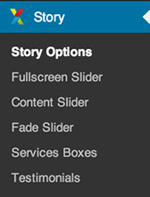
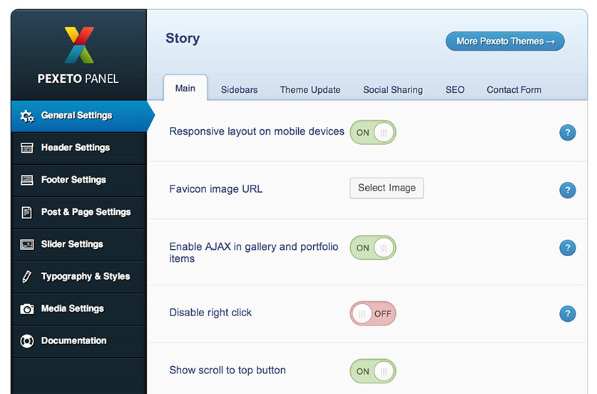
When you activate this theme, an options page that contains global theme settings is created. This page is located in the admin panel » Story » Story Options.
b. Page Settings section
We have also added a custom settings section for the pages/posts where you can apply custom settings for each single page and post and these settings won't be applied globally to the theme. This settings section is located below the main content editor of the page/post opened it edit mode. For example, in the pages this section is called "STORY PAGE SETTINGS".
c. Setting a featured image to a post/page
In order to set a thumbnail (featured image) to a post/page, when creating/editing your post/page in the bottom of the right sidebar
you will see a link "Set a Featured Image":
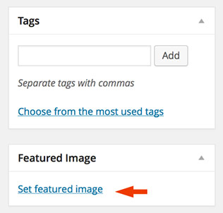
If you click on this link, a window will be opened where
you can choose the image. When you select the desired image, you have to click on the "Set featured image"
link.
The header back to top
The header consists of four main elements:
- Logo
- Menu
- Social Network Icons
- Title & Subtitle
a. Changing the logo
To change the logo image, you can either use your own existing logo image or edit the included logo PSD file - it is called logo.psd and is located within the PSD folder.
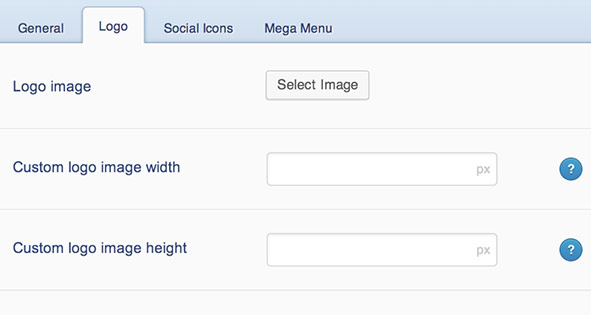
After you have your logo image, go to the Story Options » Header Settings » Logo section
and select the logo image in the Logo Image section. If you would like to have
a sharp logo image on retina displays, the image uploaded should be twice bigger than its
display size - for example if the standard logo image size is 30x70 pixels, the image size of the
uploaded image should be 60x140 pixels.
The default logo image width is 100 pixels and the height depends on the
original image ratio. If you would like to apply custom width or height to the
logo image, you can do this in the "Custom logo image width" and "Custom logo image height" fields.
b. Setting the menu

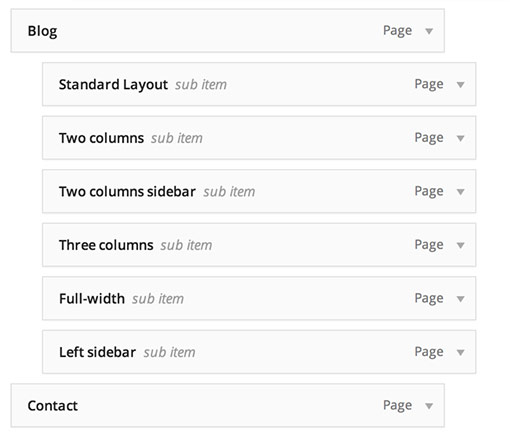
When you fisrt install the theme, the menu will contain all the pages created and it sets drop-downs when there is a parent/child hierarchy created within the pages. However, we would recommend building your custom menu by using the WordPress Custom Menus functionality, as it is more flexible and very easy to work with. To learn how to create a WordPress Custom Menu, you can follow the instructions below.
Here are the steps you have to follow in order to set the menu:
- Go to Appearance » Menus. To create the menu click on the
"Create a new menu" link.

- After you create the menu, you can
add Page, Category and custom links from the left sidebar.
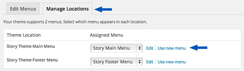
- Then click on the "Manage Locations" tab section and select the menu that you have created
in the "Story Theme Main Menu" field.
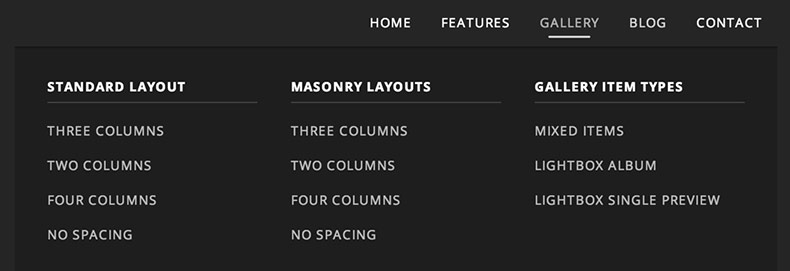
Here is an example of a mega menu:
By default all of the submenu items will be displayes as a standard drop-down menu. You can select which parent menu items will contain a mega menu in the Story Options » Header Settings » Mega Menu section:
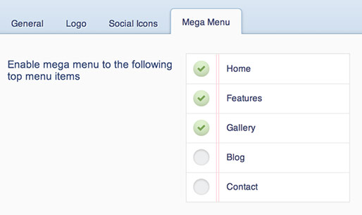
If you don't see any menu items in this section, please make sure that you have assigned a custom menu in the Appearance » Menus » Theme Locations » Story Theme Main Menu (as explained above) and that you have added menu items to that custom menu.
The Mega Menu Structure
Once you enable a mega menu for a specific menu item, every direct submenu item of this menu item will form a column in the mega menu and the second level of submenu items will be the links displayed in the corresponding column. For example, the hierarchy of the mega menu on the screenshot above looks like this:
c. Setting the social network icons

To set the icons, you have to go to Story Options » Header Settings » Social Icons » section.
You can add
the icons you like into the "Add a social icon" field:
1. Select the icon
2. Insert the link of the icon in the "Social Link" field
3. Insert a hover title (optional) - this title will be displayed when you hover the icon with the mouse
4. Click on the "Add Icon" field to add the icon
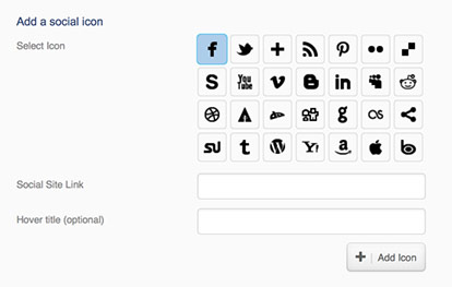
Note: Don't forget to click on the "Save Changes" button after you finish setting the Social Icons section.
d. Header search field
The header search field can be enabled/disabled in the Story Options » Header Settings » General » "Add Search in Header" field.
e. Header title section

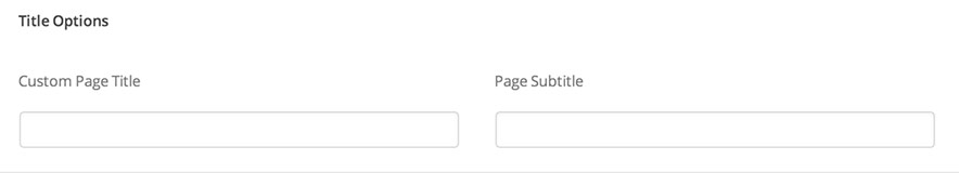
The title in the header section is displayed by default on all the pages (created from the Pages » Add New section). By default the title contains the default page title, if you would like to set a custom title you can do this in the Title Options » Custom Page Title section and you can set the header subtitle in the Title Options » Page Subtitle field of the page settings section.
Showing/hiding the page title
The page title is always displayed by default, there are two ways to set whether to show it or not:
- Globally for all the pages you can select whether to show the pages title in the Story Options » Post & Page Settings » Pages » Display page title field.
- For each page in the Display Page Title custom field of the page. By default this field is set to apply the globally selected option, but you can also select the "Show" or "Hide" option for the page specifically.
Enable/disable parallax effects to the title section
The theme includes a parallax effect option for the title section since version 1.3.0. When this option is enabled, the title opacity and default position changes and the background image in the header is set to a fixed position. You can enable/disable this option in the Story Options » Header Settings » General » "Enable header parallax effects" section.
f. Changing the default background color and image
You can set a custom background image and background color to the header section:
There are two ways to apply these settings:
- Globally for all the pages - the color you set in the Appearance » Customize » Header Color Settings » Header Background Color field will be set as a header color for all the pages. You can also set a background image for all the pages in the Story Options » Header Settings » General » Header background image field.
- Custom for each page - you can apply a custom background color and background image
for each page in the Header Background field of the settings section of the page:
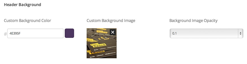
You can also apply an overlay background to the header section to improve the readability and visibility of the menu links and the other elements, especially when using light images.
You can enable this overlay background in the Story Options » Header Settings » General » Set a transparent overlay background to the top header field.
g. Setting a sticky header
The sticky header is enabled by default, you can enable/disable it in the Story Options » Header Settings » General » "Sticky Header" field. When enabled the header will be always displayed in the top section of the window, even after the user scrolls down the page.
The footer back to top
The footer consists of three main sections:
- Call to action section
- Widgetized area
- Copyright and footer menu section
a. Call to action section
The "Call to action" section looks like this:

All the settings for this section can be applied in the Story Options » Footer Settings » Call to action section:
- You can enable/disable this section in the "Show call to action section above footer columns" field
- You can insert all the settings for the section such as title, description, button text, etc. in the other fields below
- If you are using the theme in multiple languages you can enable the "Use texts for this section from translated PO file(s)" option and set these texts within the PO file included instead of the options panel. For more information about theme translation you can refer to the Translation section.
b. Widgetized area
The widgetized area looks like this:
In the Story Options » Footer Settings » Footer Layout field you can select the layout for the widgetized area. You can either select the number of columns that this area will contain or you can disable the widgetized area by selecting the "No widgetized footer" option.
If you select to display a widgetized area, you can then go to "Appearance" -> "Widgets" to add widgets to the footer. If, for example you have selected a "Three columns" layout, in the Widgets section you will see three widget areas called "Footer Column One", "Footer Column Two" and "Footer Column Three". After this you can drag and drop widgets from the left to any of these three boxes.
c. Copyright and footer menu section
The copyright and footer menu section looks like this:

The copyright text section by default displays your blog name.
If you would like to set a custom text in this section, go to the Story Options » Footer Settings » "Copyright Section", then in the "Content" field select the "Custom Text" option and add your custom text to the "Custom Text" field.
Setting the footer menu
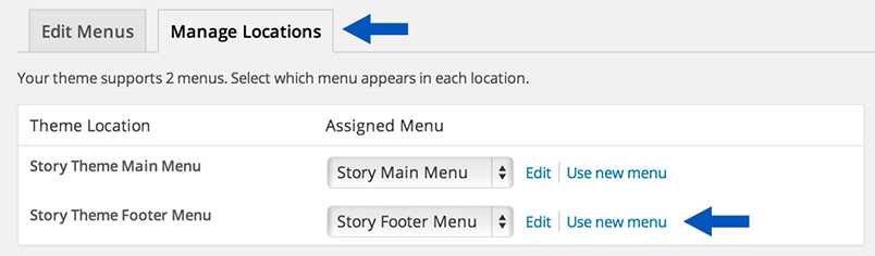
Here are the steps you have to follow in order to set the footer menu:
- Go to Appearance » Menus and create a new menu. After you create the menu, you can add Page, Category and custom links from the left.
-
To set the menu, click on the "Manage Locations" tab section and select the menu that you have created in the "Story Theme Footer Menu" field.
The sidebars back to top
This theme supports multiple sidebars and they are all dynamic. This means that you can insert whatever widgets you like on them.
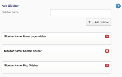
There is one default sidebar that goes to each of the pages. If you would like to have more sidebars than the default one, then you can create your new sidebars in Story Options » General » Sidebars section:
To customize your sidebars you have to go in the admin panel » Appearance » Widgets. In this section you will see your sidebars on the right part of the page. Now you can drag and drop widgets from the left into your sidebars.
Here is an example of a sidebar:
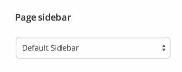
You can assign a custom sidebar to each page in the "Page sidebar" field of the Page Settings section.
Sliders back to top
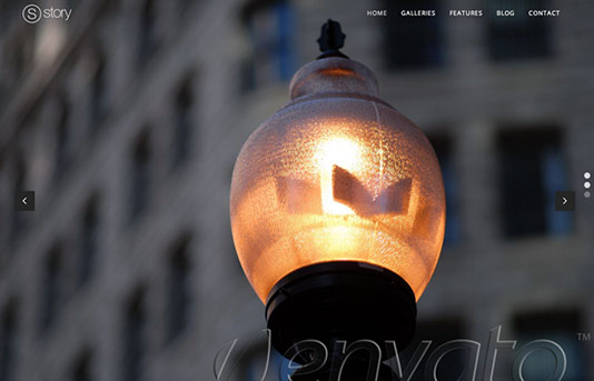
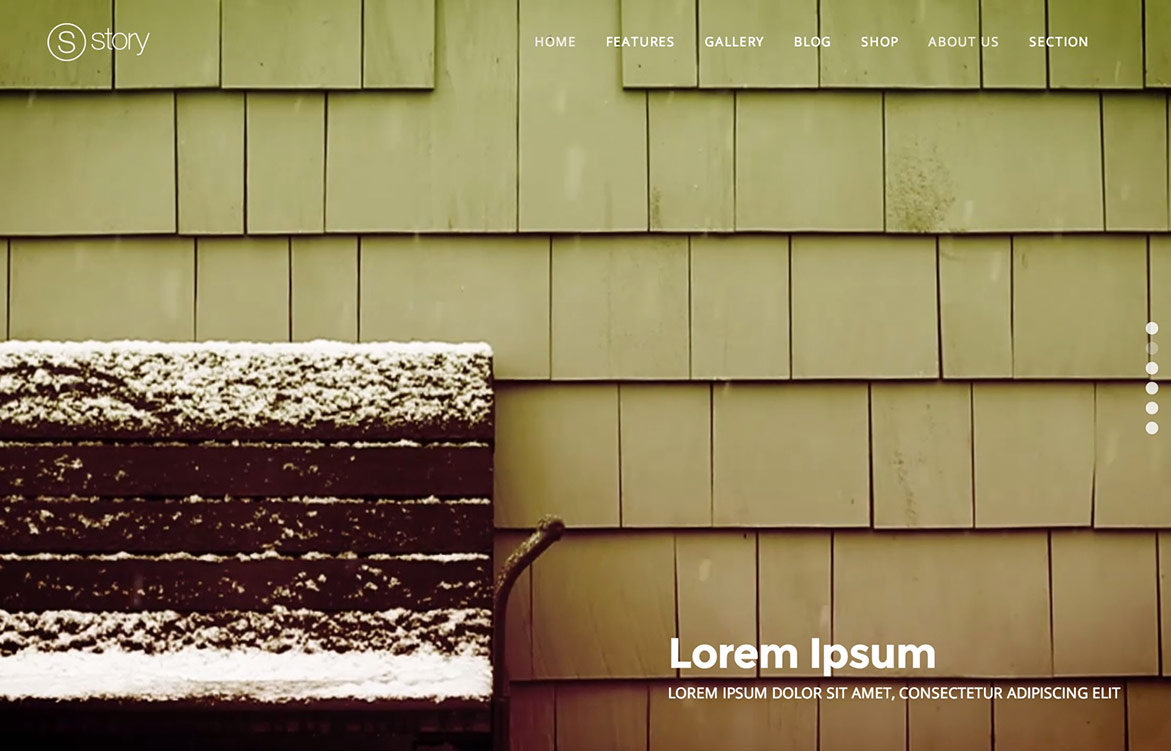
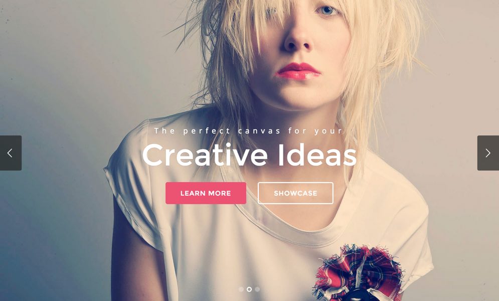
a. Fullscreen Slider
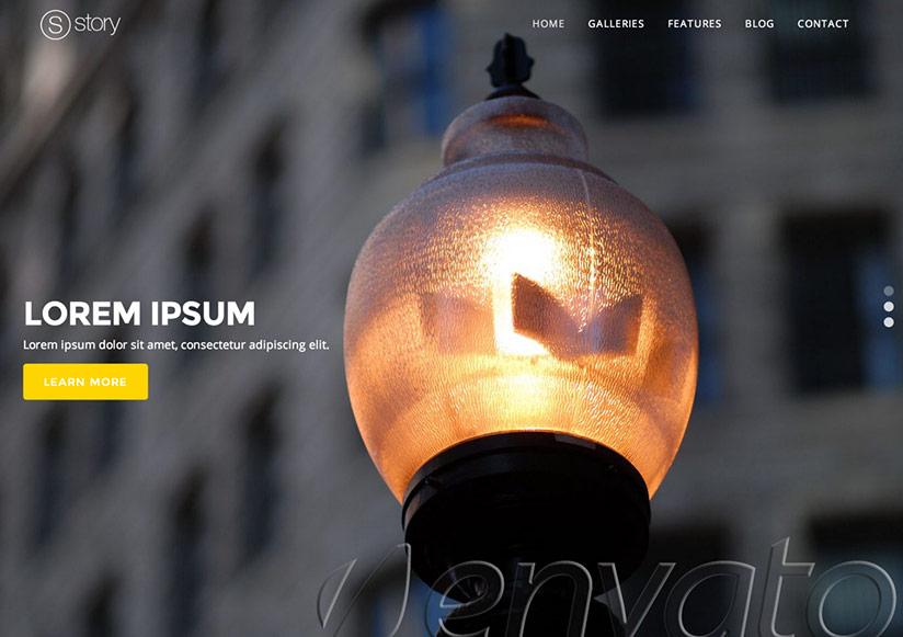
In the following video you can see how to create a fullscreen slider and add it to a page. We have also included more detailed instructions below.
Adding slides
In order to add slides to this slider go to the Story » Fullscreen Slider section. For each slide there are different options that you can apply.
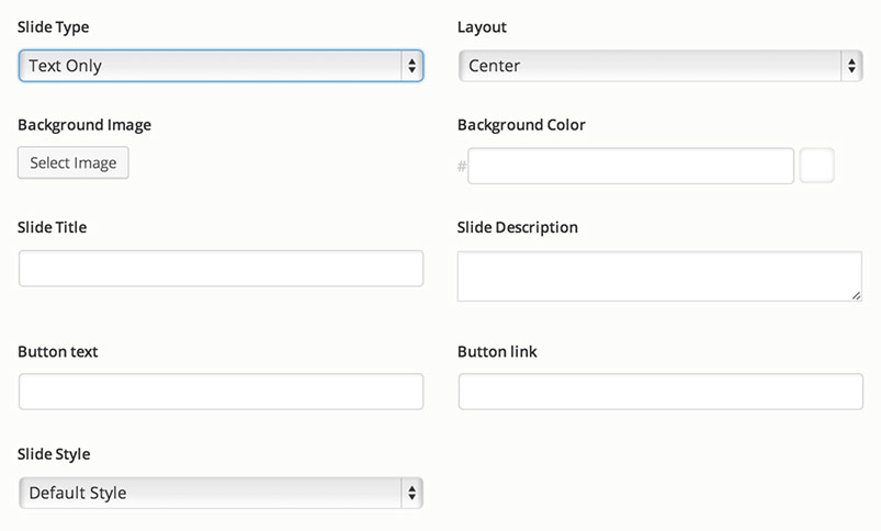
Slide Types
There are four slide layouts available: Text only, Text + Content Image, Image Slider and Video Background. You can select the type in the Slide Type field
- Text Only Slide Type
This slide is designed to display a short text + description with a background image/solid background color.
You can select the position of the text in the Layout field
You can also change the default slide typography, colors and background image alignment in the Slide Settings field by selecting the "Custom Settings" option
Optimal background image size: There is no specific default/optimal size for the background image - by default the background image is always centered in the visible slider area and how it is displayed depends on the user's browser window size and the default image ratio. It is recommended to use images that are around 1000 pixels and not bigger than 1500 pixels in size, so that the page loads faster.
- Text + Content Image Slide Type
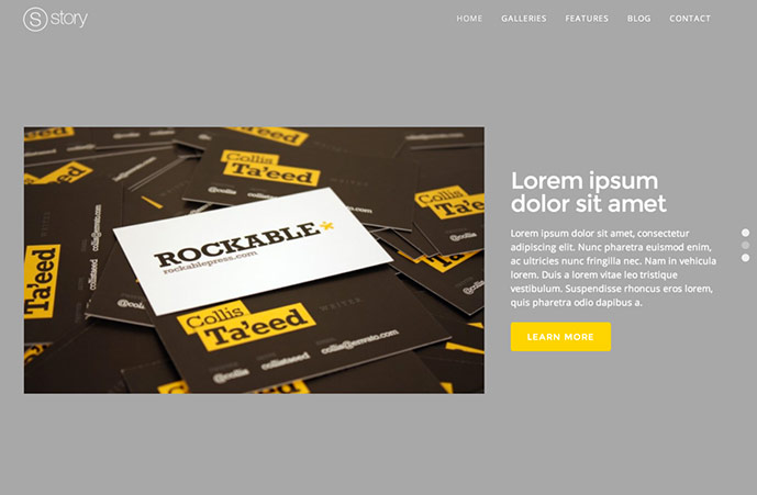
This slide is designed to display a longer text + description with an image and it optionally can have a background image/solid background color set.
You can select the position of the text in the Layout field
You can also change the default slide typography, colors and background image alignment in the Slide Settings field by selecting the "Custom Settings" option
Default content image size: You can change the default image crop size in the Story Options » Slider Settings » Fullscreen slider » Image size options section. By default the images will be cropped to the predefined sizes, however you can disable the image cropping or modify the default crop sizes. If you would like to preserve the original image ratio when cropping just leave the height field empty.
- Image Slider
- Displays a horizontal image slider with multiple images.
- You can add the images by clicking on the "Add images" button
- You can set an caption to each image in its "Caption" field
- You can reorder the images by dragging and dropping them
- Optimal image size: There is no specific default/optimal size for the background image - by default the background image is always centered in the visible slider area and how it is displayed depends on the user's browser window size and the default image ratio. It is recommended to use images that are around 1000 pixels and not bigger than 1500 pixels in size, so that the page loads faster.
- Video Background
- Displays an HTML5 video as a background to the slide.
- In order to make sure that the video will be supported by all the major browsers, you have to add the video in several different formats to the corresponding fields: MP4, WebM and Ogg. You can check the browser support for the different video formats in the "Video Formats and Browser Support" section here. It is recommended to add at least WebM and MP4 videos as all of the popular browsers support at least one of these formats.
IMPORTANT: If any of the browsers fail to load a format that they support by default, then your server needs to be configured to set the correct MIME types - you can do this by editing the WordPress .htaccess file (located in the root directory of your WordPress installation) and add the following lines to the end of the file:
AddType video/mp4 .mp4
AddType video/mp4 .m4v
AddType video/ogg .ogv
AddType video/webm .webm
AddType video/webm .webmv
- Mobile Devices: - since mobile devices don't support autoplaying background videos you can instead choose an image to display on mobile devices in the "Mobile Devices Background Image" field. Please note that the purpose of the background video is just to enhance the appearance of the slder, however if you need to show an important informational video, you would have to choose another way to display this video. For example, you can link the slider button to a page that contains the video or you can embed the video into the Description section of the slide. For example, you can embed a YouTube/Vimeo video just by adding the URL of the video to the "Description" field of the slide and it will be automatically displayed.
- Max upload size limits - if your server has a limit to the upload file size and your video files exceed this limit, you can do one of the following:
- Manually upload the file to the server via FTP and insert the file URL to the video field
- Use another server to host your videos and insert the video URL to the video field
- Contact your hosting support to increase the maximum upload size of your files
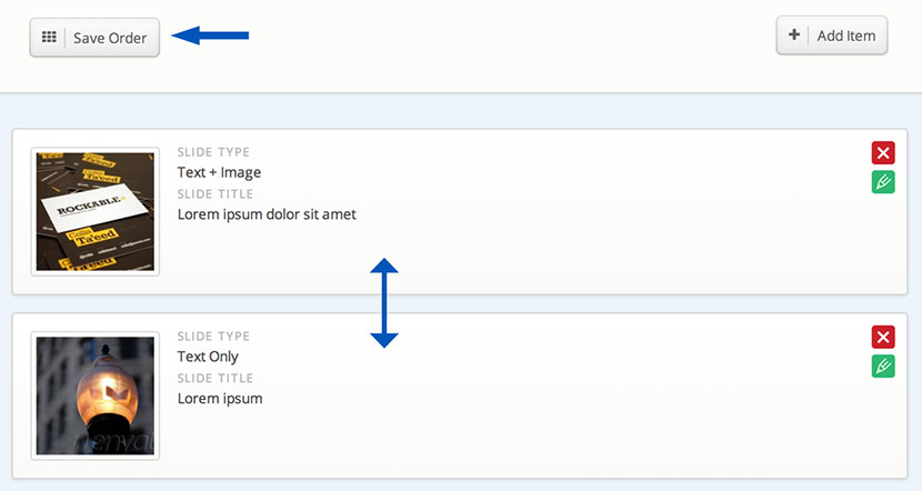
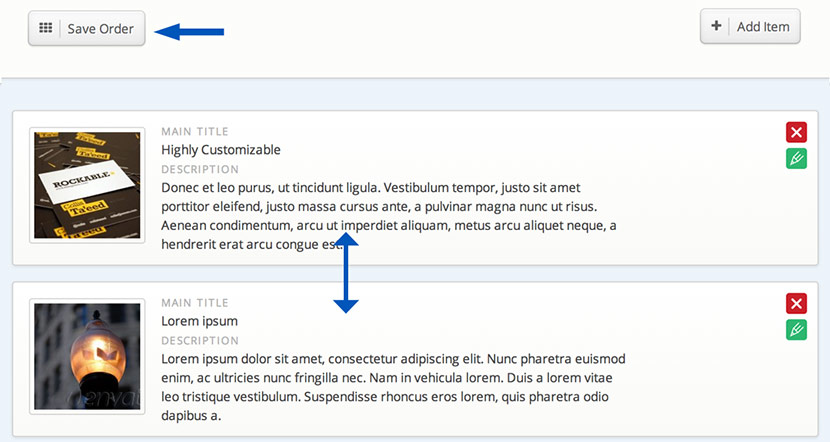
Changing the slide order
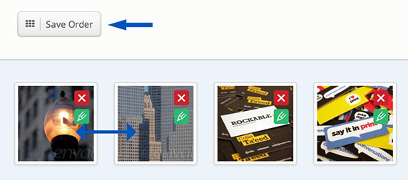
Once you add the images, you can change their order by dragging and dropping the image container to the desired place. After you change their order, in order the new order to be saved, you have to click on the "Save Order" button that would appear right above the images:
Adding the slider to a page
In order to add the slider to a page:
- Create a new page from the Page » Add New section or open an existing page in edit more.
- Set the "Fullscreen slider page" template to the page (In the Page Attributes » Template section)
- Select the fullscreen slider that you would like to show (the "default" slider will be set by default) in the "Select fullscreen slider" field of the page.
- Enable autoplay: You can optionally enable autoplay in the "Slider Autoplay"
field below (In the "Story Page Settings" section of the page).
Since version 1.3.0 you can also enable autoplay to the inner horizontal slider in the "Slide Autoplay" » "Horizontal Slider Autoplay" field. Please note that the main "Enable Autoplay" option must be active in order the autoplay functionality to be applied to the horizontal slider.
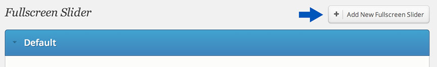
Creating additional sliders
You can create additional fullscreen sliders in the Story » Fullscreen Slider section by clicking on the "Add New Fullscreen Slider" button:
After you create a new slider you can select its name in the "Select fullscreen slider" field of the page.
Slider Options
You can also apply different options such as image cropping, animation settings, etc. in the Story Options -> Slider Settings -> "Fullscreen Slider" section.
Linking to sections of the slider from the main menu
In order to add a link from the menu to a section of the slider, go to Appearance » Menus section and click on the "Links" section. If for example, you would like to add a link to the third slide set the following options:
URL: http://site.com/page-slug/#3Link: The name of the link
(replace http://site.com/page-slug with the URL of the fullscreen slider page)
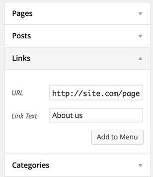
and click on the "Add to menu" button.
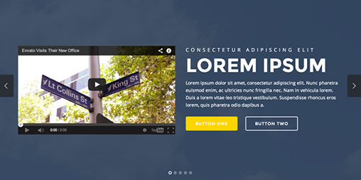
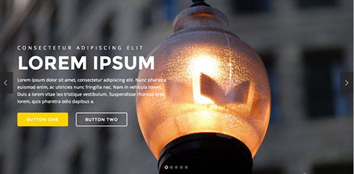
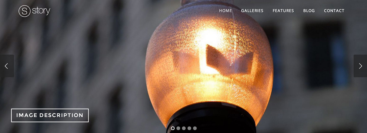
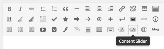
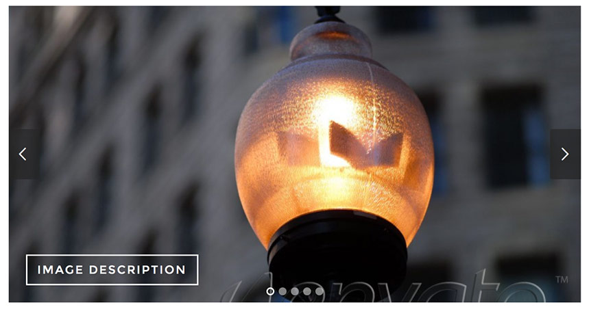
b. Content Slider
The Content Slider looks like this:
In the following video you can see how to create a content slider and add it to a page. We have also included more detailed instructions below.
Adding slides
In order to add slides to this slider go to the Story » Content Slider section. For each slide there are different options that you can apply.
-
Selecting the slide layout
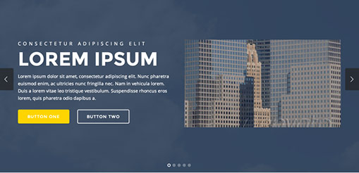
You can select the silde layout in the "Slide Layout" field. You can choose between "Centered text", "Image right - Text left", "Image left - Text right", "YouTube Video right - Text left" and "YouTube Video left - Text right". Here are examples of how each of these options looks like:
Centered Text:
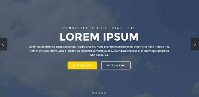
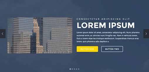
Image right - Text left:
Image left - Text right:
YouTube Video right - Text left
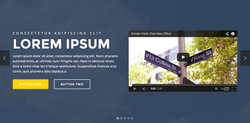
YouTube Video left - Text right
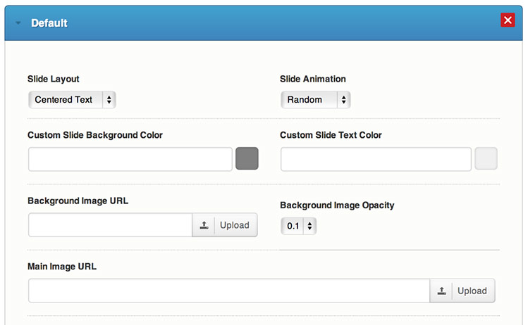
- In the Slide Animation field you can select the animation direction for the slide elements and you can set custom background and text color in the Custom Slide Background Color and Custom Slide Text Color fields
- Setting a background image
If you want, you can also set a background image to the slide in the Background Image URL field. You can also set the background image opacity in the Background Image Opacity field.
- Setting the main image
You can set a main slide image when one the "Text on the left" or "Text on the right" layouts is selected for the slide - this image is displayed on the side of the text. You can set this image in the Main image URL field.
You can also set the slide without this image, it will look like this:
- In the rest of the fields below you can set some content to the slide, such as titles, description and custom buttons with links.
- Custom Slide Settings - to each slide you can apply some custom settings by selecting the
"Custom Settings" option in the
"Slide Settings" field - when you select this option, an additional settings section will be
displayed below where you can set some advanced settings, such as:
- Custom Typography - you can change the default typography options, such as font family, font size and font style
- Background Image Alignment - please note that the alignment is not fixed and the visible image area still depends on the screen size and ratio
- Background Style - select the way the background image is displayed:
- Parallax Cover - covers the visible area of the slider with a parallax effect. When the parallax effect is applied, the background image will be resized to cover the entire window size as well, that sometimes (depending on the screen and image size) can make the image look a bit zoomed
- Cover - covers the visible area of the slider with no parallax effect.
- Contain - the image will be resized so that it fits within the slider area - it will be always fully visible with no hidden parts. - Custom Button Colors
When you set all the slide data, just click on the "Add Item" button to add the slide.
Changing the slide order
Once you add the images, you can change their order by dragging and dropping the image container to the desired place. After you change their order, in order the new order to be saved, you have to click on the "Save Order" button that would appear right above the images:
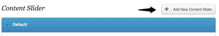
Creating additional Content Sliders
If you would like to add a new slider with a different image set, you have to click on the "Add new Content slider" button located in the top section of the page and insert its name in the dialog box that will be displayed. After that a section for the additional slider images will be created so that you can set the new images to it.
Changing the slider options
You can change the default slider options such as setting automatic image resizing and changing slider speed in the Story Options » Sliders » Content Slider section.
Default/optimal image sizes:
- Main (side) image: 569px × 320px . The image height can be changed in the slider options section.
- Background image: There is no specific default/optimal size for the background image - by default
the background image is always centered in the visible slider area and how it is displayed depends on the
user's browser window size and the default image ratio. It is
recommended to use images that are around 1000 pixels and not bigger than 1500 pixels in size,
so that the page loads faster.
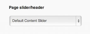
Adding a slider to a page
Setting the slider as a header of the page
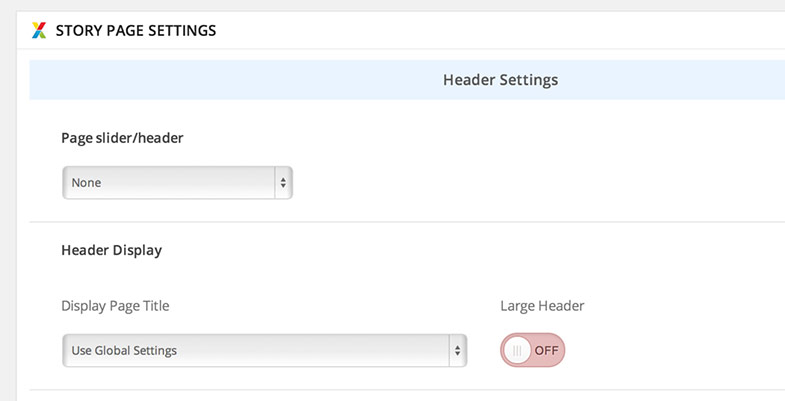
You can select the name and type of the slider that you would like to display in a page in the "Page Slider/Header" field of the page settings section (located below the main content editor)
Adding the slider to the content of the page
You can read more on how to add the slider to the content of the page in the Content slider in page/post content section
Slider Options
You can also apply different options such as image cropping, animation settings, etc. in the Story Options -> Slider Settings -> "Content Slider" section.
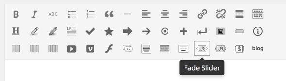
c. Fade Slider
The Fade Slider looks like this:
Adding images
In order to add images to this slider you have to go to the Story » Fade Slider section. All you have to do is to upload the selected image (or add its URL), fill the fields with the data you would like to display in the slider and press the "ADD" button. After that the image is automatically saved for the slider.
Changing the image orderOnce you add the images, you can change their order by dragging and dropping the image container to the desired place. After you change their order, in order the new order to be saved, you have to click on the "Save Order" button that would appear right above the images:
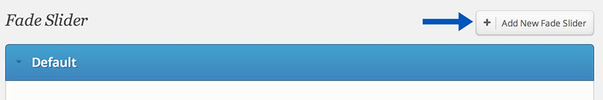
Creating additional Fade Sliders
If you would like to add a new slider with a different image set, you have to click on the "Add new Fade slider" button located in the top section of the page and insert its name in the dialog box that will be displayed. After that a section for the additional slider images will be created so that you can set the new images to it.
Changing the slider options
You can change the default slider options such as setting automatic image resizing and changing slider speed in the Story Options » Sliders » Fade Slider section.
Default crop image size: 1500px × 550px . The image height can be changed in the slider options section. Please note that although the images are set in static crop sizes, their display size depends on the browser window size, as the slider is always as wide as the window.
Adding a slider to a page
Setting the slider as a header of the page
You can select the name and type of the slider that you would like to display in a page in the "Page Slider/Header" field of the page settings section (located below the main content editor)
Adding the slider to the content of the page
You can read more on how to add the slider to the content of the page in the Fade slider in page/post content section
d. Custom Header Sliders
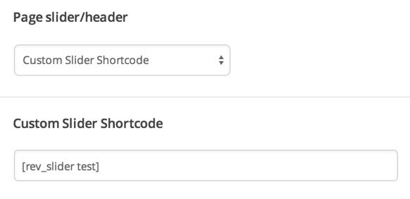
If you would like to add a third party plugin slider to the header section of a page, you can do this by using the shortcode of the slider, if the plugin provides an option to add the slider via a shortcode.
In order to do this, just select the "Custom Slider Shortcode" option in the "Page slider/header" field, located in the "Story Page Settings" section of the page. Then insert the shortcode in the "Custom Slider Shortcode" field below:
Template Pages back to top
a. The Default Page
When you create a new page from the Pages » Add New section, the "Default Template" is assigned to the page by default. The default page template is a standard page template that can be with a sidebar or full-width layout and can contain custom content.
Setting the page layoutFor this page you can select the layout to be Right Sidebar, Left Sidebar or Full Width. You can do this by setting the custom field Page Layout of the page:
Selecting a sidebar
By default this page template uses the Default Sidebar. If you would like to use another sidebar, you can create one in the Story Options » General » Sidebars section and after that you can set the custom field Sidebar and select the sidebar that you have just created. To customize it you have to go to the Appearance » Widgets and find the selected sidebar. You can drag and drop widgets from the left into it.
Setting a slider to the page:You can select the type of header on the page in the Page Slider/Header custom field of the page. In this field you can select between Fade slider, Content slider and None.
- If you select a slider, you can read about how to create and setup the slider in the
Sliders section.
Applying a custom background color and background image to the page header
You can read about how to apply a custom background color and background image to the page header in the Changing the default background color and image section.
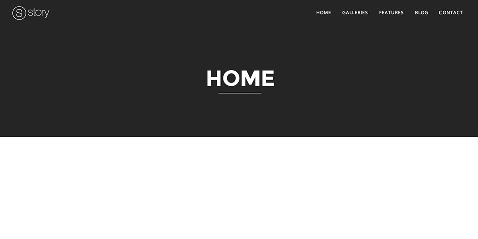
b. Home Page - Full-width custom page template
A page with full-width custom page template can look like this:
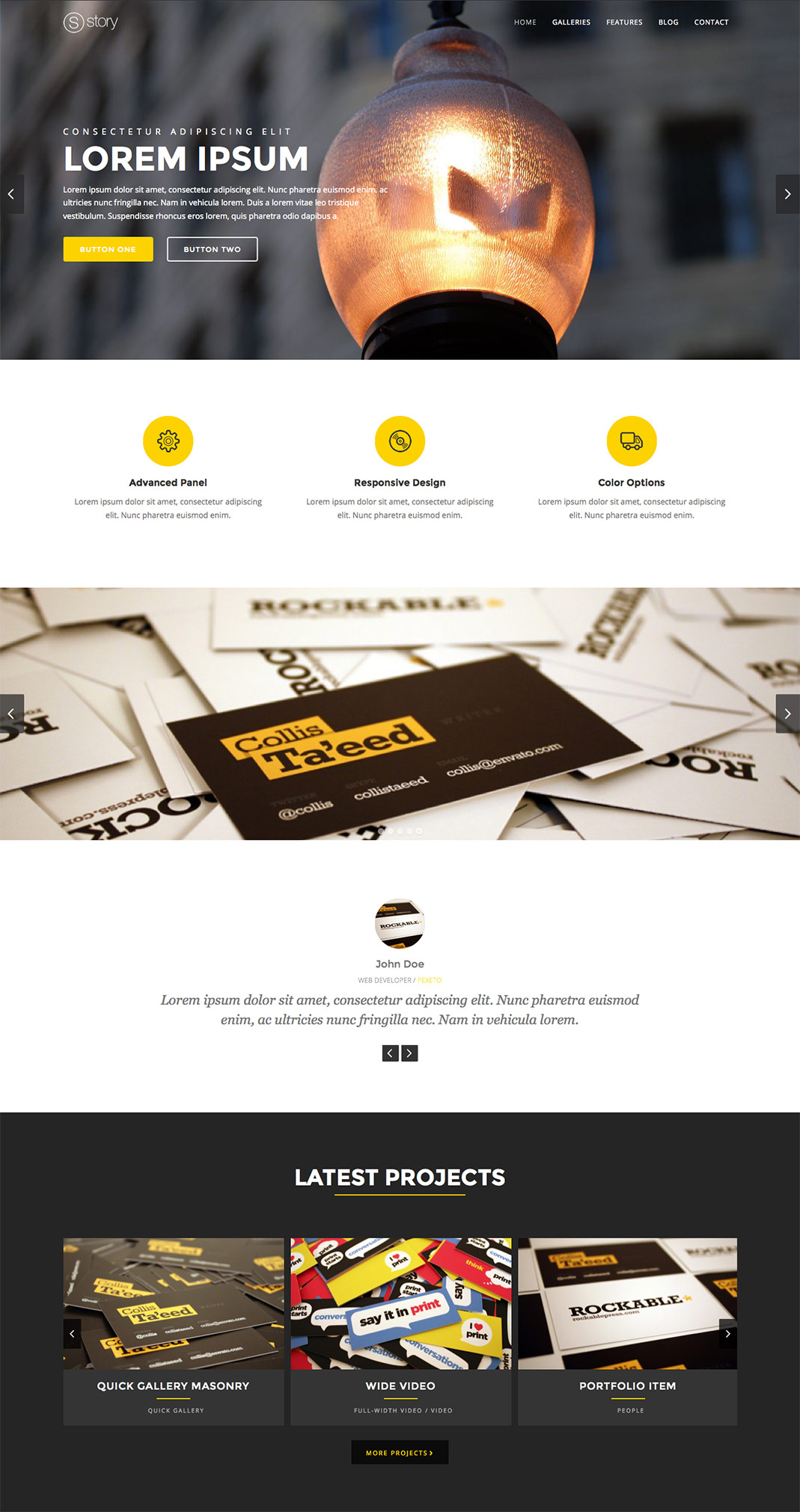
You can add many sections with different backgrounds and add different elements to all of them.
Creating The Page:
- Create a new page (Page » Add New)
- In the "Template" field (located in the right sidebar of the edit page section) select "Full-width custom page" template.
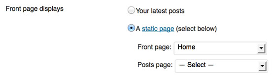
- If you would like to make this page a front page (to be opened by default when the site is visited) go to
Settings » Reading » Front page displays » Select "A static page" and select the page that
you have just created in the Front Page list:
Once you create the page, you will have a blank full-width page:
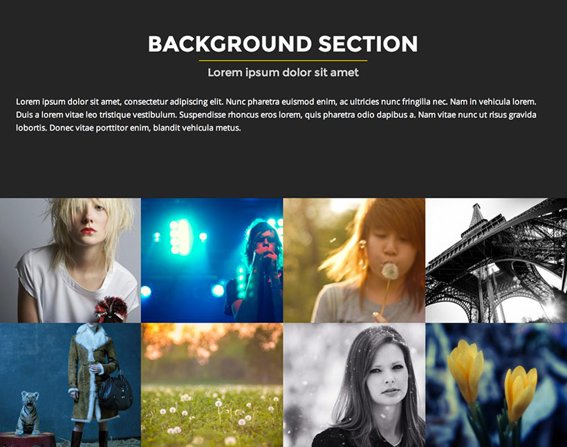
 Creating a background full-width section
In order to add a background full-width section to the Home page, you can use the "Background Section" button:
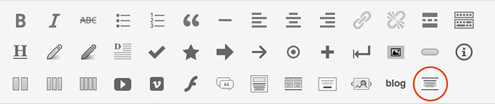
When you click the button a dialog with various options will be displayed:
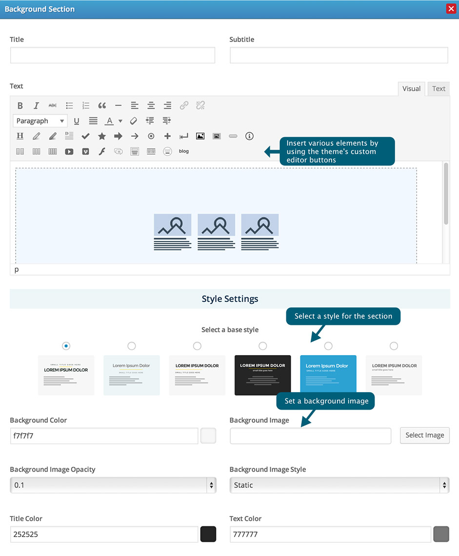
Here are examples of all the default style options for the background section:
Light Background Style |
Light Background Style 2 |
Light Background Style 3 |
Dark Background |
Dark Background Style 2 |
Additionally you can set a background image to the section in the "Background Image" field and select its opacity in the "Background Image Opacity" field:
In the following video you can see how a background section is added to the full-width page. The video also shows how to edit the background section, change the colors and add a services boxes set to the background section element.
Adding elements to the page content and the background sections
In addition to the standard content, there are also many different predefined elements that you can add, such as:
- Services Boxes
- Portfolio Carousel
- Recent Posts Element
- Testimonials
- Call to action section
- etc.
Setting a slider to the page:
You can select the type of header on the page in the Page Slider/Header custom field of the page. In this field you can select between Fade slider, Content slider and None.
- If you select a slider, you can read about how to create and setup the slider in the
Sliders section.
Applying a custom background color and background image to the page header
You can read about how to apply a custom background color and background image to the page header in the Changing the default background color and image section.
c. Home page - Fullscreen slider page
Creating The Page:- Create a new page (Page » Add New)
- Select the "Fullscreen Slider Page" option in the "Template" field (located in the right sidebar of the edit page section
You can create the slides of the fullscreen slider in the Story » Fullscreen Slider section. You can read more about the slider options in the Fullscreen Slider section above.
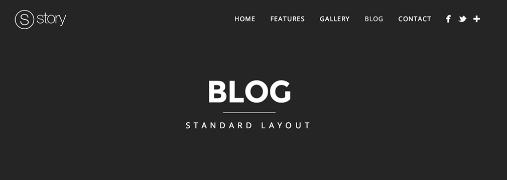
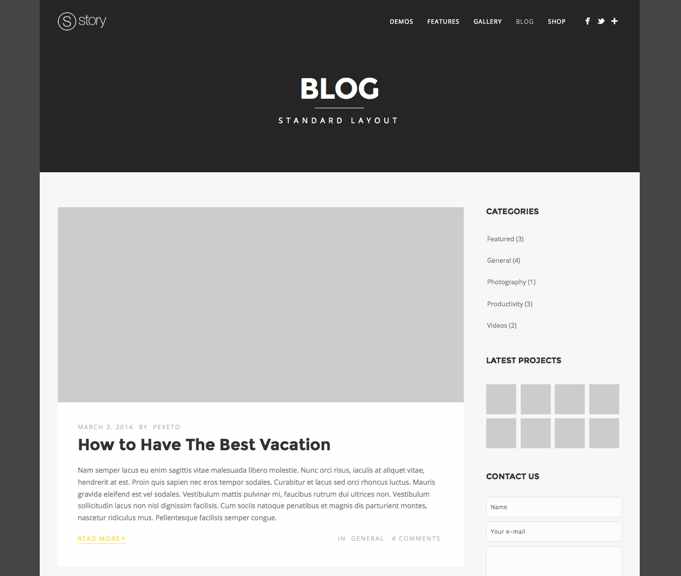
d.Blog page
Creating The Page:
- Create a new page (Page » Add New)
- Select the "Blog Page" option in the "Template" field (located in the right sidebar of the edit page section
- If you would like to make this page a front page (to be opened by default when the site is visited) go to
Settings » Reading » Front page displays » Select "A static page" and select the page that
you have just created in the Front Page list:
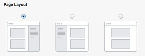
Selecting a layout for the page
You can set the page layout in the "Page Layout" field of the page settings section:
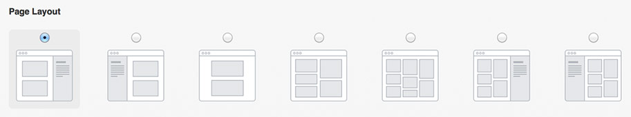
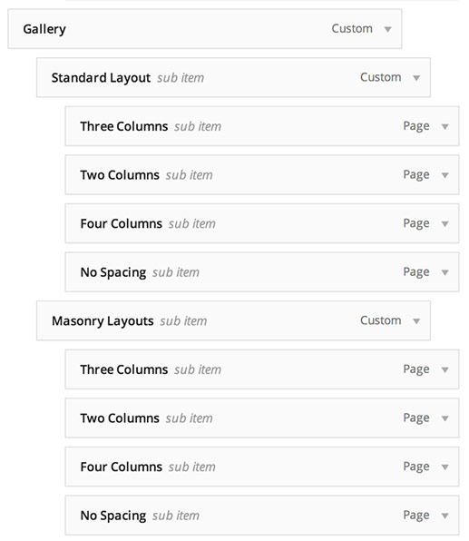
You can choose between the following options:
- Left sidebar
- Right sidebar
- Full-width - no sidebar
- Two columns - no sidebar, masonry layout
- Three columns - no sidebar, masonry layout
- Two columns with right sidebar, masonry layout
- Two columns with left sidebar, masonry layout
Selecting a sidebar
By default this page template uses the Default Sidebar. If you would like to use another sidebar, you can create one in the Story Options » General » Sidebars section and after that you can set the custom field Sidebar and select the sidebar that you have just created. To customize it you have to go to the Appearance » Widgets and find the selected sidebar. You can drag and drop widgets from the left into it.
Filtering the blog categories
You can select which categories to include only or exclude in the "Select categories to filter" field.
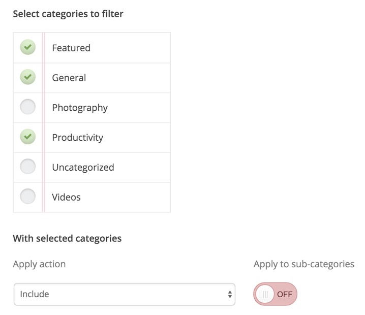
First, select the categories that you would like to include/exclude. After that, select whether you would like to include or exclude those categories in the "Apply action" field. If you select the "include" option, the blog page will show only the posts that are assigned to the selected categories. If you select the "exclude" option, the blog page will show all the posts, except the ones that are assigned to the selected categories.
You can also select whether this action should be applied to sub-categories in the "Apply to sub-categories" field. When this option is enabled, if you have included or excluded a parent category, its subcategories will be also automatically included/excluded.
Defining the number of posts on the blog
In the "Number of posts per page" field of the blog page settings section you can set the number of posts to display on that page.
Enable a Blog category filterSince version 1.9.0 of Story, you can enable a category filter in the header of your blog page.
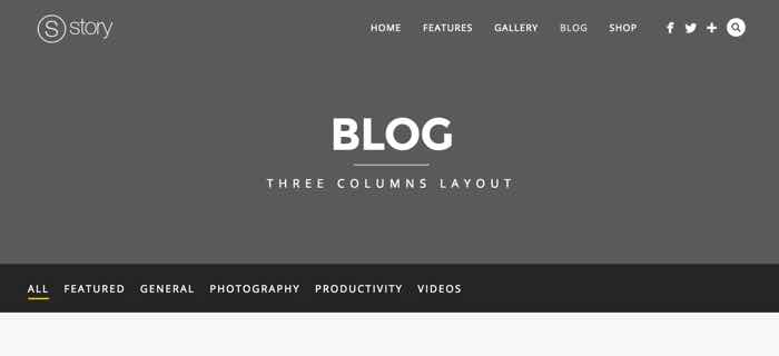
The category filter can be enabled from the "Show category filter in header" section of the blog page settings. The category filter shows the categories based on the category filter settings of the page. When you have applied an "exclude" filter, the blog categories will include all the categories, except the ones that have been excluded. When the "include" filter is selected, the blog category filter will include only the selected categories to be included. If you would like to include the subcategories, just make sure that they are selected as well.
Setting a slider to the page:
You can select the type of header on the page in the Page Slider/Header custom field of the page. In this field you can select between Fade slider, Content slider and None.
- If you select a slider, you can read about how to create and setup the slider in the
Sliders section.
Applying a custom background color and background image to the page header
You can read about how to apply a custom background color and background image to the page header in the Changing the default background color and image section.
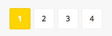
Setting advanced blog pagination
In order to have advanced pagination enabled on your blog page (as on the screenshot above) you have to install the WP-Pagenavi plugin. You can read more about how to do it the section Plugins included.
The blog posts
Selecting a format for the post
The posts support the following formats: Standard, Gallery, Video, Aside and Quote.
The format can be selected in the "Format" section of the post:
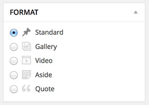
Here is an explanation about each of the supported formats:
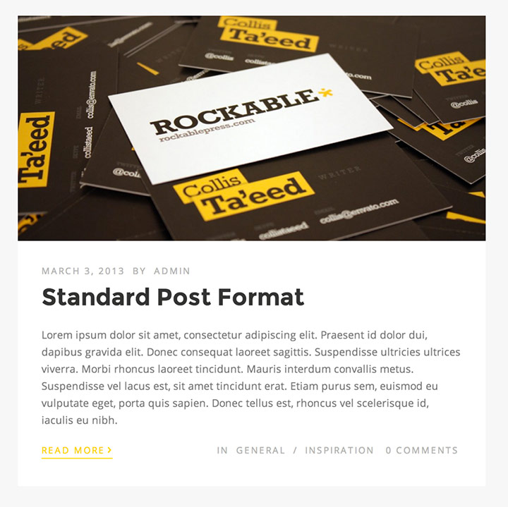
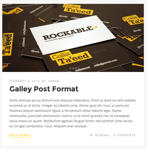
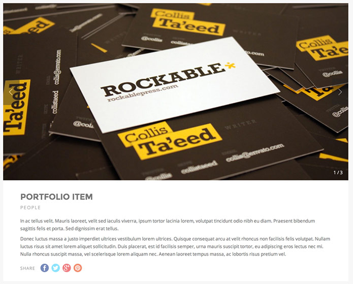
- Standard - includes a featured image in the beginning of the post. It looks like this:
You can read here about how to set a featured image to the post. - Gallery - displays the images from the first gallery in the post as a slider in the
beginning of the post. It looks like this:
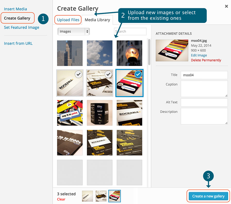
Adding the image gallery In order to add a gallery to the post click on the "Add Media" button located above the content editor of the post:
Then click on the "Create Gallery" section on the left, select the images that you would like to add and click on the "Create a new Gallery" button. After this just click on the "Insert Gallery" button to add the gallery to the post.
- Video - will display a video as header of the post. It looks like this:
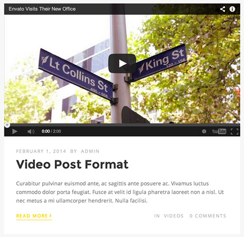
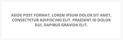
You can set the video URL in the "Video URL" custom field of the post. The theme uses the WordPress [embed] shortcode to insert the video, you can see the supported formats on the WordPress Embeds page. We have also included support for Flash videos (with .swf extension). - Aside - displays a box with text only (the content of the post). It
doesn't include any post information, such as titles, images, etc. It looks like this:
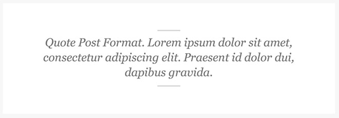
- Quote - displays the post content in a quote style. It looks like this:
Post Styles
There are two post styles available:
Standard Style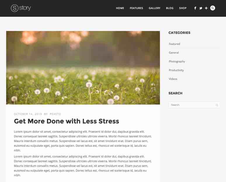 |
Title & image in header style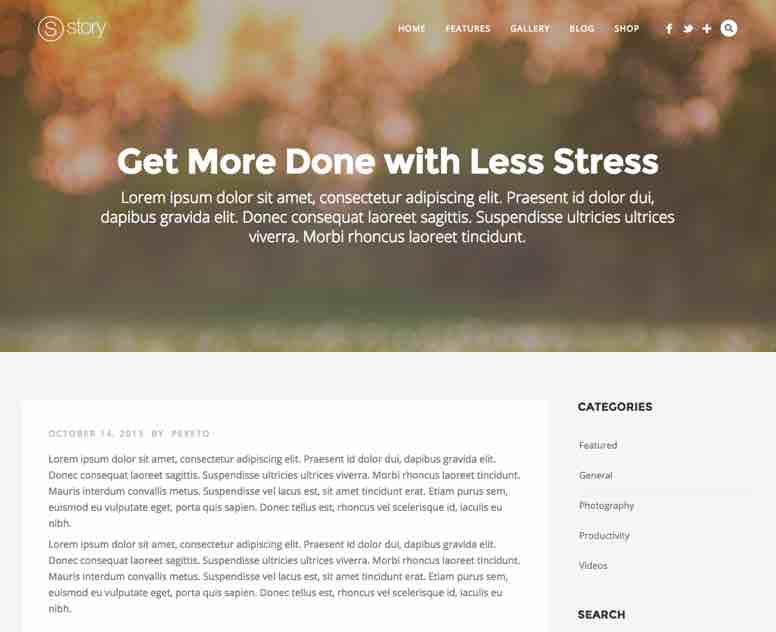 |
The "Title & image in header" style would display the title and featured image of the post in the header of the post page. Although this style is primarily designed for the default post format, you can still use it with other post formats. For example, if you use set this style to a video post, the featured image would be displayed in the header of the post page and the video would be still displayed at the beginning of the post content section.
You can select the post style in the "Post Style" custom field of the post:
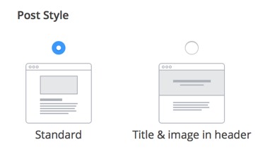
When you select the "Title & image in header" option, you can also set a subtitle and apply a custom background color and image opacity in the "Header Subtitle" and "Header Background Options" sections respectively.
Showing The Related Posts
The blog posts provide an option to show the related posts at the end of the post content on the single post page:
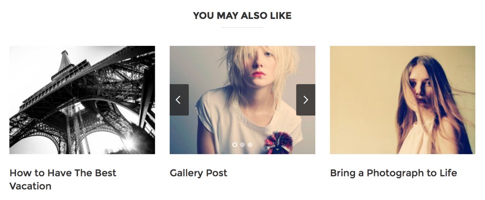
You can enable/disable the related posts element in the Story Options » Post & Page Settings » Blog Posts » Related Posts Section. In this section you can also configure the settings for this element, such as selecting a category to display, the number of columns, etc.
Hiding part of the content of the post with the "Read More" link:
Just before the text that you want to be hidden you have to click on the "Insert more tag" button (Alt+Shift+T):
Enabling threaded comments (with reply functionality):
In order to enable threaded comments, you have to go to Settings » Discussion and check the field "Enable threaded (nested) comments x levels deep"
Post Options
There is a blog posts option included in the Story Options » Post and Page settings » Blog Posts section. In this section you can set some options such as selecting the default single post layout, single post sidebar what info to display for the post (e.g. date, category, etc.).
e. Portfolio Gallery Page
The Gallery page looks like this
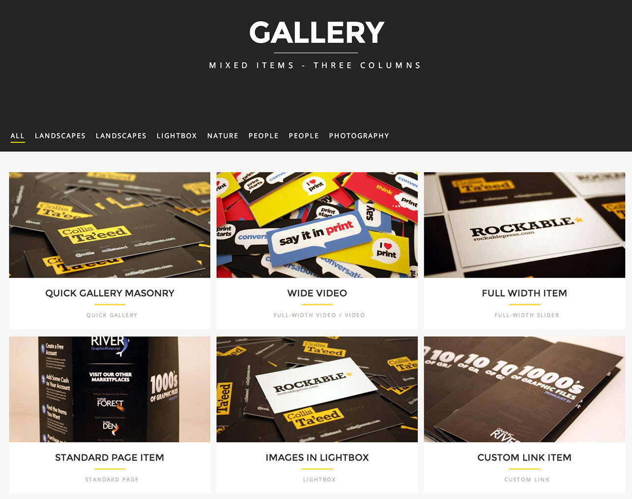 Main setup instructions
In this section are included the main steps you would have to follow in order to set this page, more options and settings are described in the "Other Gallery Page Options" section below.
Creating The Page:- Create a new page (Page » Add New)
- Select "Portfolio Gallery" in the "Template" field (located in the right sidebar of the edit page section
- If you would like to make this page a front page (to be opened by default when the site is visited) go to
Settings » Reading » Front page displays » Select "A static page" and select the page that
you have just created in the Front Page list:
Creating the portfolio/gallery items (adding images to the gallery)
Each of the images in the gallery represents a single Portfolio Item. For each of the portfolio items:
- Creating new items
You can create a new item in "Portfolio" » Add New section. You can set the title in the "Title" field of the item. - Add Images to the item
- Click on the "Add Media" button above the main content area of the portfolio item:
- Open the "Create Gallery" section. If you would like to upload new images click on the
"Upload Files" tab and upload the images. If you would like to add existing Media Library
images, click on the "Media Library" tab and select the images you like. After you select
the images, click on the "Create a new gallery" button.
- After this when you click on each image in the gallery, in its Caption field you can set a description to it. You can also change the default image order by dragging and dropping the images on different positions.
- When you finish editing the images Click on the "Insert Gallery" button. This will insert a gallery object into the content section of the portfolio item.
- Later if you would like to edit the images, click on the gallery object and click on its "Edit Gallery"
button:
- Click on the "Add Media" button above the main content area of the portfolio item:
- Setting the thumbnail of the item
By default the first image of the images you have added will be used as the item's thumbnail. If you would like to set another image as thumbnail, you have to set it as featured image to the item. You can read about how to set a featured image here.
As the images uploaded would be bigger, the thumbnail image will be resized automatically to the size in which it should be displayed. However, if you prefer to use your custom thumbnail image, you can set it in the "Custom Thumbnail URL" field of the item.
- Selecting the type of the item
Each portfolio item supports different formats in which it can be displayed. You can select the type of the item in the "Item Type" field:
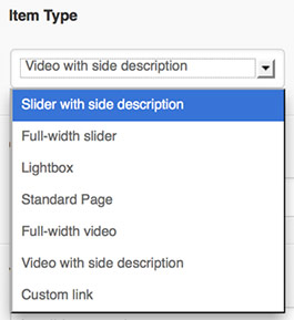
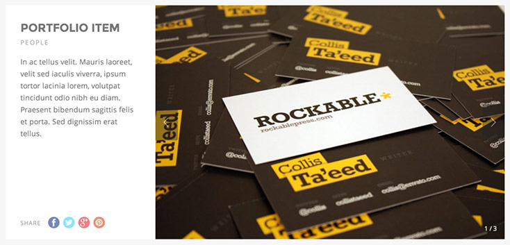
Here is an explanation for each of the item type options:- Slider with side description / Full-width slider
These two options display the same type of content, but in a different layout. The slider with side description displays a slider of images and a description on the side and the full-width slider displays a full-width slider with a description located below it:
Slider with side description
Full-width slider
You can read about how to add the images to the slider in the "Add images" section above.
The slider description is the actual post content - the content that you insert in the portfolio post content editor area will be displayed as a description to the item.
Slider optionsYou can change the default slider options in the Story Options » Slider Settings » Portfolio Slider section. In this section you can select whether the images to be automatically resized or not and select whether to display a related projects carousel below the slider and you can also customize the default carousel options.
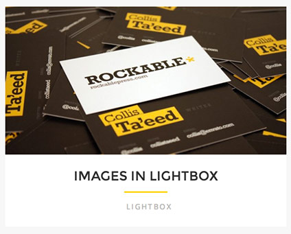
- Lightbox
If you select this option the images of the item in the Grid Gallery will be displayed lightbox:
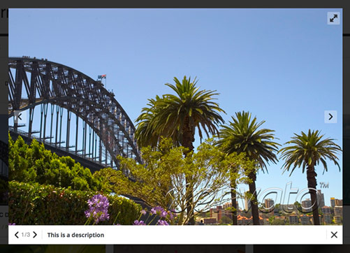
With this type selected, the single portfolio item page will automatically include a Quick gallery with option to open the images in lightbox. Setting a single preview image per itemBy default the lightbox items are designed to display albums of images - each items displays a set of images in the lightbox. However if you would like to have only one preview image per item and have all the lightbox images in the gallery page related in a group, so that when you click on the first item's image and then click on the "Next" arrow of the lightbox, the second item's image will be displayed, you can enable the "Make lightbox items preview images related to each other" option in the gallery page settings section.
- Standard Page
The item will be displayed in a standard page format. In the Story Options » Post and Page Settings » Portfolio Posts section you can select the layout and sidebar for the page.
- Video with side description / Full-width video
Displays a video either in a full-width layout or with a side description. You can set the video URL in the "Video URL" custom field of the portfolio item. The theme uses the WordPress [embed] shortcode to insert the video, you can see the supported formats on the WordPress Embeds page. We have also included support for Flash videos (with .swf extension).
- Custom Link
The item will be linking to a custom link that you have set in the custom field "Custom Link URL" of the item
- Slider with side description / Full-width slider
Ordering the items in the gallery
You can select how the items will be ordered in the "Order items by" and "Order" fields of the gallery page settings section:
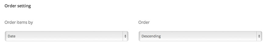
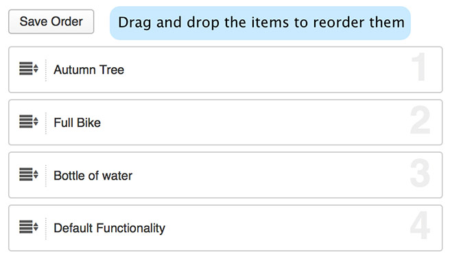
The default options are set to order the items by date in a descending order. This means that the newest items will be displayed first. You can also select the items to be ordered by "Custom order". In this case, you can set an order number to the portfolio item in its "Order" field. We have also created a Portfolio » Custom Order page where you can easily drag and drop the portfolio items to reorder them:
Other Gallery Page Options
The gallery page includes some customization options in its settings section which is located below the main content editor of the page.
- Select the categories to be included/excluded from the page
In the Filter portfolio categories section when the Filter Type option is set to "Exclude" the select categories will be excluded from the page. If the "Include" option is selected, only the items from the selected categories will be displayed.
- Show/hide the category filter
You can disable/enable the category filter within the "Show portfolio category filter" field
- Set the number of items to be displayed per page
You can set the number of items that will be displayed per page in the "Number of portfolio items per page" field
-
Change the number of columns
You can change the number of columns in the "Number of columns" field
- Change the image layout
You can enable a Masonry layout in the "Masonry layout" field. If you enable this option, the images height will vary depending on the original image ratio and also the images will be positioned one below another by filling all the space. If the "Masonry layout" option is disabled, you can set the image height in the "Thumbnail image height" field.
Customizing the item thumbnails
The theme includes some options to change the appearance of the thumbnails, such as hiding the title/category of the thumbnails or removing some of the hover effects in the Story Options » Post & Page Settings » Portfolio Posts » Portfolio Thumbnail Settings section.
f. Quick/Easy Gallery page
This is the default WordPress image gallery - the purpose of this gallery is to insert multiple images at once - you can very quickly create multiple galleries just for several minutes. Here is how the gallery looks like:
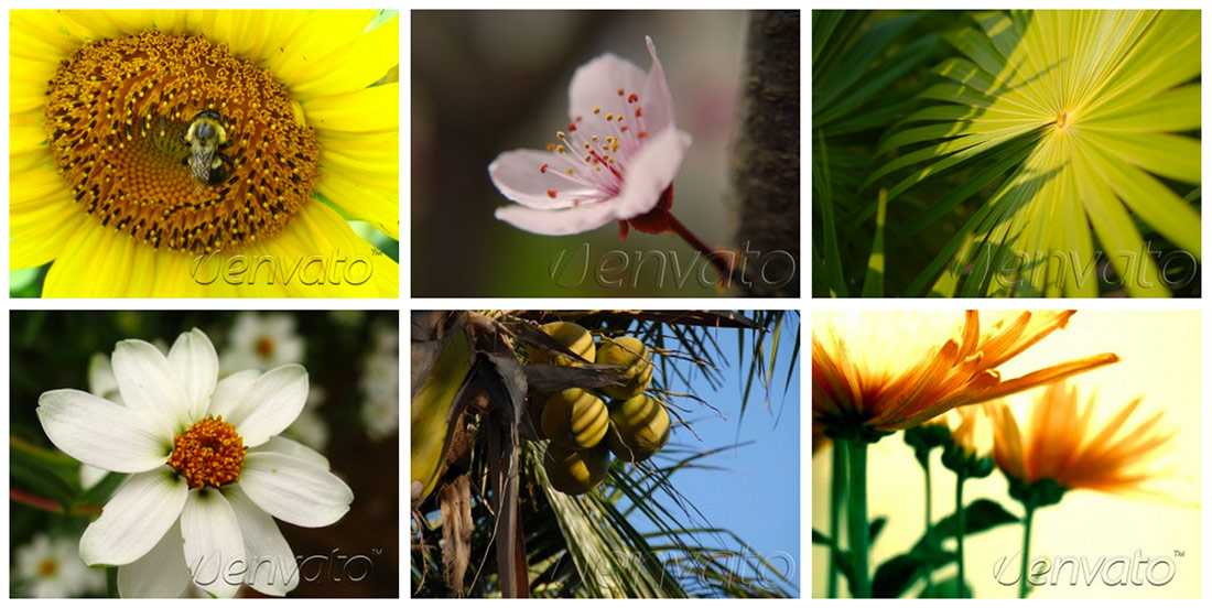
In order to create a quick gallery you have to:
- Create a new page (you don't have to set a page template to it)
- Click on the "Add Media" button above the main content area:
- Open the "Create Gallery" section. If you would like to upload new images click on the
"Upload Files" tab and upload the images. If you would like to add existing Media Library
images, click on the "Media Library" tab and select the images you like. After you select
the images, click on the "Create a new gallery" button.
- After this when you click on each image in the gallery, you can set a caption that will be displayed below the image thumbnail in the "Caption" field and also you can set a description that will be displayed in the lightbox preview in the "Description" field of the image.
- Use the "Gallery Settings" section to change the gallery settings:
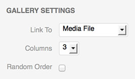
In the "Link to" select "Media File" and in the "Gallery Columns" field select the number of columns you would like to display.
Click on the "Insert Gallery" button.
Setting a full-width quick gallery in the Full-width custom page template
The full-width gallery option is available since version 1.3.0 of the theme.
By default the quick gallery is displayed in a boxed layout when added to a Full-width custom page template. If you would like to set a full-width layout, you can do this in the "Full-width pages gallery layout" field of the Story Options » Media Settings » Quick Gallery.
Gallery Options
The quick gallery options section can be found in Story Options » Media Settings » Quick Gallery section. For the different post types (post / page / portfolio) you can enable/disable the masonry layout and if the masonry layout is disabled you can set a default static height to the thumbnail images.
Setting a custom image height to the different galleriesBy default you can select the default gallery thumbnail height for the
different post/page types in the Story Options
» Media Settings » Quick Gallery section.
If however you would like to set a different height to two different
galleries from the same post type, you can do this by adding the
"thumbnail_height" attribute to the gallery shortcode. In order to edit the gallery
shortcode, click on the "Text" tab of the content editor, the gallery shortcode
should look like this:
[gallery columns="5" link="file" ids="150,139,138"]
if for example you would like to set a height of 300 pixels to that gallery,
you can apply this value by adding the thumbnail_height attribute, like this:
[gallery columns="5" link="file" ids="150,139,138" thumbnail_height="300"]
g. Contact Form page
The contact form page looks like this:
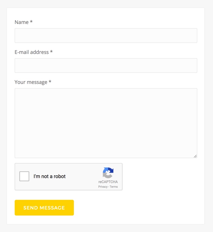
This page contains an AJAX contact form which visitors of your website can use to contact you.
To make one page contain a contact form you have to do some settings. When you create (or edit) your page, you should find the field Template and in it to choose the Contact form page option. After that immediately your page will contain a contact form.
Setting your e-mail address
You can set the e-mail address to which to send the messages in the Story Options » General Settings » Contact Form » Email to which to send contact form message field.
Setting a sender e-mail address
You can set the e-mail address to which to send the messages in the Story Options » General Settings » Contact Form » Email sender field.
Yahoo has recently published a DMARC policy of reject, meaning that all the emails that are sent from Yahoo emails, but not from the Yahoo servers, should be rejected by the email providers. This means that if your site visitor sets a Yahoo email and this email is set as a sender, you may not be able to receive the email (depending on the email provider that you use to receive the messages). Therefore, please make sure to set your custom email address in this field (such as [email protected], non-Yahoo address), so that you can make sure that you will receive all the emails from Yahoo users.
Data Collection Consent Checkbox
Version 1.9.6 of the Story theme introduces a data collection consent checkbox option in the contact forms. When enabled, a checkbox requesting consent for storing and using the visitor's personal data (that they submit with the contact form), will be added to the contact form. When the option is enabled, the checkbox will be required, which means that the visitor will need to check this box in order to send the message.

You can enable the checkbox in the Story Options » General Settings » Contact Form section. All you need to do is enable the checkbox in the "Enable data collection consent checkbox" field and set the checkbox message in the "Data collection consent message field". You can use HTML code in the message if you wish to link to your privacy page. For example:
I consent to Example.com storing and using my personal data
submitted with this form as described in the privacy policy.
For GDPR compliancy, you must also mention if you will send or share the data with any 3rd-parties and which.
When this option is enabled and the person checks the checkbox, the following text will be added to the email message:
Consent given: yes
Setting CAPTCHA
Having CAPTCHA enabled for your form will prevent sending spam emails by robots, just by asking the users to click on the checkbox.
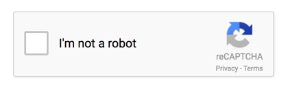
The theme uses the Google reCAPTCHA service for the captcha feature. In order to enable reCAPTCHA for the theme, apply the following settings in the Story Options » General Settings » Contact Form section:
- Select "ON" in the "Enable CAPTCHA" field.
- Register API keys and set your generated site and secret keys in the "reCAPTCHA Site Key" and "reCAPTCHA Secret Key" fields.
You can very easily generate these keys here. You would need to login with a Google account - if you don't have one, you can easily create one. After you log in, you will be able to generate the API keys for your site. - (Optional) You can change the reCaptcha widget theme in the "reCAPTCHA Widget Theme" option
- (Optional) Changing the language: The reCaptcha widget will automatically detect the user's language. If you prefer to explicitly set a language to be loaded, you can enter the corresponding language code in the "reCAPTCHA Language Code" field - you can find the full codes reference here.
Customizing the contact form fields
The built into the theme contact form by default supports the following fields: Name, E-mail address and Question. If you need to change these fields and add new fields, we would recommend using the Contact Form 7 plugin instead - you can download it for free from here. The theme includes built-in styles for this plugin so its elements style would match the theme's style. This plugin is very easy to install and use - you can very easily build custom forms with it. You can find the Contact Form 7 documentation here.
Setting the page layout
For this page you can select the layout to be Right Sidebar, Left Sidebar or Full Width. You can do this by setting the custom field Page Layout of the page:
Selecting a sidebar
By default this page template uses the Default Sidebar. If you would like to use another sidebar, you can create one in the Story Options » General » Sidebars section and after that you can set the custom field Sidebar and select the sidebar that you have just created. To customize it you have to go to the Appearance » Widgets and find the selected sidebar. You can drag and drop widgets from the left into it.
Setting a slider to the page:You can select the type of header on the page in the Page Slider/Header custom field of the page. In this field you can select between Fade slider, Content slider and None.
- If you select a slider, you can read about how to create and setup the slider in the
Sliders section.
Applying a custom background color and background image to the page header
You can read about how to apply a custom background color and background image to the page header in the Changing the default background color and image section.
h. Archive page
The archive page displays an archive of the blog posts by category, month and a list with the posts.
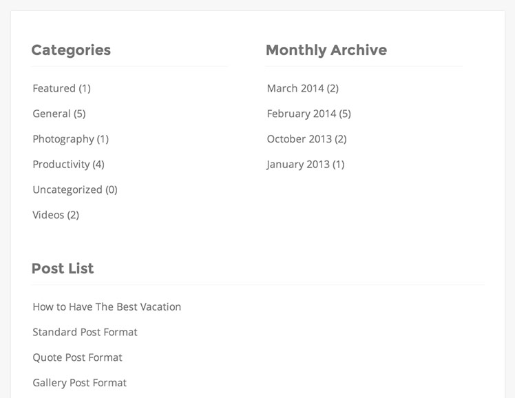
To create an archive page you have to create a new page (Page » Add New) and select the "Archive" option in the "Template" field of the page (located in the right sidebar of the edit page screen)
Setting the page layoutFor this page you can select the layout to be Right Sidebar, Left Sidebar or Full Width. You can do this by setting the custom field Page Layout of the page:
Selecting a sidebar
By default this page template uses the Default Sidebar. If you would like to use another sidebar, you can create one in the Story Options » General » Sidebars section and after that you can set the custom field Sidebar and select the sidebar that you have just created. To customize it you have to go to the Appearance » Widgets and find the selected sidebar. You can drag and drop widgets from the left into it.
Applying a custom background color and background image to the page header
You can read about how to apply a custom background color and background image to the page header in the Changing the default background color and image section.
Elements back to top
Important: If you are running WordPress 5.0 or newer, please make sure to install the Classic Editor plugin. This theme supports the classic editor only and a major part of its elements rely on the classic editor.
a. Services boxes
There are 4 styles of services boxes included. Here are some examples:
Default style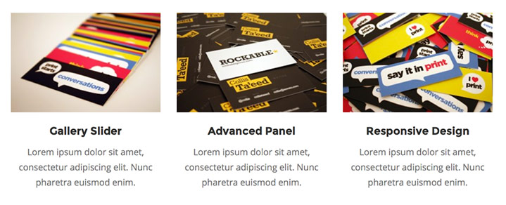
|
Thumbnail style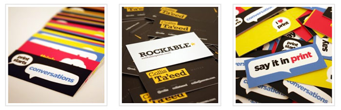
|
Boxed Photo style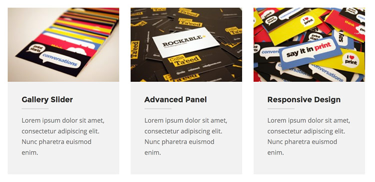
|
Icon style
|
| Full-width Grid style with standard data
Each box has an image and title/description set 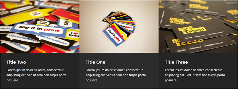
|
Full-width Grid style with no image or no title/description Each box has either an image only or title/description only set 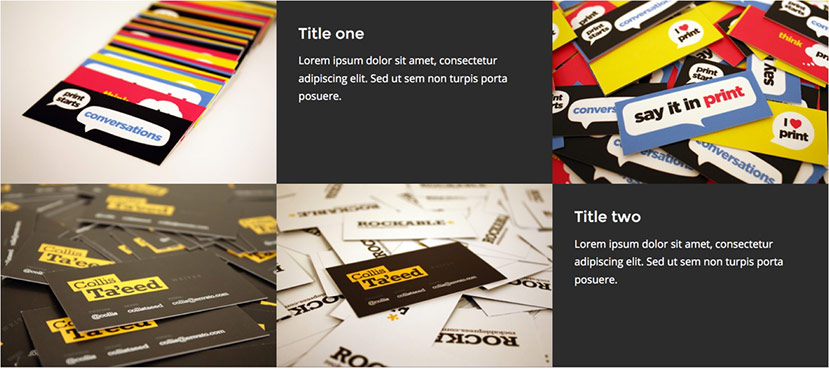
|
In the following video you can see how to create a services boxes set and add it to the page. We have also included more detailed instructions below.
Creating Services Boxes
You can create the services boxes in the Story » Services Boxes section.
By default there is a "Default" services boxes set created where you can add the boxes. For each box you can add a Title, Image, Link and Description:
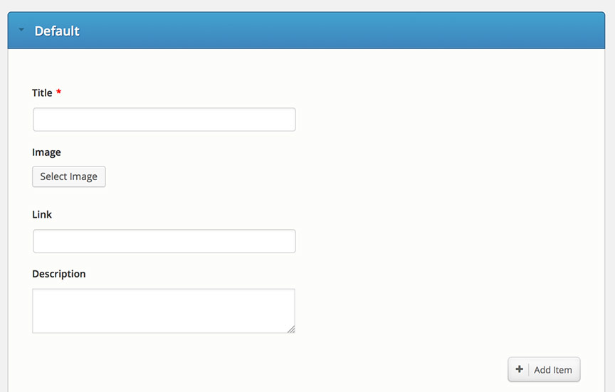
You can create many different services box sets and include them in different sections of the pages and posts. To create a new Services boxes set just click on the "Add New Services Box Set" button in the top right section of the window.
Adding the Services Boxes to the page
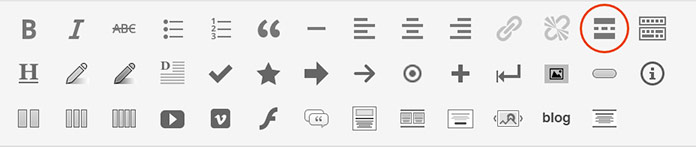
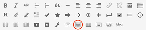
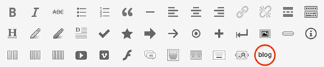
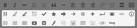
In order to add a services boxes set to a page/post, just click on the "Insert Services Boxes" button from the editor buttons:
Then a dialog will be displayed where you can set the options for the services boxes set:
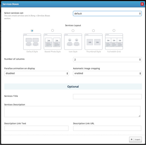
In this dialog you can set:
- The services boxes set to display. By default there is a "Default" set created, however if you would like to create additional sets of boxes, you can do this in the Story » Services Boxes section, by clicking on the "Add a New Services Box Set" button (located in the top right section of the page)
- Services Layout - select the layout/style of the services
- In the "Number of columns" field you can select the number of boxes to display per row
- Parallax animation on display - if enabled, each of the services boxes will be animated with a parallax animation when the user scrolls to the services set.
- In the "Services title" field you can select the title for the services box set. If you insert a title, it will be displayed on the left of the boxes
- In the "Services description" field you can select the description for the services box set. If you insert a description, it will be displayed on the left of the boxes
- If you would like to add a link (for example a "Read more" link) in the Description section of the services set, you can setup the link data in the "Description Link URL" and "Description Link Text" fields of the dialog.
b. Portfolio Carousel
The portfolio carousel displays a set of portfolio items. You can read about how to create portfolio items and all the options that you can set to them in the "Creating the portfolio/gallery items" section of the Portfolio Gallery template section.
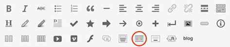
You can insert a carousel anywhere in the content of your pages or posts by using the "Insert Portfolio Carousel" button of the editor buttons:
In the dialog that will be opened you can choose the portfolio category to display, set a title and setup the ordering options. The carousel will be added as a shortcode in the content of the post/page.
Customizing the item thumbnails
The theme includes some options to change the appearance of the thumbnails, such as hiding the title/category of the thumbnails or removing some of the hover effects in the Story Options » Post & Page Settings » Portfolio Posts » Portfolio Thumbnail Settings section.
Setting a custom thumbnail height
When the carousel is added by using the content editor "Portfolio Carousel" button, you can set a custom height to its thumbnails in the "Thumbnail Height" field of the element settings. For the portfolio items that automatically include the carousel element, you can set a custom height of the thumbnails in the Story Options » Sliders » Portfolio Slider » Related projects carousel » "Items thumbnail height" field.
Enable album lightbox preview per item
For lightbox items the carousel would by default show a single preview image per item. If however you have added a gallery of images to the content of the item and you would like to display all of the images in the lightbox preview, you can select the "Album Preview" option in the "Lightbox Preview Type" field of the carousel element.
c. Recent Blog Posts Element
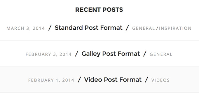
The recent blog posts element supports two main layouts:
Column layout - 2, 3 or 4 columns: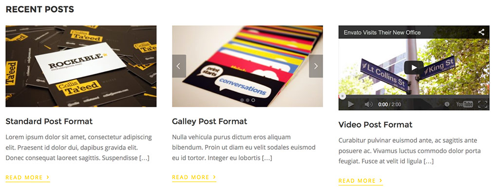
List layout:
You can insert the blog posts element anywhere within the content of the pages or posts, by using the "Recent Blog Posts" button of the editor buttons:
Creating a Featured Posts section
You can create a Featured Posts section by following these steps:
- Create a Featured category
- Assign your featured posts to that category
- When inserting the Recent Blog Posts element, select your Featured category in the "Show posts from category" field.
d. Testimonial Slider
 Creating the testimonials
You can create the testimonials in the Story » Testimonials section.
By default there is a "Default" testimonials set created where you can add the your testimonials.
You can create many different testimonial sets and include them in different sections of the pages and posts. To create a new testimonials set just click on the "Add New Testimonials Set" button in the top right section of the window.
Adding the testimonial slider to the page
You can insert a testimonial anywhere within a page/post by using the "Testimonial Slider" button of the content editor buttons
In the "Select testimonials set" field you can select a specific set of testimonials to show on the testimonial slider.
e. Call to action section
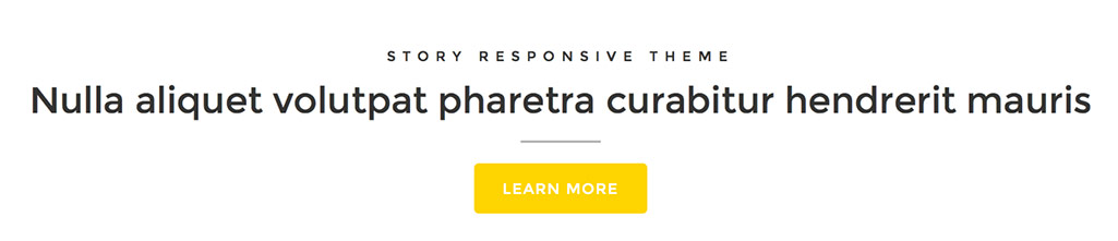
You can insert a call to action section anywhere within a page/post by using the "Circle call to action section" button of the content editor buttons
Please note that this circle is with a static size and it is designed to fit short titles only.
f. Content Slider in page/post content
You can insert a Content slider anywhere within a page/post by using the "Content slider" button of the content editor buttons
If you insert a Content slider into the content of a Full-width custom page template, the slider will be displayed in a full-width size, for the rest of the pages and posts, the slider will be set to fit the width of the content container element of the page/post.
You can create different sliders within the Story Options -> Content Slider section. You can learn more about creating sliders in the Content Slider section.
You can also customise the default slider settings in the Story Options -> Slider Settings -> "Content Slider" section.
g. Fade Slider in page/post content
You can insert a Fade slider anywhere within a page/post by using the "Fade slider" button of the content editor buttons
If you insert a Fade slider into the content of a Full-width custom page template, the slider will be displayed in a full-width size, for the rest of the pages and posts, the slider will be set to fit the width of the content container element of the page/post.
You can create different sliders within the Story Options -> Fade Slider section. You can learn more about creating sliders in the Fade Slider section.
You can also apply different options such as image cropping, animation settings, etc. in the Story Options -> Slider Settings -> "Fade Slider" section.
h. Pricing Tables
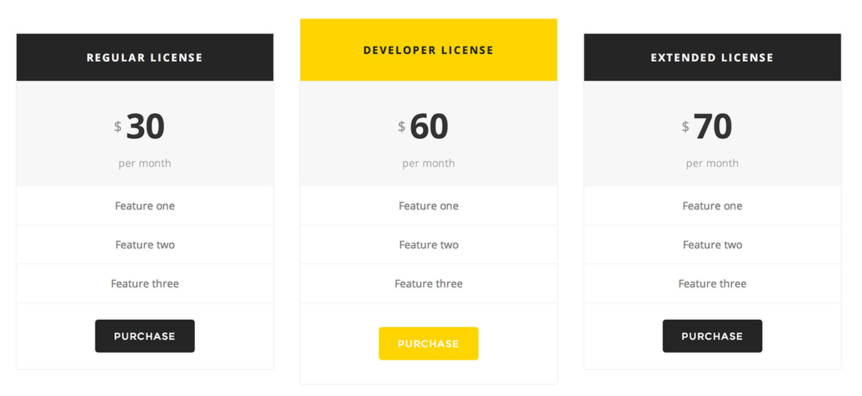 Creating the Pricing Tables
You can create pricing tables in the Story » Pricing Tables section.
By default there is a "Default" Pricing Table set created where you can add your Pricing Table items.
When adding a pricing table item you can make it highlighted by checking the "Highlight" option.
You can create many different pricing tables and include them in different sections of the pages and posts. To create a new Pricing Table just click on the "Add New Pricing Table" button in the top right section of the window.
Adding the pricing table to the page
You can insert a pricing table anywhere within a page/post by using the "Pricing Table" button of the content editor buttons
In the "Select a pricing table" field you can select a specific Pricing Table to show.
In the pricing table dialog you can also select the number of columns to set to the pricing tables and a custom highlight color.
i. Social Sharing Buttons
The theme includes sharing buttons for the main social network sites: Facebook, Twitter, Google+, Pinterest and LinkedIn . These buttons can be enabled on posts, pages, portfolio posts and portfolio post sliders.

You can configure the how and where the buttons will be displayed in the Story Options » General Settings » Social Sharing section.
j. Accordion
The Accordion looks like this:
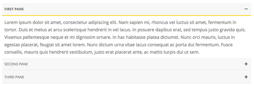
You can add an accordion by using the Accordion shortcode:
[accordion][apane title="First Pane"]Pane One Content[/apane] [apane title="Second Pane"]Pane Two Content[/apane] [apane title="Third Pane"]Pane Three Content[/apane][/accordion]Note: Please make sure that all the shortcode tags are on the same line, but separated with at least a space, for example:
... [apane]Tab One Content[/apane] [apane]Tab Two Content[/apane] ...
All the panes to be closed by default
If you would like to set all of the panes to be closed by default, add an all_closed="true" attribute to the [accordion] shortcode:
[accordion all_closed="true"][apane title="First Pane"]Pane One Content[/apane] [apane title="Second Pane"]Pane Two Content[/apane] [apane title="Third Pane"]Pane Three Content[/apane][/accordion]
k. Tabs
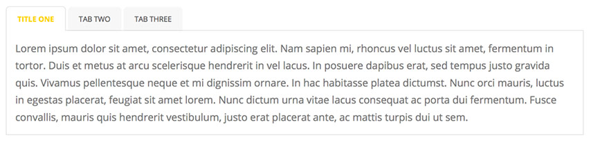
You can add a tabs element by using the tabs shortcode:
[tabs titles="Title One, Tab Two, Tab Three"][pane]Tab One Content[/pane] [pane]Tab Two Content[/pane] [pane]Tab Three Content[/pane][/tabs]Note:Please make sure that all the shortcode tags are on the same line, but separated with at least a space, for example:
... [pane]Tab One Content[/pane] [pane]Tab Two Content[/pane] ...
l. Sidebar Contact Form
The sidebar contact form looks like this:
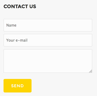
You can insert this contact form in the sidebar or footer section just by using the WordPress Text widget and inserting the following shortcode into it:
[contactform]
You can set the email to which to send the messages in the Story Options » Page Settings » Contact section.
m. Buttons

You can add a button element by using the "Button" button in the WordPress editor:
You can also use the "pexbutton" shortcode in other sections outside of the editor, that support shortcodes:
[pexbutton text="Button" link="http://buttonlink.com" color="6fcc43"]
The button shortcode supports the following attributes:
- text - the button text
- link - the button link
- color - the button color in a hexadecimal format
- style - default | border - the border style applies a transparent background and only a border to the button
- target - _self | _blank - set to open the link in the same window/tab or a new one.
Use target="_blank" to open the link in a new window:
[pexbutton text="Button" link="http://buttonlink.com" target="_blank"]
n. Other editor buttons
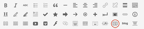
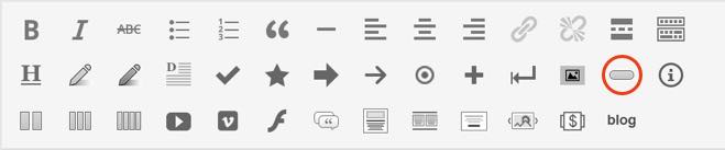
In addition to the elements mentioned above, there is also a set of other editor element buttons, such as:
- Styled headings
- Text highlights
- Drop caps
- Styled lists
- Lightbox image
- Info boxes - info / error / note / tip
- Columns - 2, 3 and 4 columns
- Videos - YouTube / Vimeo / Flash
Changing the theme style
a. Color settings
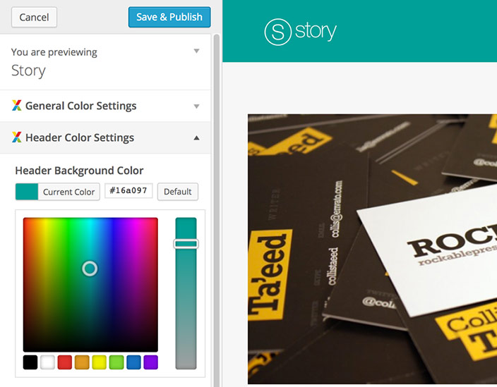
You can change all the theme colors in the Appearance » Customize section.
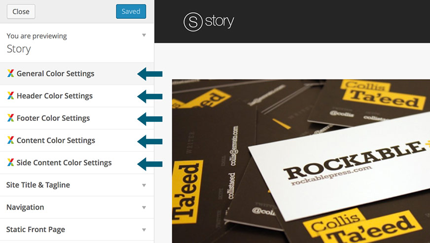
In this section you can change all the main elements colors and you can preview the changes while selecting your colors:
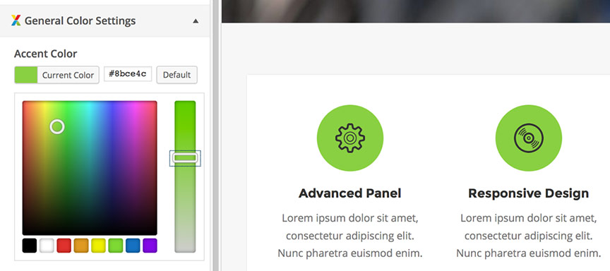
 Changing the accent color:
The accent color is the primary theme elements color, which is applied as background or text color to different elements, such as buttons color, elements hover color (e.g. arrows), pagination elements color, etc. You can change the default Accent Color in the General Color Settings » Accent Color section of the Theme Customizer panel:
Other style options
The rest of the Theme Customizer sections contain some general style settings, such as colors for the main header, content and footer areas.
b. Setting a boxed layout
You can set the boxed layout to the theme in the Story Options » General Setting » Main » "Theme layout" field.
If you would like to set a background image to the boxed layout, first make sure to refresh the options page after selecting the boxed layout option, then you will see a "Boxed layout background image" option just below the "Theme layout" field where you can select a background image and set its style.
c. Additional CSS Styles Section
If you would like to make CSS modifications to the theme's style, you can insert the additional CSS changes into the the Story Options » Typography & Styles » Additional Styles. It is recommended not to edit the style.css file, as this file will be reset to default once you update the theme and you will loose your CSS modifications. Another option to safely make CSS modifications is by creating a WordPress child theme. You can read more about creating child themes in the Installing a child theme section.
Fonts back to top
By default the theme uses the "Open Sans" (for the body text) and "Montserrat" (for the headings) Google fonts.
All the fonts settings can be applied in the Story Options » Typography & Styles » Fonts section.
This section provides an option to change the fonts for the main body font, headings and menu:
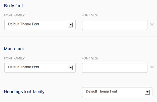
By default you can select between the standard web-safe fonts in the font options. However, you can also add custom Google fonts.
Adding Google fontsYou can browse the Google Fonts library here
In order to use Google Fonts, the field "Enable Google Fonts" should be set to "ON". You can add additional fonts in the "Add Google Font" section.
In the Font Name / Font Family you have to either insert the font name of the font or a font family.
In the Font URL field you have to insert the URL of the font file.
EXAMPLE
If you would like to use the Nobile font, click on the "Quick Use" button.
In the Font Name / Font Family field you have to insert the font family
that Google Provides, in this case:
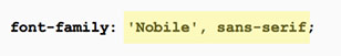
'Nobile', sans-serif
In the Font URL you have to insert the font file URL only
(not the entire embed link), in this case:
http://fonts.googleapis.com/css?family=Nobile

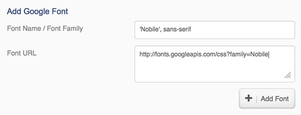
After you click on the "Add Font" option, this font will be automatically added to the default theme font list where you can choose what fonts to apply to the elements
Translation back to top
This theme is ready for translation - it comes with a .po file that contains all the embedded into the theme strings. The translation process consists of two main steps:
- Generating .mo files that contain the theme's translated strings
- Configuring your language locale
a. Creating a mo file with the translated strings
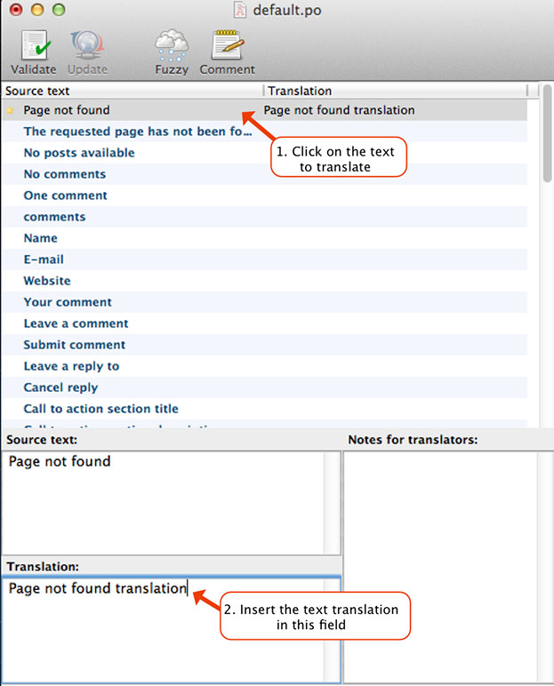
There is a file called default.po located in the lang folder within the main theme folder. You have to open this file with a program that can generate .mo files, such as PoEdit. Once you open it, you can insert the words in the additional language. Here is an example, with the file opened with PoEdit and the meanings of the words inserted into English:
In the same way you can insert the translations in the additional language. Once you save the document, a .mo file
will be generated in the directory you specify. You have to rename this .mo file to the locale of the language used.
For example, if this language is French, the name of the file should be fr_FR.mo. You can
check a list with more language locales here: http://codex.wordpress.org/WordPress_in_Your_Language
After that, you have to insert this .mo file in the lang folder of the theme.
Please note that if you save the .mo file within the lang folder of the theme,
the lang folder will be reset when you install a theme update and that's why it is recommended
to set the .mo files within a child theme:
Setting the .mo files within a child theme
If you have a child theme activated for the theme, it is recommended to
save the .mo files within the child theme, as they will remain saved even after a
theme update which replaces all the theme files. To do this you have to:
- Create a "lang" folder in your child theme folder and save the .mo files in that folder
- Go to Story Options » General Settings » Main and select the "Child Theme Folder" option in the "Load translation files from" field.
You can read more about how to install a child theme in the Installing a child theme section
If you would like to change some of the theme strings, but still your default language to be U.S. English, you have to follow the steps above and name the generated .mo file en_US.mo
b. Configuring your language locale
-
If you would like to use the WordPress installation in one language only, other than U.S. English and you are not using any additional language plugins, you can select your WordPress installation language in Settings » General » Site Language section of the WordPress admin dashboard.
You can alternatively also set the language locale manually in the Story Options » General Settings » Main » Default locale field. You can check a list with more language locales here: http://codex.wordpress.org/WordPress_in_Your_Language. If you use additional language plugins, such as WPML you have to leave this field empty, as the plugin will be the one to configure the locale based on its options.
If you would like to use the WordPress installation in multiple languages, the easiest way to accomplish this would be to use a multilingual plugin, such as WPML. Multilingual plugins add options to translate all the content into multiple languages and will also take care of setting the locale and loading the correct text translation.
If for example, you have two additional languages, such as German and French, you just have to follow the instructions above and generate a .mo file for each language - that would be de_DE.mo and fr_FR.mo respectively.
WooCommerce Support back to top
Story includes support for the e-commerce plugin WooCommerce. It registers a dedicated page template for the WooCommerce elements and applies custom styles to them.
Once you install WooCommerce you can change some of the default WooCommerce settings, such as number of products per page and set the single product page layout in the Story Options » WooCommerce section.
Additionally, for each page that the plugin generates (such as "Shop" page and "Cart" page), you can edit the corresponding page and apply the theme's settings to change the default layout, sidebars and header settings.
Product page recommended sizes
You can change the default image sizes in the WooCommerce » Settings » Products » "Product Image Sizes" section. We recommend the following sizes:
- Catalog Images : 400 x 400
- Singe Product Image: 600 x 600
- Product Thumbnails: 200 x 200
As instructed in the "Product Image Sizes" section, please make sure to regenerate the thumnails of the existing products after changing the default settings.
Using the WooCommerce 3.0 Product Gallery
WooCommerce 3.0 introduces a more advanced product gallery, which enables some additional effects:
- Slider - when this option is enabled, clicking on the thumbnail image will load a larger image in the main product image section. You can still preview the image in lightbox by clickinng on the maginfying icon.
- Zoom - enables a zoom effect when hovering the main preview image
Story by default has the Slider option enabled. You can enable/disable these effects in the Story Options » WooCommerce » Product Gallery Effects section.
Please keep in mind that the theme doesn't change the way WooCommerce works, it only applies custom styles and layouts to its content. If you have any questions related with the WooCommerce functionality, please make sure to check the WooCommerce documentation and support forums.
Plugins included back to top
The theme goes with some additional plugins included:
- Classic Editor - this is the only plugin that is required by the theme. You will need this plugin in order to add the theme elements to the content of your pages and posts. It can be downloaded from https://wordpress.org/plugins/classic-editor/
- Story Portfolio Items widget - its purpose is to display the latest portfolio thumbnails in the sidebar
- Story Recent Posts widget - its purpose is to display the latest blog posts with thumbnails in the sidebar
- WP PageNavi - displays an advanced blog pagination - downloaded from http://wordpress.org/extend/plugins/wp-pagenavi/
All the plugins are bundled with the theme zip file by default. When you activate the theme a message saying that the theme recommends these plugins will be displayed in the top section of the admin pages. You can either install the plugins you need or dismiss the message by clicking on the "Dismiss this notice" link.
If you decide to install any of the plugins later, you can access the recommended plugins page in the Appearance » Install Plugins section.
Note: The Contact Form widget that you see on the demo in sidebar section is not added via plugin, but with a shortcode. It is explained how to add a contact form in the Sidebar Contact Form section above.
CSS Files back to top
The theme contains the following CSS files:
- style.css - the main CSS file containing the styles for the default dark skin
- prettyPhoto.css - style for the PrettyPhoto plugin
- fullpage.css - style for the Fullscreen slider
- woocommerce.css - style for the WooCommerce plugin
- style_ie8.css - for Internet Explorer 8
We have also included a style.less file which is the one that we have used to generate the style.css file, so if you would like to apply major modifications to the style of the theme, you may consider using this file to generate the style.css where all the main colors and sizes are declared as variables. The style.less file is located in the root folder of the theme.
The style.css file consists of the following main sections:
- CSS Reset
- Basic Typography
- Basic Document Structure and Styling
- Theme Colors & Stylings
- Widgets and Page Templates
- Elements
- Others
- Responsive And Media Queries
- Updates
You can check the full list with sections in the beginning of the file.
For each of the main parts of the website there are comments. For example, for the footer the comments look like this:/*-------------------- MEDIA QUERIES --------------------*/ --media queries styles here--
Javascript files back to top
The theme contains the following JavaScript files:
- main.js- this is the main script for the theme, it includes all the basic
JavaScript functionality such as initialization code and widgets scripts.
Also, in order to decrease the number of JavaScript file requests and decrease the loading
time, it contains the code from another JavaScript libraries/plugins:
- jQuery Touchwipe - downloaded from http://www.netcu.de/jquery-touchwipe-iphone-ipad-library
- Mousewheel - downloaded from http://brandonaaron.net/code/mousewheel/docs
- jQuery imagesLoaded plugin - downloaded from http://github.com/desandro/imagesloaded
- Sharrre - downloaded from http://sharrre.com/
- Pretty Photo - this ithe jQuery plugin for lightbox effect for the images on the portfolio page- downloaded from http://www.no-margin-for-errors.com/projects/prettyPhoto-jquery-lightbox-clone/#download
- jQuery Easing - for the animation transitions- downloaded from http://gsgd.co.uk/sandbox/jquery/easing/
- jQuery ScrollTo - downloaded from http://flesler.blogspot.com.au/2007/10/jqueryscrollto.html
- jQuery Waypoints - downloaded from https://github.com/imakewebthings/jquery-waypoints/ - html5shiv.js - downloaded from https://github.com/aFarkas/html5shiv
- fullpage.js - includes the Fullscreen slider functionality. Uses the Fullpage.js library - downloaded from: https://github.com/alvarotrigo/fullPage.js
- portfolio-gallery.js- this file contains the Grid Gallery page functionality.
This file also includes the following third party libraries:
- jScrollPane - downloaded from http://jscrollpane.kelvinluck.com/ - masonry.js - jQuery Masonry - downloaded from http://masonry.desandro.com
- nivo-slider.js- the Fade slider- downloaded from http://nivo.dev7studios.com
- content-slider.js - the Content Slider (by Pexeto)
- colorpicker.js - script for the color picker- downloaded from http://eyecon.ro/colorpicker/#download
Image resources back to top
Special thanks to all the great graphic resources to:
- Mono Social Icons: http://icondock.com/free/mono-social-icons
- Iconmoon icons: http://icomoon.io/, icon sets: Font Awesome, Entypo
- Users Insights Icons: https://usersinsights.com/
- Streamline icon set: https://www.iconfinder.com/iconsets/streamline-icon-set-free-pack
- http://photodune.net/
- http://unsplash.com/
- http://shutterstock.com/
- http://mazwai.com/
- https://www.flickr.com/photos/125167502@N02/sets/
- http://graphicriver.net/
- http://www.imcreator.com/free
- http://icomoon.io/
- http://graphicburger.com/
- http://www.pixeden.com/
PHP files back to top
Apart of the main files needed for this theme to run, here are the other external PHP files used:
- aq_resizer.php- the purpose of this script is to resize/crop images to smaller sizes. The file is downloaded from: https://github.com/sy4mil/Aqua-Resizer/
- Envato WordPress Toolkit Library - downloaded from https://github.com/envato/envato-wordpress-toolkit-library
- class-tgm-plugin-activation.php - TGM Plugin Activation - downloaded from https://github.com/thomasgriffin/TGM-Plugin-Activation
- recaptchalib.php - ReCAPTCHA lib - downloaded from http://recaptcha.net
Installing a child theme back to top
If you would like to apply some code tweaks, it is recommended to use a child theme so that the changes can remain saved after you install theme updates. If you would like to apply some CSS changes only, you can add the CSS snippets in the Story Options -> Typography & Styles -> Additional Styles section, however if you would like to apply some additional code tweaks, such as PHP code changes, it is recommended to use a child theme instead.
We have included a child theme in the maind download package - it is called thestory-child.zip. You can install the child theme in the same way you install a standard theme - you can follow the instructions here
After you install the theme you can add custom CSS snippets in the style.css file of the child theme, custom PHP code in the functions.php file, add the theme translation files in the lang folder of the child theme and create other files to overwrite the current templates - you can read more about using child themes in the official WordPress Child Themes guide.
All the main PHP functions in the theme are set to be overwritable, so if you would like to modify the way a function works, you can just redeclare it. For example if you would like to change the defaul pexeto_wp_title function that displays the title of the document:
if(!function_exists('pexeto_wp_title')){
	function pexeto_wp_title( $title, $sep ) {
		//theme code goes here
	}
}
You can just overwrite it in the functions.php file of the child theme like this:
function pexeto_wp_title($title, $sep){
	//custom code goes here
}
In this way, you can overwrite every theme function that is wrapped with the function_exisis check:
if(!function_exists('function_name')){
	//function code
}
Hooks back to top
The theme supports hooks in the main elements sections that can be used to apply custom code from child themes. The available hooks are the following:
- pexeto_before_header - called before the header elements (inside the header element)
- pexeto_after_header - called after the header elements (inside the header element)
- pexeto_before_content_container - called before the content container element
- pexeto_before_content - called before the content area of a page/post
- pexeto_after_content - called after the content area of a page/post
- pexeto_after_content_container - called after the content container element
- pexeto_before_footer - called before the footer content (inside the footer element)
- pexeto_footer - called in the footer copyright section
- pexeto_after_footer - called after the footer content (inside the footer element)
Example: adding a phone number to the header, above the main navigation menu
- In your child theme's functions.php file add the following code:
add_action('pexeto_before_header', 'my_before_header'); function my_before_header(){ echo '<div class="alignright my-header-phone"> Phone number: 0123 456 789 </div><div class="clear"></div>'; } - In the code above we have added the custom my-header-phone class
that you can use to style the element. For example, if you would like to change
its color, you can use the following CSS snippet (you can add it to the child
theme's style.css file):
.my-header-phone{
color:#fff;
}
Support back to top
We will do our best to assist with questions directly related to the theme set up, however please note that theme support is completely voluntary for ThemeForest authors. Therefore before you contact us, please consider finding an answer to your question in:
- The relevant section of the documentation
- Search our Knowledgebase which contains frequently asked questions
- Troubleshooting section above
- WordPress Codex for general WordPress questions
- Google for general questions
Updates back to top
a. Installing an update
You can install an update of the theme either automatically by using the Envato Market Plugin or manually.
If you have modified the theme's code: your modifications will be lost when you install the update. Please create a backup of your code modifications and consider using a child theme instead of modifying the theme's code. More info here.
Due to the retirement of the old Envato API, since version 1.9.2 of the theme we have changed the way automatic updates are installed from the Dashboard. We had to remove the Envato Toolkit Library from the theme and recommend installing the Envato Market Plugin that can replace it.
In order to install updates automatically from the dashboard, you first need to install the Envato Market Plugin. The Envato Market Plugin, created by the Envato team, can be used to install updates of all of your ThemeForest and CodeCanyon items.
Installing the Envato Market Plugin
- Download the plugin
- If you are running version 1.9.2 or later, you should see a notification in your Dashboard to automatically install the plugin
- If you are using an older version or you don't see the dashboard notification:
- Download the plugin from here or
- Go to the Envato Market Github page, scroll down to the "Installation" section of the plugin description and click on the "download" link. Do not use the "Download ZIP" link of the repository!
- Install the plugin. After you have downloaded the plugin, you can install it from the Plugins » Add new » Upload Plugin section and select the downloaded plugin zip file.
Configuring the Envato Market Plugin
Once you have the Envato Market Plugin installed and activated, you will need to setup your API token in order to be able to use it. To setup your token, visit the "Envato Market" page of your dashboard and follow the instructions on the page. This page includes a link to the Envato Market site where you can easily generate your token.
Once you setup your token, you should see a "Themes" tab on the page where you can install updates of all your ThemeForest themes. Clicking on the "Update Available" button will start installing the update.
If you experience issues with using the Envato Market Plugin
- Check the Envato Market Plugin Issues Page to see if this is a known issue
- Consider reporting the issue on the Envato Market Issues Section
- Although the Envato Market plugin is not built by us, feel free to open a ticket/bug report on our Support Site so we can see if there is anything that we can do to help
- You can alternatively just install the update manually, as explained in the next section.
Installing an update manually
There are two main ways of installing an update manually:
- By uploading the theme as a new theme (recommended)- this is an easier way to accomplish this.
First you have to either delete your current theme or rename its folder on the server. To rename the theme, log in via FTP to the server, navigate to the WordPress installation folder » wp-content » themes folder where you will find the theme folder that you can rename. After this, just upload the updated theme zip file via the built in WordPress theme uploader as a new theme as explained here and activate the theme.Note: Please note that with the activating of the new theme it is possible your menu setting not to be saved for the new theme. If so, you just have to go to Appearance » Menus » Theme Locations, select the menu (it will be still there) and press the "Save" button.Once you install the updated theme and make sure that everything is working normally, you can go back to the Themes section and delete the older version of the theme.
- Via FTP - you can use an FTP client (such as FileZilla) and replace all the theme files with the updated ones. The theme folder is located in the WordPress installation folder » wp-content » themes folder of the server.
b. Version 1.0.1
This update includes:
- Added: A Pricing Table element - you can read more about it in the Pricing Tables section
- Added: An option to add a "scroll down" arrow to the first slide of the fullscreen slider. You can enable it in the "Story Options" » "Slider Settings" » Fullscreen Slider » "Show a scroll down arrow on the first slide" field.
- Fixed: Error displayed "You are not allowed to edit the theme options" when theme editing is disabled
- Fixed: Default color of buttons in content editor - set it to the default theme color
- Fixed: Story -> Fullscreen slider section in admin: horizontal slider images displayed on two lines
- Fixed: Set the custom text color from the secondary elements section to the tabs and accordion elements
- Fixed: Spacing of the two-column layout of the fullscreen slider on small screens
c. Version 1.1.0
This update includes:
- Added: an autoplay functionality to the fullscreen slider. It can be enabled per slider in the page settings section of the page that contains the slider.
- Added: an option to change the sticky header and header overlay background colors.
- Added: an option to set a custom color to the footer call to action section (by default the accent color is applied)
- Added: an option to set a custom color to the call to action element in content (by default the accent color is applied)
- Added: PhotoShop files of the main theme pages - they are located within the PSD folder of the main download package
- Improved: Spacing of the content slider on mobile devices
- Improved: Spacing of the lightbox description when long texts are added
- Improved: Spacing of the portfolio slider image caption when long texts are added
- Improved: Social sharing of pages and custom post types - set the featured image of the page to be shared
- Improved: Set the title on the single blog post page as h1
- Improved: Always display the content slider arrows on mobile devices as a main navigation
- Fixed: Page settings section sometimes gets hidden under some cirumstances
- Fixed: Fullscreen slider on mobile devices: apply the custom theme header color to the header on this page
d. Version 1.2.0
This update includes:
- Added: one-click demo import functionality in Story » Demo Import section - you can read more about it in the Installing and activating the theme section.
- Added: boxed layout option for the theme - it can be activated in the Story Options » General Settings » Main » "Theme Layout" field
- Added: included a child theme in the main download package - you can read more about using the child theme in the Installing a child theme section
- Added: an option to disable the single hover effects from the portfolio items in the portfolio gallery and carousels. The option is located inthe Story Options » Post and Page settings » Portfolio Posts » "Enable hover effects in galleries and carousels".
- Improved: fullscreen slider autoplay loading appearance on Chrome
- Improved: fullscreen slider with two-column content layout on ipad landscape
- Improved: added IDs to each of the slides on the fullscreen slider so that they can be linked from the menu on mobile devices as well. You can read more about linking to slides from the main menu in the Fullscreen slider section
- Fixed: adding new items to sliders and other sections sometimes gets blocked from the mod_security settings because of the action ID used in the AJAX request - another action ID has been set instead
- Fixed: theme not detecting WooCommerce as active on multisite installations when the plugin is Network deactivated
- Fixed: portfolio gallery item info box sometimes displayed too high
e. Version 1.2.1
This update includes:
- Improved: design of the WooCommerce shortcodes on standard pages
- Improved: WooCommerce: set the product category and product tag archive pages to automatically inherit the page layout and sidebar settings from the main shop page
- Improved: resizing of the HTML5 videos
- Improved: set a smaller font size to the page titles on mobile devices, even when a bigger font size is set in the options panel
- Fixed: Selecting a category in the Recent Blog Posts element not working
- Fixed: Content slider navigation arrows preview thumbnails mispositioned on the latest version of Chrome
- Fixed: Hovering social icons in header make them disappear on the latest version of Chrome
- Fixed: Some compatibility issues with the upcoming WordPress 4.0 including:
- Columns button in editor not working properly
- Remove the static height from the editor of the background section dialog to work with the new dynamic height functionality of the editor
- Fixed: Remove button of the image select fields in the admin mispositioned on the latest version of Chrome
f. Version 1.3.0
This update includes:
- Added: A fullscreen video background option to the fullscreen slider. You can read more about it in the Fullscreen Slider section.
- Added: Full-width layout option to the Quick Gallery in the full-width pages. You can read more about this option in the Quick Gallery section.
- Added: A parallax effect option for the header title section. You can read more about this option in the Header Title section.
- Added: An autoplay functionality to the fullscreen slider's inner horizontal slider. You can read more in the Fullscreen Slider section.
- Added: An option to change the default copyright text in the footer's copyright section to a custom text. You can read more about this option in the Footer section.
- Added: An option to set a background image to the Boxed Layout of the theme. You can read more about this option in the Styles section.
- Added: A new demo (Vintage) to the Story » Demo Import section.
- Improved: The positioning of the texts on the fullscreen slider on mobile devices
- Improved: The layout of the portfolio post archive
- Improved: Mobile menu positioning when the boxed layout is selected for the theme
- Improved: The layout of the added elements containing long texts under the Story section of the admin
- Fixed: Contact form not responsive when the full-width layout is selected on the page
- Other general and layout improvements
g. Version 1.4.0
This update includes:
- Added: A new full-width grid layout option for the services boxes. You can read more about it in the Services Boxes section
- Added: Typography options for the Content Slider allowing to apply different typography to each slide - you can read more about this option in the Content Slider section
- Added: Option to change the default background image alignment on the Content Slider and Fullscreen Slider. This option can be set per slide in the "Background Image Alignment" field of the slide (by selecting the "Custom Settings" option in the "Slide Settings" field)
- Added: Option to use custom icons for the header social icons section
- Added: Option to set the custom links to be opened in a new tab/window for the following elements:
-
- Services Boxes
- Portfolio Custom Link Items
- Fullscreen Slider Button (available for each slide in the "Custom Settings" section of the slide)
- Content Slider Buttons (available for each slide in the "Custom Settings" section of the slide)
- Fade Slider
- Call To Action element in footer and content
- Button Element
- Pricing Boxes
- Added: A new demo (Agency) to the Story » Demo Import section.
- Added: Generation of IDs to each section of the full-width page template, so it is easier to link to those sections from the navigation menus
- Improved: Update notification loading time when the updates data cannot be loaded
- Improved: Indentation and spacing of the post comments form textarea
- Fixed: Gallery category loads posts category archive when linking to a portfolio category within the page and the gallery page is set as a front page
- Fixed: Adding an empty item (with no image) to the fade slider section creates an item that can’t be removed
- Fixed: Escape HTML code in the previews of the elements added under the Story section (such as services boxes, testimonials, etc.)
- Fixed: Footer copyright element flickering on Chrome when the gallery items are hovered
- Other general improvements and minor bug fixes
h. Version 1.5.0
This update includes:
- Added: More typography options - added a font style option for header titles and menu links and also font settings for the sidebar titles
- Added: Search button option for the header section. It can be enabled in the Story Options -> Header Settings -> General -> "Add Search in Header" field
- Added: Option to add a custom slider shortcode in the header, so you can easily embed third party sliders (e.g. Revolution Slider). For more information, please refer to the Custom Header Sliders section.
- Added: Option to select the background style in the content slider. For more information, please refer to the Content Slider section.
- Added: Option to set a min height to the background sections
- Added: LinkedIn button to the sharing buttons set - it can be enabled/disabled in the Story Options -> General Settings -> Social Sharing section.
- Added: Option to change the default vertical padding of the content slider. The option is located in the Story Options -> Slider Settings -> Content Slider section.
- Added: Option to hide the featured image from the single portfolio pages (when the item type is set as "Standard Page". The option is located in the Story Options -> Post & Page Settings -> Portfolio Posts -> "Display featured image" section.
- Added: Option to change the default portfolio carousel thumbnail height. For more information, please refer to the Portfolio Carousel section.
- Improved: Visual Composer plugin compatibility. The theme registers all of its custom shortcode elements with the Visual Composer, so that you can now use the Visual Composer builder instead of the theme's elements builder if you prefer that. Please note that the Visual Composer plugin is not included with the theme.
- Improved: Contact form - added a sender email option to avoid messages failing to be sent due to the Yahoo DMARC reject policy. For more information, please refer to the Contact Form Page section.
- Improved: Lightbox design
- Improved: Category filter loading icon spacing on mobile devices
- Improved: Compatibility issues with the upcoming WordPress 4.1:
- Set a smaller font size to the editor text
- Fixed: WordPress link button not working in the background sections editor
- Disabled the new inline edit toolbar for the theme's visual elements in the editor
- Improved: WooCommerce call to action buttons for the different product types
- Improved: Fullscreen slider loading animation
- Improved: Styles of the form elements
- Fixed: Fullscreen slider scrolling issue on Nokia Lumia
- Fixed: Editor buttons dialog in the WooCommerce Edit Product screen.
- Fixed: Alignment in the WooCommerce AJAX cart when variations are added
- Fixed: Strip slashes from the header social icons titles
- Fixed: Portfolio items show custom thumbnail image instead of the featured image/first gallery image in lightbox preview in the portfolio carousel and gallery page (when lightbox previews are linked)
- Fixed: Background sections background style option not working (since the 1.3.0 update)
- Other general improvements and minor bug fixes
i. Version 1.5.1
This update includes:
- Added: A new demo - "Creative Business" to the Demo Import section
- Added: A button shortcode so you can easily add buttons to other sections outside of the page/post content editor. For more information please refer to the Buttons section
- Improved: fullscreen slider animations and fixed a flickering issue on the latest version of Firefox
- Improved: add shortcodes support to the services boxes descriptions
- Improved: compatibility with the upcoming WooCommerce 2.3, styled the new remove buttons from the cart widgets and improved the variations element style in the cart widget
- Fixed: Services boxes grid style - custom services title color not applied when the default theme title color has been customised
- Fixed: portfolio category archive items don't have a white background applied
- Fixed: fullscreen slider - caption of the first image of the horizontal slider not displayed on mobile devices
- Other general code improvements
j. Version 1.6.0
This update includes:
- Added: A "Title & Image in header" blog post style that shows the title and featured image in the header of the single post page. You can read more about this option in the Post Styles section.
- Added: A related posts element to the single post pages. You can read more about how to configure it in the Showing the related posts section.
- Added: An option to display an album of images in the portfolio carousel when it is loaded in non-gallery pages. For more information please refer to the Portfolio Carousel section.
- Added: An option to set all the panes of the accordion element to be closed by default. For more information please refer to the Accordion section.
- Added: A "static contain" background style option to the background sections
- Added: An option to the content slider to enable autoplay on mobile devices (which was always disabled by default). The option can be found in the Story Options » Sliders » Content Slider » "Autoplay on mobile devices" section.
- Added: Styles for the Contact Form 7 forms elements to better match the theme's style
- Improved: Added styles for the JetPack video embeds that strip the theme's responsive video div wrappers
- Improved: Clear floats in the tabs and accordion elements
- Improved: Accordion element - close opened panes on click
- Fixed: Issue with the Fade slider display on mobile
- Fixed: Sharing icons display issue on Chrome
- Other general code improvements
k. Version 1.6.1
This update includes:
- Added: option to use embed iframe code in the portfolio video items and blog video posts
- Added: WP 4.2 Term Splitting handling for the header sliders and filtered categories in the Blog page and Portfolio Gallery page templates
- Added: option to change the default drop-down menus colors
- Improved: allow custom (user-supplied) excerpts in the recent blog posts element
- Improved: the sharpness of the gallery post format images
- Improved: Made the portfolio slug as a constant that can be modified in a child theme
- Improved: Updated the Twitter icon
- Fixed: option to exclude post format in the related blog posts settings section does not show post formats that don't contain any posts
- Fixed: Portfolio Gallery - clicking on the "ALL" category in the filter when it is selected hides all of the items
- Fixed: Fullscreen slider - clicking on the currently selected navigation item disables the slider navigation
- Fixed: Portfolio Gallery - when the gallery page is opened with a category selected by default and after another category is selected in the filter, the previous/next navigation doesn't work properly
- Other general code improvements and minor bug fixes
l. Version 1.6.2
This update includes:
- Security update to fix issues related with the recently found XSS vulnerability of the add_query_arg() function - updated the TGM Plugin Activation class
m. Version 1.7.0
This update includes:
- Added: option to add the content slider to the content of the pages/posts. For more information please refer to the Content slider in page/post content section.
- Added: WordPress hooks to the main elements (header, content and footer) so that custom code can be applied to those sections in child themes. For more information please refer to the Hooks section.
- Added: display featured images in the posts RSS feed
- Updated: the PrettyPhoto plugin to version 3.1.6 to fix the recently found XSS vulnerability issue
- Fixed: minor markup errors in the post comments section
- Fixed: portfolio gallery - when AJAX is disabled and a category is selected, the pagination links link to all categories of the page instead of the selected category only
- Fixed: removed a reference to a non-existing image in the style.css file
- Other general code improvements and minor bug fixes
n. Version 1.7.1
This update includes:
- Fully handle the WordPress 4.3 terms splitting. The upcoming WordPress 4.3 will automatically split all of the shared terms between different taxonomies, which means that it will change the IDs of those terms in the database. This can affect the theme’s elements that store references to the terms IDs. With this theme update, when a term splitting occurs, the theme will change all of the references from the old IDs to the new IDs.
Important: Please make sure to update the theme before updating WordPress to 4.3 once it is released, as the terms splitting will be performed during the WordPress upgrade process.
o. Version 1.8.0
This update includes:
- Fixed: WordPress 4.4 issue - selected and saved sets in editor elements (recent posts element, portfolio carousel and sliders) not selected by default when editing
- Added: option to set max display width to the embedded into the content YouTube and Vimeo videos
- Added: hentry properties to the blog posts markup - this can help the search engines to more easily identify the different elements of the blog posts data
- Improved: The portfolio slider content scrolling when the content is higher than the content area
- Improved: layout and style of some of the WooCommerce shop elements (header cart icon and layered nav widget)
- Improved: removed the usage of the deprecated WooCommerce hook add_to_cart_fragments
- Fixed: portfolio gallery category filter issue on mobile devices when AJAX is disabled
p. Version 1.8.1
This update includes:
- Fixed: issues with the new WooCommerce 2.5 update: the number of items in header cart icon not updated, also fixed some design and spacing issues
q. Version 1.8.2
This update includes:
- Added: option to select categories to be included in the blog page - modified and extended the "Exclude categories" option to allow choosing an "include" action
- Improved: when replying to comments, adds the reply form below the comment to reply to
- Fixed: WordPress 4.5 issue - the new inline link tooltip not working in background sections
- Fixed: compatibility issue with Polylang - language switcher redirects to the home page instead of the translated version of the current page
- Fixed: compatibility issue with 3rd party plugins: theme's editor dialogs broken when plugins load custom jQuery UI dialog styles and apply them globally to all dialogs used in the dashboard
- Style improvements on the Story Options page
r. Version 1.8.3
This update includes:
- Improved: The design of the WooCommerce account page
- Improved: The way the WooCommerce cart icon is loaded in the header (works better with caching plugins)
- Updated: The TGM Plugin Activation library to the latest version
- General code improvements and minor bug fixes
s. Version 1.9.0
This update includes:
- Added: Option to enable a category filter in the blog page header (similar to the gallery page filter). For more information please refer to the Blog Category Filter section
- Added: More content column layouts with options to change the layout available when hovering a column element in the editor
- Added: New demo - "Adventure", available for importing from the Demo Import section
- Added: More typography options - option to change the default font of the secondary elements (blog details, portfolio categories, etc.) and the font of the portfolio items title
- Added: Option to enable vertically centered and emphasized content of the text-only services boxes with Boxed Layout applied
- Added: Option to apply custom CSS class to the background sections
- Added: More WordPress action hooks to the footer section - more detains in the Hooks section
- General code improvements and minor bug fixes
t. Version 1.9.1
This update includes:
- Fixed: Quick gallery in blog page with masonry layout not resizing the thumbnails correctly (since 1.9.0)
- Improved: the way the widgets styles are loaded in the admin, so they are not cached after installing a theme update
u. Version 1.9.2
This update includes:
- Major change affecting the automatic updates from the dashboard: removed the Envato Toolkit Library that handles automatic updates due to the retirement of the old Envato API (that Envato Toolkit uses). Implemented a script to install the Envato Market Plugin, which is the new tool to install automatic updates from the dashboard. For more information please refer to the Updates section.
v. Version 1.9.3
This update includes:
- Introduced compatibility with the upcoming WooCommerce 3.0, including support for the new product gallery (more info in the WooCommerce section)
- General code improvements and minor bug fixes
w. Version 1.9.4
This update includes:
- Updated the contact form reCAPTCHA widget to version 2, since version 1 is now deprecated and will be shut down in March 2018. This requires generating new API keys. Please refer to the Contact Form Page section for more details.
- Fixed: PHP7 issue with the demo importer
- Fixed: Some minor styling issues with some of the WooCommerce elements
- Fixed: WooCommerce shop page showing the gallery & blog templates settings in the edit page screen
x. Version 1.9.5
This update includes:
- Introduced support for the upcoming WordPress 4.9 Gallery Widget
- Fixed: scroll to top button not working on the latest version of Chrome
- Improved the way the demo import works
- Minor bug fixes
y. Version 1.9.6
This update includes:
- GDPR: Contact page - added an option to enable a data collection consent checkbox, requesting the visitor's consent to store & use their data, submitted with the form. For more information please refer to the Contact form page section
- GDPR: Add support for the upcoming WordPress 4.9.6 comment form cookie checkbox. The commenter cookie is used to pre-fill the name,
email and URL fields of the comment form when the commenter intends to post another comment. It also allows the commenter to preview
and delete any comments awaiting moderation.
WordPress 4.9.6 automatically includes the cookie checkbox in the comments form, however you need to update the theme to version 1.9.6 in order for the checkbox to be displayed. - Fixed: Fullscreen slider background videos not autoplaying in some cases. Chrome recently
released a strict autoplay policy
which prevents the videos from autoplaying in some cases. To overcome this limitation we have introduced the following changes:
- Added an option to make the video muted. At this point the limitation does not affect muted videos, so if your videos have no sound (which should be the case with most of the background videos), just enable the "Mute video" option of the slide
- In the cases when Chrome refuses to autoplay the video, a play button is added to the slide which when clicked, will play the video
- General improvements and minor bug fixes
z. Version 1.9.7
This update includes:
- WordPress 5.0 Preparation: Make the Classic Editor plugin required by default. This theme supports the classic editor only and a major part of its elements rely on the classic editor. If you wish to use Gutenberg, you can do so by not installing the Classic editor plugin, however please keep in mind that some of the theme elements might not function properly, as they were designed to be added via the Classic Editor. You can learn more in this article.
- General improvements and minor bug fixes
aa. Version 1.9.8
This update includes:
- Disable the theme's classic editor functionality in the block editor (Gutenberg) - hides the theme's element buttons in the Gutenberg editor (Classic Editor Block) and displays the theme's elements as shortcodes
- Disable the block editor option in the Classic Editor plugin, as by default after the Classic Editor plugin is activated, it shows the Block Editor option as first option to edit posts/pages.
ab. Version 1.9.9
This update includes:
- Fixed: Blog posts widget with column layout displaying the wrong excerpt in WordPress 5.2
ac. Version 1.9.10
This update includes:
- Fixed: WordPress 5.3 - inconsistent styling of the inputs in the dashboard after the new WordPress dashboard redesign
- Fixed: Incorrectly registering a submenu page with an extra parameter in the dashboard
- Minor tweaks/code improvements
ad. Version 1.9.11
This update includes:
- Fullscreen slider: Enabled touch swipe events for devices that are detected as desktop devices, but support touch events (such as iPad Pro)
- Prepared the theme for the future removal of jQuery Migrate from WordPress core:
- Removed the usage of the deprecated jQuery functions from the PrettyPhoto lightbox plugin
- Updated the jQuery Waypoints to the latest version
- Fixed a positioning issue with the select inputs in the editor dialogs
- Other general improvements and minor bug fixes
ae. Version 1.9.12
This update includes:
- Compatibility fixes and improvements for the upcoming WordPress 5.5 sitemaps, including:
- Changed the way the theme's custom elements post types (such as sliders and services boxes) are registered, so their URLs are not added to the sitemap
- Added a new section under Story Options -> General -> SEO -> WordPress 5.5+ sitemaps that allows you to disable the lighbox and custom link portfolio items from sitemaps, as well as disable the portfolio taxonomy category sitemap
- Use the WordPress Title Tag feature to generate the document title. Now
the document title generation is controlled by WordPress with the exception of:
- Tagline is removed for consistency with the previous title format and to avoid showing the default "Just another WordPress site" tagline in case it is not configured
- The title separator that can be configured under Story Options -> General -> SEO is still applied
- Added support for the wp_body_open hook
- Other general improvements and minor bug fixes
af. Version 1.9.13
This update includes:
- Fixed: editor elements not working with the latest WordPress 5.6 update
ag. Version 1.9.14
This update includes:
- Fixed compatibility issues with the upcoming WordPress 5.9, including:
- Issue with adding/updating background sections in the editor
- When editing theme elements (such as slider items, services boxes, etc.) the loading does not hide and the edit form does not close after saving the changes
Once again, thank you so much for purchasing this theme! If you like it, please don't forget to rate it on the ThemeForest site.
Pexeto