Header background images – optimal size & positioning
This article includes some general info about the optimal image size of the background images in the header section of the Story theme and also some general tips about positioning the images depending on how you would like to display them.
The header section by default displays the background images with a parallax effect covering the entire visible area of the element. Depending on the current screen size, the image will be displayed in a different way on each screen/device, so there is no specific optimal ratio for the images, however it is recommended to use images that are around 1000 pixels and not bigger than 1500 pixels in size, so that the page loads faster.
1. Parallax effect
Depending on the image and screen ratio, the parallax background effect can sometimes make the background images look a bit zoomed – that’s because when a position fixed is set to the background style, the background image covers the entire screen area instead of the visible element area.
Here is a screenshot that better illustrates this:
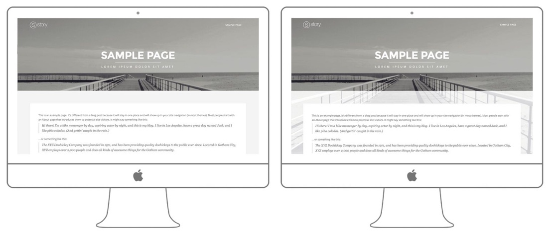
The first example displays how the background image looks with a parallax effect and the second one illustrates how actually the background image is positioned.
Disable the parallax effect
Disabling the parallax effect will resize the background image so that it covers only the header area and not the entire screen. Here is an example how the image above would look like when the parallax effect is disabled:
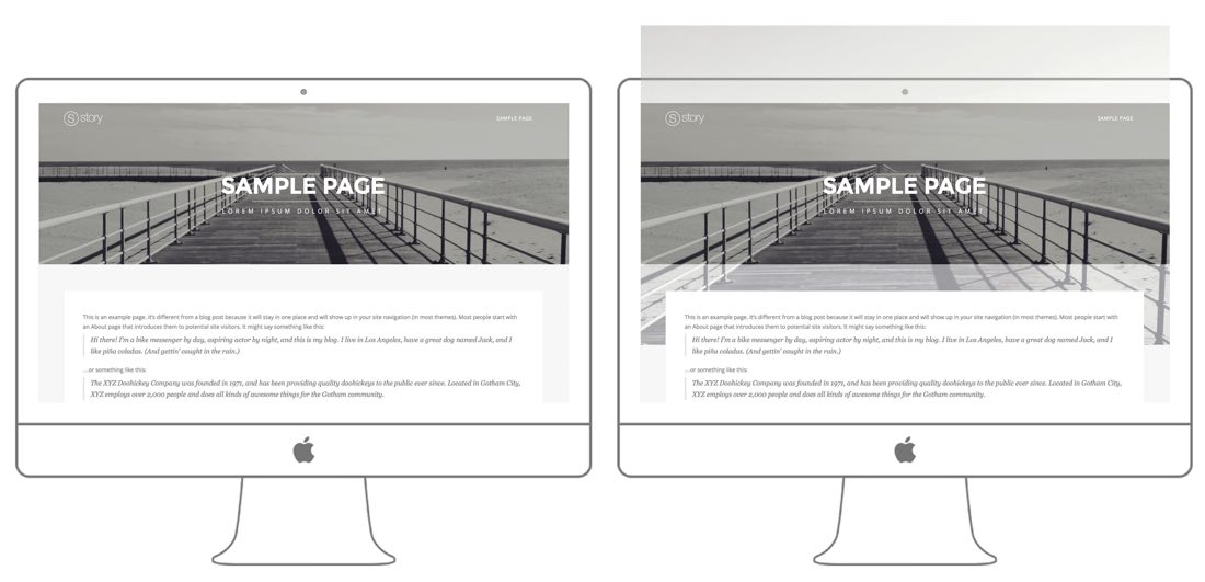
The second image illustrates how the image is actually positioned – as you can see, it would cover only the header area, positioned in the center.
You can disable the parallax background effect for the header background images in the Story Options » Header Settings » General » “Enable header parallax effects” section.
2. Image positioning
As you can see on the example above, the image by default would be centered in the visible area. If you would like to apply a specific position to the image, for example position the image to the bottom:
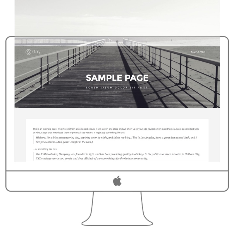
You can accomplish this with a CSS tweak – just by changing the background-position property of the element. For example, in order to apply a bottom vertical alignment, but keep the horizontal alignment in the center, you can use the following CSS snippet:
.header-wrapper > .full-bg-image{
background-position: center bottom;
}
You can add the snippet to the Story Options -> Typography & Styles -> Additional Styles section.
You can read more about the available background position property and the available options here. In short, the first value sets the horizontal alignment – you can choose between left , center and right and the second option sets the vertical alignment – you can choose between top, center and bottom .
Note: Please note that when the parallax effect is enabled, the position would be applied according to the window instead of the header area, so if you need to position the image according to the visible header area, you would have to disable the parallax effects as explained in section 1. above.
If you would like to apply the CSS snippet above to one page only, please take a look at this article where we have described how you can do this.
3. Displaying the full image with no hidden parts
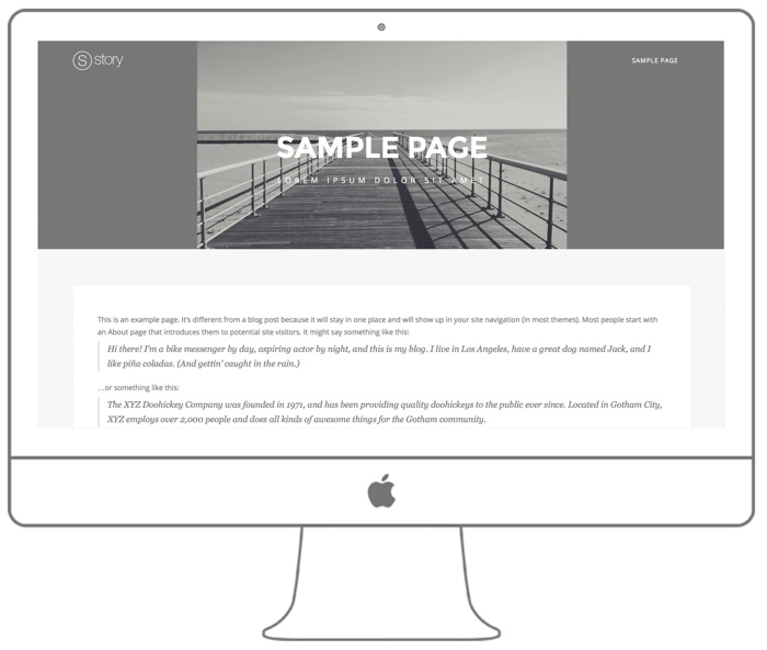
The header background images are designed to cover the header area, so they would automatically adjust their size so that the entire area would be covered. In some cases though, you might want to fully display the image without any hidden parts and that can be accomplished by setting the background image size to contain. Here is an example of how this would look like:
In order to apply this style to the header background images, add the following snippet to the Story Options -> Typography & Styles -> Additional Styles section:
.header-wrapper > .full-bg-image{
background-size:contain;
background-repeat:no-repeat;
}
If you would like to change the default position of the image (e.g. position it to the left), you can follow the instructions in section 2. above.
If you would like to apply the CSS snippet above to one page only, please take a look at this article where we have described how you can do this.